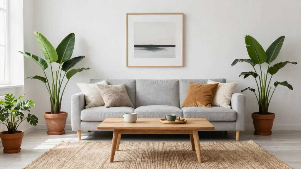
Creating a cozy living room that feels bright and open can sometimes feel overwhelming, especially when choosing the right wall color. I made this post because I believe that the right light wall colors for your living room can transform your space into a peaceful retreat. Color has the power to influence mood and perception, and I want to help you make choices that not only look good but also feel great.
If you’re someone who loves home decor, especially with a Scandinavian-inspired touch, this post is for you. Perhaps you’re looking to refresh your space or simply dreaming of a more airy atmosphere. You’ll find 16 light wall color ideas that evoke warmth, tranquility, and brightness, perfect for curating a serene living environment.
With this guide, you will discover how each color can enhance your living room, making it feel more spacious and inviting. From soft whites that offer a classic touch to gentle pastels that bring a breath of fresh air, you’ll have plenty of options to consider. Whether you’re redecorating or just exploring new ideas, this list will help you find the perfect hue for your cozy haven.
Key Takeaways
– Choose the Right Shade: Light wall colors like soft white and light gray can create a neutral backdrop, making your living room feel larger and more open.
– Consider Color Psychology: Colors like pale blue and soft lavender promote calmness and serenity, making your space a relaxing retreat.
– Warmth with Neutrals: Creamy beige and light taupe add warmth and comfort, ensuring your living room feels inviting without overwhelming the senses.
– Add a Pop of Color: Incorporate shades like light peach or soft mint for a subtle hint of color that brightens the room while maintaining a cozy atmosphere.
– Balance and Contrast: Use soft charcoal or light sand to add depth without darkening the space, achieving a balanced look that enhances both comfort and style.
1. Soft White: The Classic Choice
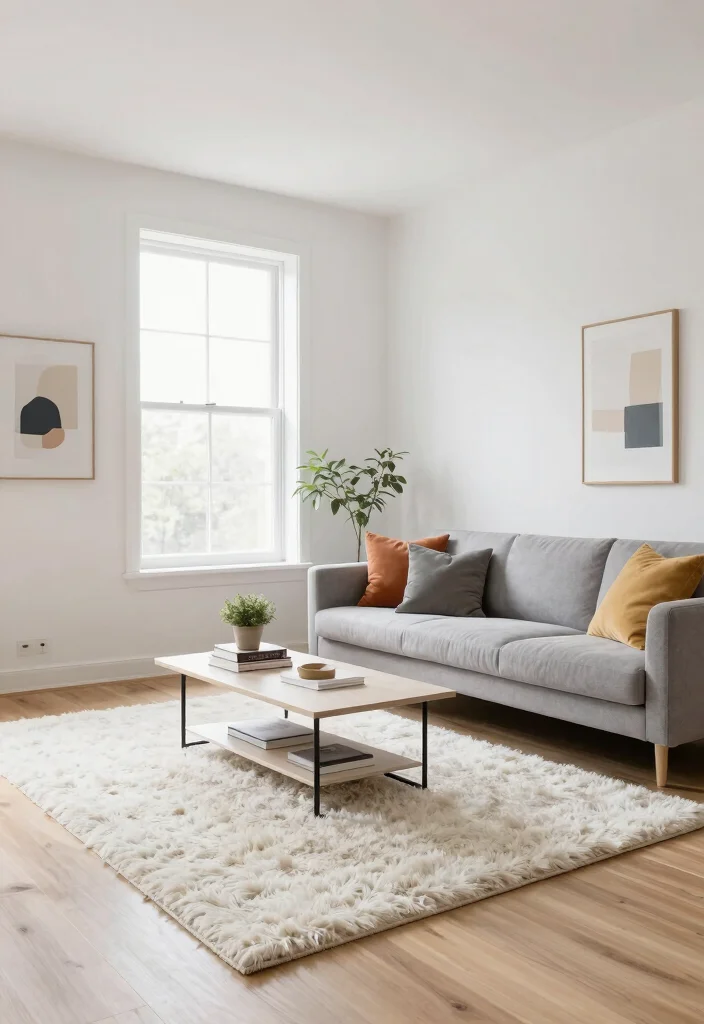
Soft white walls stand as a timeless choice, effortlessly brightening your living room and creating an airy atmosphere. This hue reflects light beautifully, enhancing the openness of your space while maintaining a sense of warmth. It pairs wonderfully with materials like natural wood and textured fabrics, allowing your decor to shine without competing for attention. Imagine a gallery of colorful art pieces standing out against a soft white backdrop, transforming your room into a vibrant haven.
To achieve this look, consider selecting a warm white for a cozier environment or a cool white for a fresh and invigorating vibe. An eggshell finish can also add a subtle sheen, enhancing the light reflection in your room.
Key Benefits:
– Brightens up the entire room
– Pairs well with any furniture style
– Easy to refresh with seasonal decor
This classic choice enhances the overall aesthetic, while the interplay of textures and materials creates a balanced and inviting space.
Soft white walls are a classic example of light wall colors for living room, instantly brightening your space and making it feel cozier. It’s the blank canvas that lets natural wood textures and colorful art shine—no glare, just warm, welcoming light.
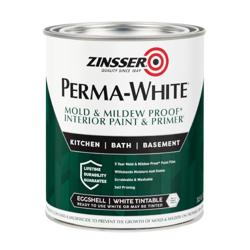
Self-Priming formula - requires no sanding
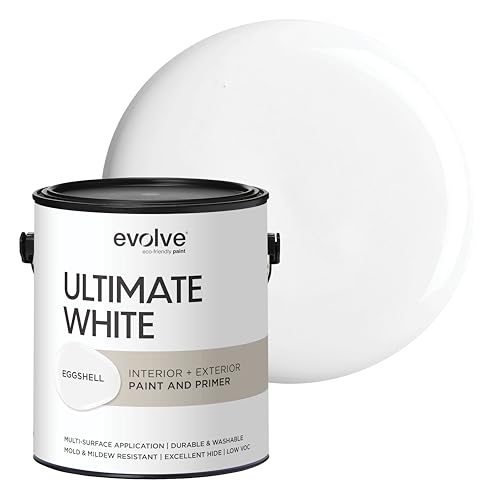
ALL-IN-ONE PAINT AND PRIMER: Saves time and effort by priming, sealing, and finishing in one step for smooth, efficient coverage

ALL-IN-ONE PAINT AND PRIMER: Saves time and effort by priming, sealing, and finishing in one step for smooth, efficient coverage
2. Light Gray: The Modern Neutral
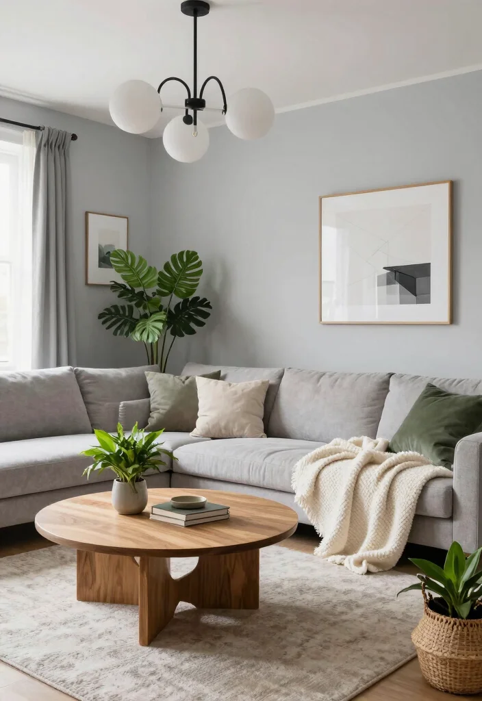
Light gray serves as a sophisticated neutral that brings a contemporary touch to your living room. This color creates a chic backdrop that seamlessly integrates with various design elements, ensuring a stylish atmosphere. In Scandinavian-inspired spaces, light gray beautifully complements natural wood and soft textiles, crafting an inviting and harmonious environment. Whether you opt for a warm or cool shade, this versatile color elevates the sense of space while still feeling cozy.
To implement this look, pair light gray with crisp white trim to achieve a polished finish. Incorporating textured materials like linen or wool can add warmth and depth, making the space feel even more inviting.
Key Benefits:
– Offers a contemporary look
– Works well with both warm and cool decor
– Easy to accessorize with soft furnishings
With its balance of elegance and comfort, light gray enhances your living room’s overall aesthetic, allowing for easy integration of various textures and designs.

PET FRIENDLY & NON-SLIP BACKING: 8x10 area rugs featuring a neutral abstract design, complements various decor styles. Non-slip TPR backing makes the covering for bringing your space together. Make the most of your time at home with our pet-friendly and easy-to-clean area rugs. Decorate your home with this rug and enjoy it with pleasure
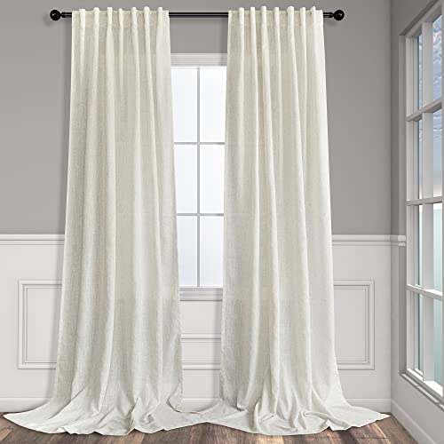
Basic Information: 2 LINEN PANELS in 1 package. Each panel measures width 52 x 84 length. 3-Way Hanging Options: Hang these curtain panels (1) using the back loops to create an elegant pleated effect, (2) from the 3 inch rod pocket for a classic look, or (3) using clip rings for easy, slide open and closed (clip rings are not included)

PINCH PLEATED DESIGN: Curtains top features 1.5 times length fabric design for an elegant pleated effect. Perfectly presenting a sense of stereoscopic and layering. Whether in living room, bedroom, dining room or sliding door etc, it fit perfectly into a variety of room decor style
3. Pale Blue: A Breath of Fresh Air
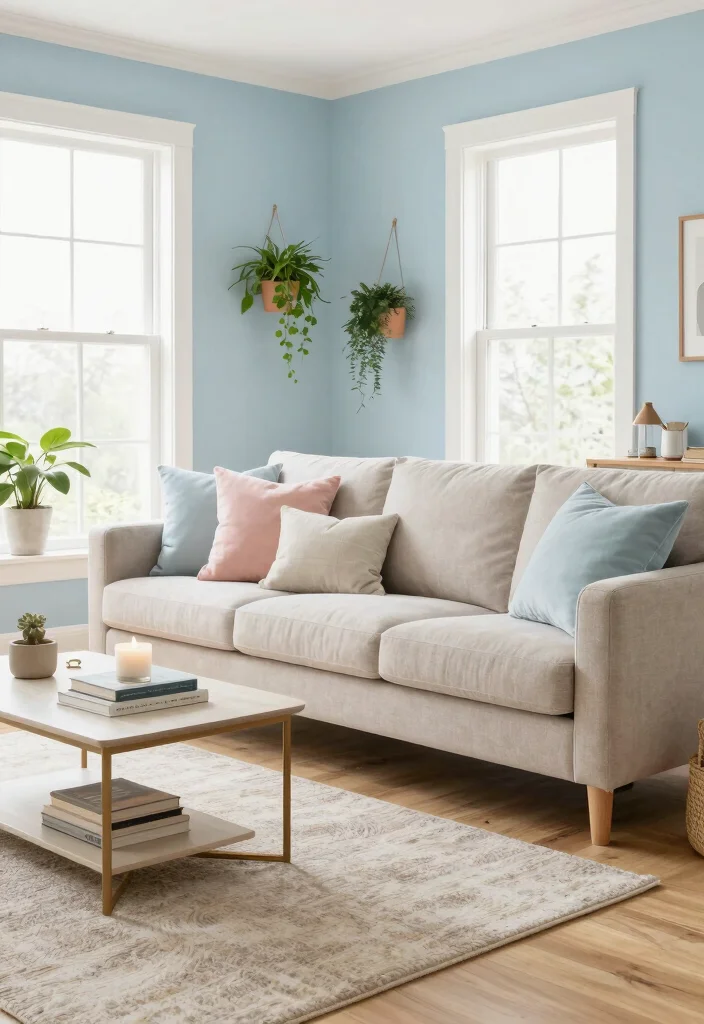
Pale blue walls evoke a refreshing ambiance reminiscent of clear skies and tranquil waters, perfect for creating a serene living space. This gentle hue enhances calmness and tranquility, making it an ideal choice for relaxation. In Scandinavian designs, pale blue pairs beautifully with wooden elements and soft whites, creating a harmonious balance of cool and warm tones. When sunlight streams in, this color reflects light, making your room feel bright and inviting.
To maximize this palette, accessorize with soft whites and natural woods for a cohesive and peaceful look. Using pale blue in larger spaces can amplify its calming effect, inviting serenity into your home.
Key Benefits:
– Infuses the room with a sense of calm
– Complements a variety of color schemes
– Enhances natural light reflection
This tranquil choice not only beautifies your living area but also cultivates a soothing atmosphere, enhanced by the interplay of textures and materials.

Elegant gold framed artwork featuring a tranquil coastal landscape with a misty cliffside meeting a calm, serene sea under a soft sky.
Elegant gold framed artwork featuring a tranquil coastal landscape with a misty cliffside meeting a calm, serene sea under a soft sky.
Elegant gold framed artwork featuring a tranquil coastal landscape with a misty cliffside meeting a calm, serene sea under a soft sky.
4. Creamy Beige: Warmth and Neutrality
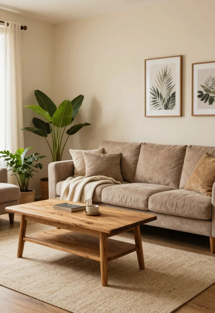
Creamy beige walls create a warm and inviting backdrop, ideal for fostering comfort in your living room. This neutral shade sets a relaxed atmosphere that perfectly aligns with Scandinavian design principles. Beige harmonizes beautifully with both light and dark woods, allowing for flexibility in accent colors and decor choices. This rich yet neutral tone effortlessly enhances your space without overwhelming it.
To make the most of this color, consider incorporating darker furniture pieces for added contrast and depth. Layering with textured textiles can also enhance warmth and coziness, creating an inviting environment.
Key Benefits:
– Creates a warm and relaxing environment
– Pairs beautifully with earthy tones
– Ideal for a cozy and welcoming feel
This comforting choice enriches the overall aesthetic, while varied textures and materials elevate the design, making your living room a truly inviting retreat.

SOLD AS 2 PANELS: Each package includes sheer curtains 84 inch length 2 panels set; Each panel measures 42" width, total width is 84", not only wider than ordinary 38" width, but also affordable cost than other extra wide sheer curtains, 42 inches will allow these panels to decorate sufficiently over your windows.

Screen Description: Lavender pictures wall decor features soft purple blooms, slim green stems and a warm neutral background, creating a gentle botanical look with calm, natural charm

Size:55inch Length x 20inch Height, Large Canvas Wall Art
How To Choose the Right Light Wall Colors for Your Living Room
Choosing the right light wall colors for your living room can transform the space into a bright, inviting area. Here are some key factors to consider when selecting the perfect hue for your cozy retreat.
1. Consider Natural Lighting
The amount of natural light your living room receives can greatly impact how a color looks on the walls. Rooms with lots of sunlight can handle deeper tones without feeling dark, while north-facing rooms might benefit from warmer shades to create a more inviting atmosphere. Always test paint samples on your walls and observe them at different times of the day to see how they change with the light.
2. Understand Color Psychology
Different colors evoke different feelings and moods. For example, soft blues can create a calming effect, while light yellows can bring cheerfulness and energy. Think about how you want your living room to feel when choosing a color. If you want a cozy reading nook, consider warm neutrals. If you’re looking for a refreshing vibe, opt for pastel shades like mint or pale blue.
3. Match Your Decor Style
Your choice of light wall color should harmonize with your existing decor and furniture. A Scandinavian-inspired living room often features whites and soft grays, complementing natural wood furniture and minimalistic designs. If your decor leans towards bohemian, soft pastels may work well to enhance the playful elements you have. Always keep your overall aesthetic in mind.
4. Test Samples at Home
Before committing to a color, purchase sample pots and paint swatches on your walls. This allows you to see how the color interacts with your furniture and decor. It’s important to view the color at different times of day to appreciate its true tone. This step can prevent costly mistakes and ensure that you love the final result.
5. Consider the Size of the Room
The size of your living room can influence your color choice. Light colors tend to make small spaces feel larger and more open, while darker shades can make a big room feel cozier. If you’re working with a compact living area, soft whites, light grays, or pale blues can enhance the spacious feeling. In larger rooms, you might experiment with bolder light shades that still keep the area feeling airy.
6. Incorporate Accent Colors
Once you select your main light wall color, think about accent colors. These can be used in your furniture, artwork, and accessories. Adding pops of color through cushions, throws, or décor can create visual interest and enhance the overall ambiance of your living room. For instance, a soft cream wall can be beautifully complemented with vibrant oranges or deep greens in your décor pieces.
🚀 Pro Tip: Always start with a color palette that includes your main wall color and 2-3 accent colors. This strategy helps create a cohesive look and makes it easier to coordinate the entire room’s décor.
Choosing light wall colors for your living room doesn’t have to be overwhelming. By considering the lighting, color psychology, decor style, testing samples, the size of the room, and incorporating accent colors, you can create a beautiful, inviting space that reflects your personality. Happy decorating!

High-covering, premium acrylic-based pigment paint in an easy-to-handle marker that works on almost every surface, both indoors and outdoors

Polycarbonate Structure: Smooth polycarbonate, resistant to scratches, wear, and heat up to 100°C, ideal for everyday use

ALL SEASON PAINT & PRIMER-IN-ONE: Cascadia XL is a 100% Acrylic Latex Paint & Primer-in-One with advanced technology for rain protection and a superior finish
5. Soft Sage: Nature-Inspired Elegance
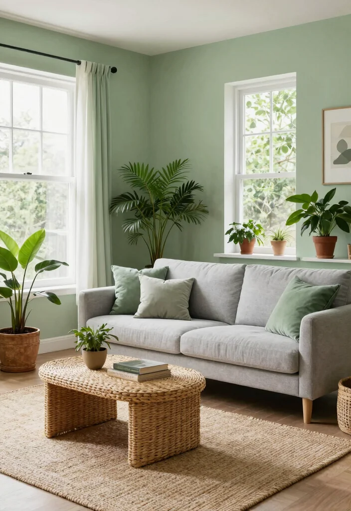
Soft sage green walls breathe a hint of nature into your home, cultivating a refreshing and tranquil environment. This color beautifully aligns with Scandinavian design, emphasizing natural elements and a peaceful ambiance. Sage pairs effortlessly with whites, creams, and light woods, making it a delightful choice for an inviting living room. Its subtle green tones bring an organic feel, enriching the space without overwhelming the senses.
To enhance this look, combine sage with botanical prints or decor for a cohesive theme. Using varied shades of green throughout the space can create depth and visual interest, enhancing your living area further.
Key Benefits:
– Promotes relaxation and tranquility
– Adds a natural touch to your decor
– Perfect for creating a serene retreat
This nature-inspired color not only elevates your living room’s aesthetic but also invites a sense of calm through the thoughtful use of textures and materials.
Fun fact: sage green walls reduce perceived clutter by up to 25% in a bright space using light wall colors for living room. This nature-inspired hue pairs beautifully with whites and light woods, delivering a calm, Scandinavian-inspired space you’ll love coming home to.


PAINT + PRIMER IN ONE: Signature formula delivers flawless coverage from the first stroke, sealing surfaces and minimizing coats for a refined finish.

RUST-OLEUM PAINT WALL LINEN WHITE GA 380220
6. Light Peach: Warmth with a Hint of Color
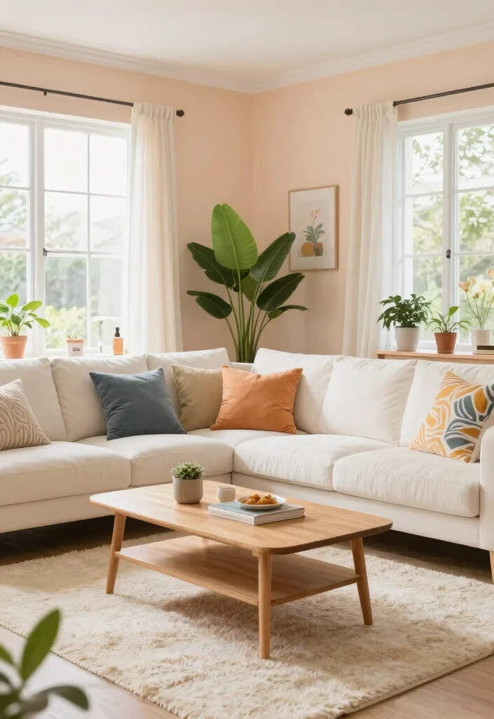
Light peach walls introduce a warm and inviting hue that radiates cheerfulness and comfort in your living room. This soft color embodies the essence of Scandinavian designs while infusing your space with a gentle touch of warmth. Peach pairs beautifully with wooden elements and works seamlessly with warm neutrals, making it an excellent choice for those desiring a hint of color without overwhelming their decor.
To create a balanced atmosphere, consider pairing light peach with light gray or cream furnishings. Incorporating decorative items in deeper peach tones can also enhance harmony, creating a cohesive and inviting look.
Key Benefits:
– Creates a warm and welcoming ambiance
– Versatile enough for various decor styles
– Adds a cheerful element to the room
This soft yet vibrant choice not only brightens your living space but also enhances the overall aesthetic through the interplay of textures and colors.

Neutral Vintage Rug: This area rug features a trendy retro design adorned with medallion pattern. Its unique tones blend perfectly with your home decor. Its unique texture and patterns add a layer of sophistication and comfort to any room

【Modern Glass Table Lamps】Constructed of quality metal base and milky white glass shade, our desk lamp is durable and sturdy in daily use. The nice curved lines of its lamp shade will create beautiful luminous light and add gorgeous ambiance for your home. This bedside table lamp is makes a perfect night light in your home, and also a great gift for your families, friends, or your colleagues.
7. Soft Lavender: A Touch of Serenity
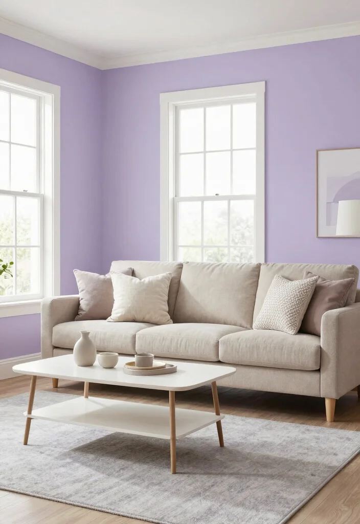
Soft lavender walls can transform your living room into a serene retreat, embodying the essence of tranquility and calm. This gentle pastel shade complements Scandinavian minimalism beautifully, pairing effortlessly with light woods and neutral tones. Lavender encourages relaxation and creativity, making it an ideal choice for spaces meant for unwinding or gathering with loved ones. Its soft nature allows for bolder decor elements without clashing, achieving a lovely balance between serenity and style.
To enhance this soothing environment, use white or cream furnishings to amplify the light, airy feel. Adding dark accents can create contrast and visual interest, enriching your decor.
Key Benefits:
– Encourages relaxation and calmness
– Provides a gentle pop of color
– Pairs well with earthy tones and whites
This calming choice not only elevates your living room’s aesthetic but also promotes a peaceful atmosphere through thoughtful use of textures and materials.
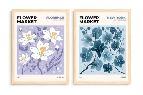
【Delicate Floral Design】This 2-piece wall art set features elegant flowers with soft purple and blue tones, bringing natural beauty and a serene atmosphere to your walls

Sophisticated ethereal digital oil painting with soft blended brushstrokes for a serene atmosphere.

Ultra premium paint and primer in one
8. Light Taupe: The Perfect Blend
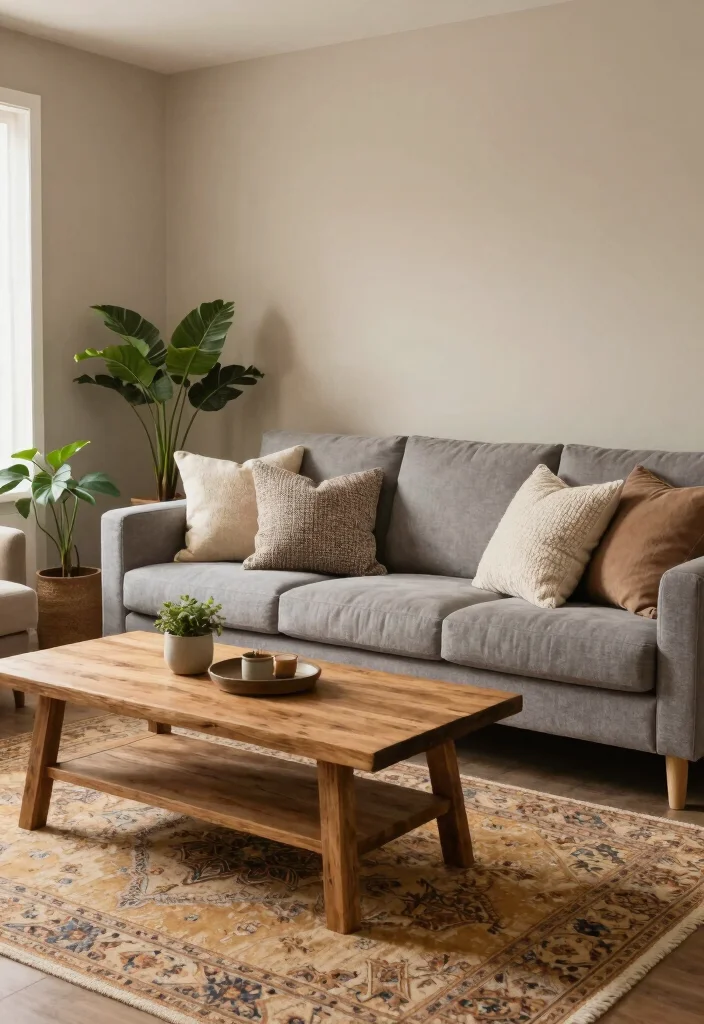
Light taupe walls offer a delightful blend of warmth and neutrality, perfect for creating a cozy living room. This versatile hue fits seamlessly into Scandinavian designs, providing a sophisticated backdrop that enhances various decor styles. Taupe harmonizes beautifully with wooden furniture, soft textiles, and vibrant accents, allowing for endless decorating possibilities. This color adds depth without making the space feel smaller, striking a balance between comfort and openness.
To achieve a trendy look, pair light taupe with deep greens or rust tones. Layering different textures can also add visual interest, enriching the overall design of your living room.
Key Benefits:
– Adds warmth and richness
– Suitable for both modern and traditional styles
– Enhances the coziness of the room
This inviting choice not only enhances the overall aesthetic but also encourages the use of varied textures and materials to create a captivating living space.

【Made in the USA】 All our fantasy landscape artwork is crafted in the USA, available in sizes from 8x12 inches to 24x36 inches. Select the ideal size to complement your wall decor, and our canvas art featuring an ethereal purple dreamscape brings a sense of wonder, mystery, and tranquil beauty to your personal space.
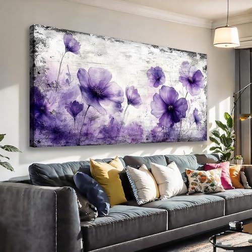
【STUNNING ARTWORK】: Small purple floral canvas print featuring delicate watercolor poppies against a textured gray background, perfect for modern home decor

【Thick Memory Foam Rug】DweIke modern indoor carpet is crafted from soft wool coral fleece. This upgraded rug features skin-friendly, non-shedding properties and a luxuriously soft touch
9. Ice Blue: Cool and Crisp
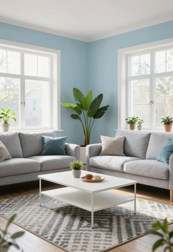
Ice blue walls create a refreshing and crisp atmosphere, reminiscent of fresh mountain air. This color is ideal for making your living room feel spacious and bright, perfectly aligning with the simplicity of Scandinavian design. Ice blue pairs beautifully with whites and natural wood tones, enhancing the overall brightness of the room. It’s a calming color that promotes relaxation and can also make a bold statement when paired with darker colors.
To maintain an open vibe, use light furnishings that complement the ice blue walls. Consider incorporating darker accent pieces to create depth and visual interest, enriching your living space.
Key Benefits:
– Enhances the sense of space
– Refreshing and invigorating feel
– Pairs well with bright whites
This cool and crisp choice not only beautifies your living room but also fosters a serene atmosphere through the thoughtful use of textures and colors.

Interior/exterior use on wood, metal, plastic and more

Two-in-one paint and sealer. Creamy consistency
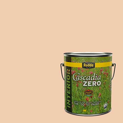
PAINT & PRIMER-IN-ONE: Cascadia ZERO is an Ultra-Low VOC, Acrylic Blend Paint & Primer-in-One; save time with less coats
10. Soft Mint: Greenery Indoors
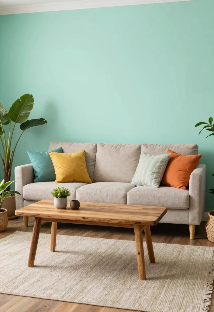
Soft mint walls introduce a lively yet gentle vibe into your living room, striking the perfect balance between freshness and comfort. This light green color echoes nature’s tranquility, harmonizing beautifully with the neutral palettes often found in Scandinavian interiors. Mint is versatile enough to pair with both pastel and bold colors, easily reflecting your personal style. Its uplifting nature makes it a delightful choice for spaces meant for gathering and relaxation.
To ground the space, use warm wooden accents that complement the mint walls. Incorporating colorful artwork can create beautiful contrasts, further enhancing your living area.
Key Benefits:
– Refreshing and uplifting feel
– Perfect for creating a vibrant, cozy atmosphere
– Pairs beautifully with other soft colors
This lively choice not only energizes your living room but also enriches the overall aesthetic through the thoughtful use of textures and materials.
11. Whisper Pink: Soft and Sweet
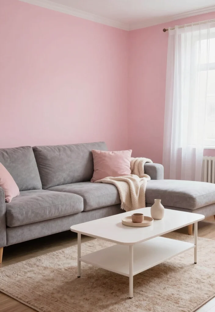
Whisper pink walls add a soft and sweet touch to your living room, crafting an intimate and cozy space. This gentle hue embodies warmth, making it an excellent choice for creating a serene environment. In Scandinavian design, whisper pink beautifully complements light woods and whites, allowing for a soft palette that feels both inviting and chic. This color works particularly well in smaller spaces, making them feel open and welcoming.
To balance this soft tone, combine it with natural wood elements that enhance the overall warmth. Using darker decor items can add contrast and depth, enriching your living room’s design.
Key Benefits:
– Creates a warm and cozy atmosphere
– Ideal for intimate gatherings
– Pairs well with both light and dark accents
This gentle choice not only enhances your living space’s overall aesthetic but also promotes a warm and inviting environment through varied textures and materials.
12. Light Lemon: A Pop of Cheer
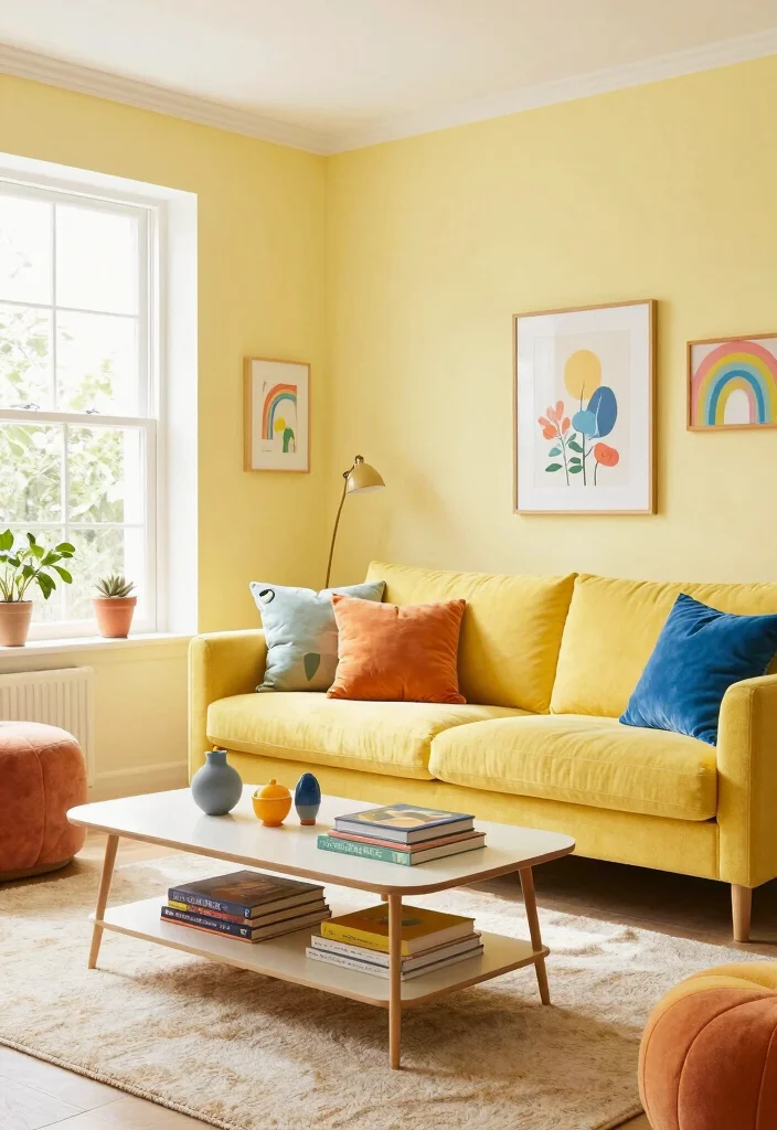
Light lemon walls infuse your living room with a cheerful and uplifting ambiance, perfect for a lively space. This sunny hue adds a playful touch, brightening your room and inviting positive energy. In Scandinavian-inspired design, light lemon works wonderfully with natural materials and soft whites, balancing brightness with warmth. This color creates an inviting atmosphere, making it perfect for social gatherings and family time.
To enhance this lively vibe, use colorful accents that lend a fun, eclectic look. Balancing the brightness with soft white or gray furnishings can keep the space grounded and cohesive.
Key Benefits:
– Provides a bright and cheerful ambiance
– Enhances the sense of space and light
– Pairs beautifully with neutral decor
This vibrant choice not only uplifts your living room but also enriches the overall aesthetic through thoughtful use of textures and colors.
Fun fact: light lemon walls bounce natural daylight, a bright spot among light wall colors for living room ideas. In Scandinavian-inspired spaces, this cheerful hue pairs beautifully with natural materials and soft whites. It creates warmth and energy, perfect for everyday gatherings and social moments.
13. Light Coral: Warmth and Energy
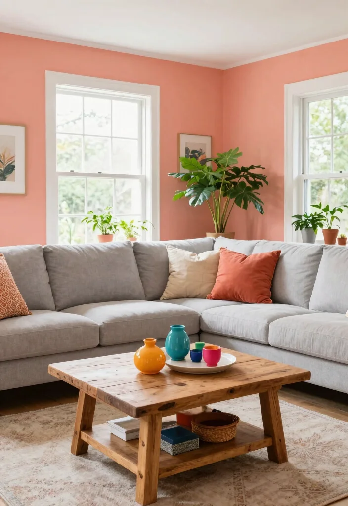
Light coral walls offer a lively yet warm vibe, creating a playful atmosphere in your living room. This hue captures the essence of Scandinavian design by providing warmth without the heaviness of darker shades. Coral pairs well with white and natural woods, making it easy to incorporate into various decor styles. Its cheerful touch invites energy into your space, making it feel welcoming and vibrant.
To achieve a cohesive look, highlight coral accents throughout your decor. Combining light coral with greenery can also create a refreshing contrast, enriching the overall design.
Key Benefits:
– Brightens and energizes the room
– Works well with a range of accessories
– Adds warmth without being overpowering
This lively choice not only enhances your living room’s aesthetic but also fosters an energetic atmosphere through the thoughtful use of textures and materials.
14. Light Sand: Earthy Elegance
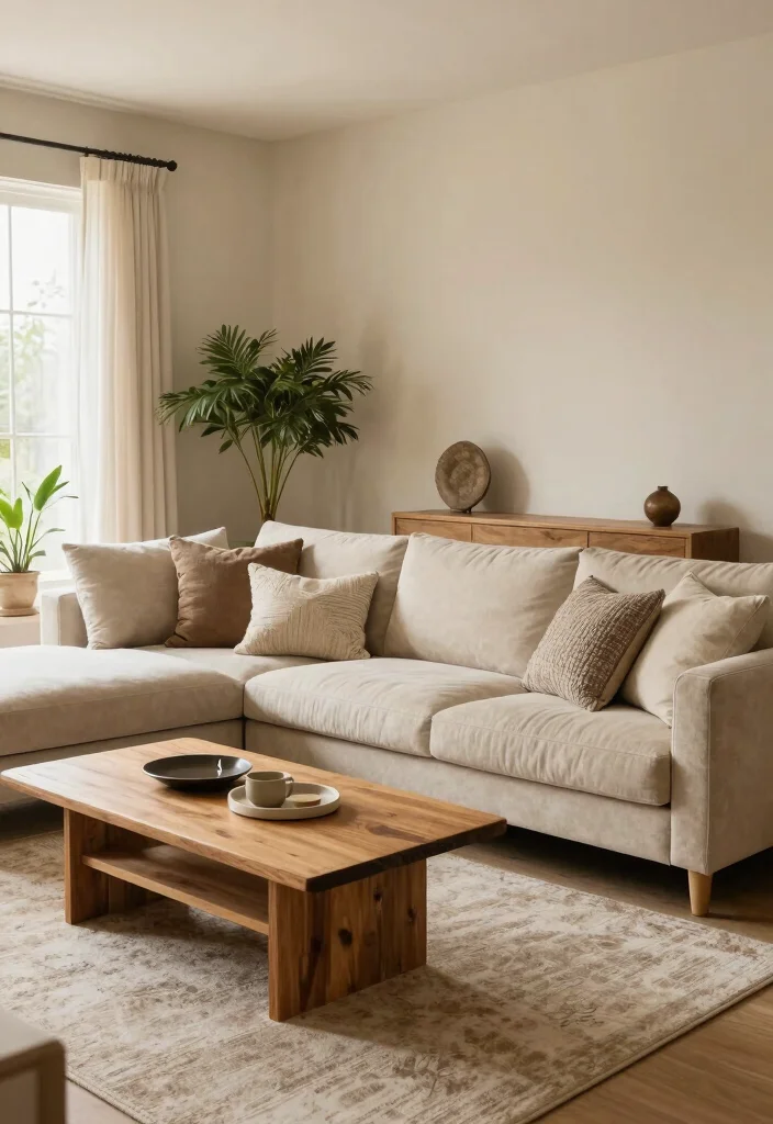
Light sand walls create an earthy yet elegant backdrop for your living room. This neutral tone resonates beautifully with Scandinavian design, offering a warm and inviting feel that is both modern and timeless. Sand pairs seamlessly with other neutral tones, enhancing the overall warmth of the space without making it feel heavy. This versatile color serves as a blank canvas that can be easily accessorized with colorful decor items or natural elements, striking a perfect balance between chic and comfortable.
To enhance visual appeal, use varying textures in fabrics and furniture. Incorporating bold accent pieces can add character and interest to your living space.
Key Benefits:
– Provides a warm, grounded feel
– Versatile for decorating with various styles
– Enhances natural light reflection
This earthy choice not only enriches the overall aesthetic but also invites a sense of calm through thoughtful use of textures and materials.
15. Soft Charcoal: Depth without Darkness
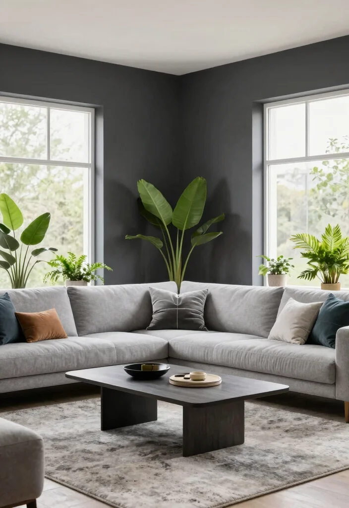
Soft charcoal walls introduce a unique way to add depth to your living room without sacrificing brightness. This sophisticated color complements the light hues often found in Scandinavian design, creating a chic contrast that enhances the overall aesthetic. Charcoal pairs beautifully with whites and warm wooden tones, enriching the space and making it feel layered and interesting. It’s perfect for those who want to create a modern and elegant vibe while maintaining a cozy atmosphere.
To keep the space feeling inviting, use warm lighting to prevent any heaviness. Incorporating colorful accents can brighten up the room and add pops of interest throughout your decor.
Key Benefits:
– Adds depth and sophistication
– Pairs well with a variety of colors
– Creates a cozy, intimate setting
This refined choice not only elevates your living room’s aesthetic but also promotes warmth through the thoughtful use of textures and materials.
16. Soft Stone: Nature’s Neutral
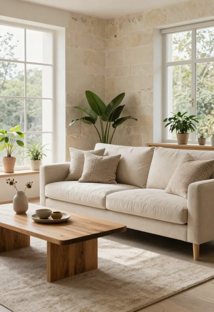
Soft stone walls epitomize the tranquility of nature, providing a calming backdrop for any living room. This neutral shade resonates beautifully with the minimalist yet warm essence of Scandinavian design, creating a grounded and serene space. Stone hues pair seamlessly with a variety of colors, making them a versatile choice for decor and furnishings. They enhance the feel of natural light in the room, making it an ideal choice for those seeking a bright, airy vibe.
To create a cohesive look, combine soft stone with natural wood furniture that complements the overall aesthetic. Using colorful decor can create focal points that enliven the space, enriching your living area.
Key Benefits:
– Provides a serene and calming environment
– Versatile for a variety of decor styles
– Enhances natural light
This nature-inspired choice not only fosters a peaceful atmosphere but also enriches your living room’s overall aesthetic through the thoughtful use of textures and materials.
Conclusion
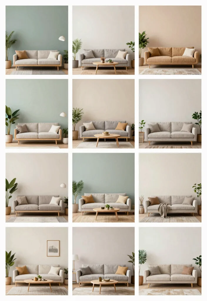
Choosing the right light wall color for your living room can transform the entire space into a bright and inviting haven. Whether you lean towards soft whites, calming blues, or cheerful pastels, each color option plays a role in creating a cozy atmosphere.
By embracing these Scandinavian-inspired hues, you can craft a living room that feels spacious, comfortable, and uniquely you. Consider these ideas as you embark on your decor journey!
Frequently Asked Questions
What are the best light wall colors for a bright, open living room in a Scandinavian-inspired space?
Choosing light wall colors for a bright, open living room starts with favoring whites and soft neutrals that lean warm rather than stark. In a Scandinavian-inspired space, look for neutral wall colors with warm undertones—think warm white, creamy beige, or pale greys with subtle beige or yellow undertones. These hues brighten the room, reflect natural light, and create a calm backdrop for living room color schemes built around light woods and minimalist furniture. Avoid pure, cold whites unless you have ample daylight; instead, test at different times of day to see how the color shifts. Pair with natural textures and light woods to maximize the bright interior design feel and keep the space airy. If you want a small boost of color, introduce a soft pastel as an accent on textiles or artwork—tiny pops won’t overwhelm the wall color but will enrich the color psychology for rooms.
How can I create a spacious feel with light wall colors in a living room?
To make a spacious living room feel larger with light wall colors, keep the palette cohesive and restrained. Start with a single light base and layer with textures—think a woven rug, linen curtains, and a wood coffee table. A Scandinavian-inspired approach uses neutral wall colors in shades like pale grey or warm white and introduces contrast only in furniture or decor. Use lighter hues on ceilings and walls to bounce natural light, and choose furniture in slightly darker neutrals to create depth without breaking the open feel. Avoid heavy dark accents on large surfaces; instead, let color appear in cushions, throws, and art to maintain a bright interior design vibe and generous spacious living room ideas.
Which light wall colors pair best with neutral furniture and natural wood for a cozy look?
Several light wall colors work beautifully with neutral furniture and natural wood. Try off-white or warm white with light oak or ash furniture for a clean, airy backdrop. A soft gray with birch or maple woods adds sophistication without feeling cold. Beige or greige (gray-beige) pairs nicely with pine or honey-toned wood, creating a cozy, inviting vibe. If you want a hint of color, a very pale sage or blue-gray can complement natural wood without overpowering, preserving a calm, Nordic-inspired mood. These combos support a balanced color palette and a mood that leans on the color psychology for rooms.
How do light wall colors affect mood and color psychology in a living room?
Light wall colors can set the tone for mood and daily energy in a living room. Warm whites and pale neutrals typically promote calm, openness, and focus, supporting bright interior design and a welcoming space. Light walls reflect more natural light, making the room feel larger and happier, which can support a relaxed, cozy atmosphere. On the other hand, very cool whites may feel crisp or sterile if not balanced with textures and warm woods. Consider how color psychology for rooms influences you: a bright, airy backdrop encourages socializing and activity, while softer whites with warmth invite rest and comfort whenever you need it.
What steps can I take to test and apply light wall colors before committing to paint?
Here’s a practical plan to test and apply light wall colors without guessing:
1) Gather swatches from your top color options and compare under your room’s natural and artificial lighting.
2) Buy small sample cans and paint test patches on the wall, ideally in a large area to see true color.
3) Observe each patch at different times of day—morning, noon, and evening.
4) Consider finish—eggshell or satin helps reflect light without glare and pairs well with neutral wall colors.
5) Create a quick mood board or digital palette to ensure your wall color aligns with living room color schemes and the overall Scandinavian-inspired vibe.
6) Pilot the paint, then roll the rest once you’re sure. This practical approach makes it easy to achieve the desired bright, open feel in your living room.
Related Topics
light wall colors
living room decor
Scandinavian design
neutral color schemes
bright interiors
spacious living rooms
color psychology
cozy atmospheres
minimalist style
easy updates
home decor trends
beginner friendly