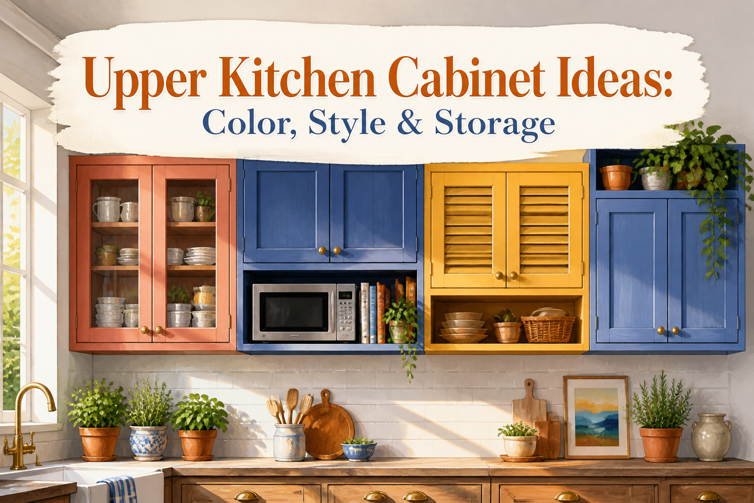
Upper kitchen cabinet ideas run from a weekend paint job to full custom millwork, and the right choice depends on whether you own the space or answer to a landlord. Paint in electric yellow or terra-cotta pink costs a few hundred dollars and an afternoon; native materials like pecky cypress or vented cabinets hiding a microwave demand planning before the boxes go up. The detail that separates a collected look from a mistake is the gap: keep spacing uniform between salvaged and new cabinets, and the mismatch reads as rhythm rather than accident.
1. Paint Them a Cheery Yellow
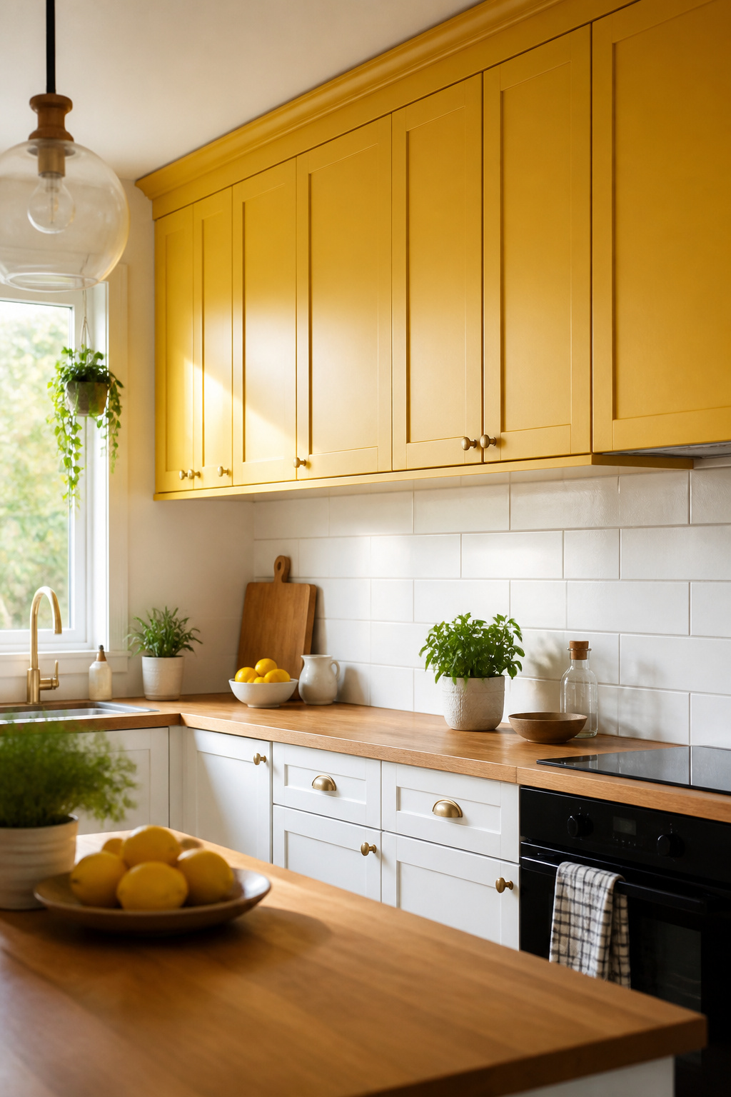
Bright yellow on upper cabinets lands differently than the softer, earthier tones that usually pass for "color" in kitchens. The warmth reads as morning light even on gray afternoons, and because it sits above eye level, it energizes the room without overwhelming it. Galeana Younger used exactly this logic for a client who prioritized joy over resale value, coating the uppers in an electric yellow that carried the whole kitchen. In Cecilia Casagrande’s Massachusetts space, a bold, sunshiney yellow performs the same trick, brightening from above while the lower cabinets stay quiet. The risk is real: too saturated and the kitchen feels like a diner booth, too muted and you lose the cheer entirely. For renters or first-home owners, this is a weekend project with outsized payoff, yellow uppers against white or natural wood below.
2. Paint Them a Soft Neutral Tone
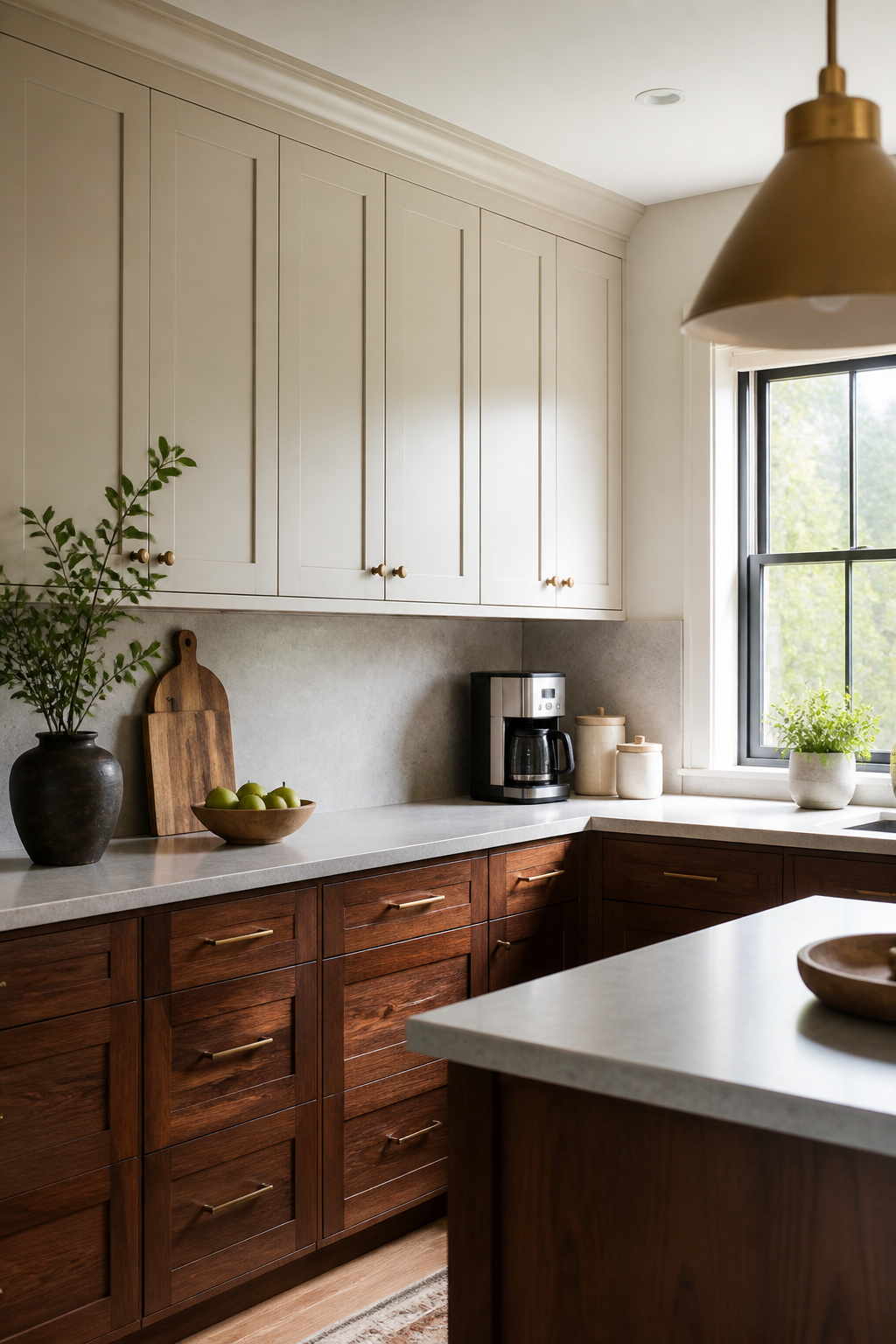
A soft neutral on upper cabinets buys you years before the color feels dated. Benjamin Moore’s Natural Cream reads as a warm greige that shifts with the light, looking cream in morning sun and settling closer to taupe by evening. That chameleon quality matters in a kitchen, where overhead lighting and windows hit different faces of the cabinets at different hours.
I watched a friend paint her uppers this color while her island stayed a dark walnut. The Natural Cream carried enough gray to keep the two from clashing, but enough warmth that the kitchen still felt lived-in, not showroom-stiff. Bold colors on upper cabinets can work, but they lock you into a mood. This shade lets you swap hardware, art, or a rug without starting over.
The greige tone survives trend cycles because it borrows from both sides, never fully committing to the gray wave or the beige revival. If you are renting and painting cabinets you will eventually leave behind, or buying your first place and unsure where your taste will land in five years, that flexibility is worth more than the momentary thrill of something louder.
3. Paint Them Pink
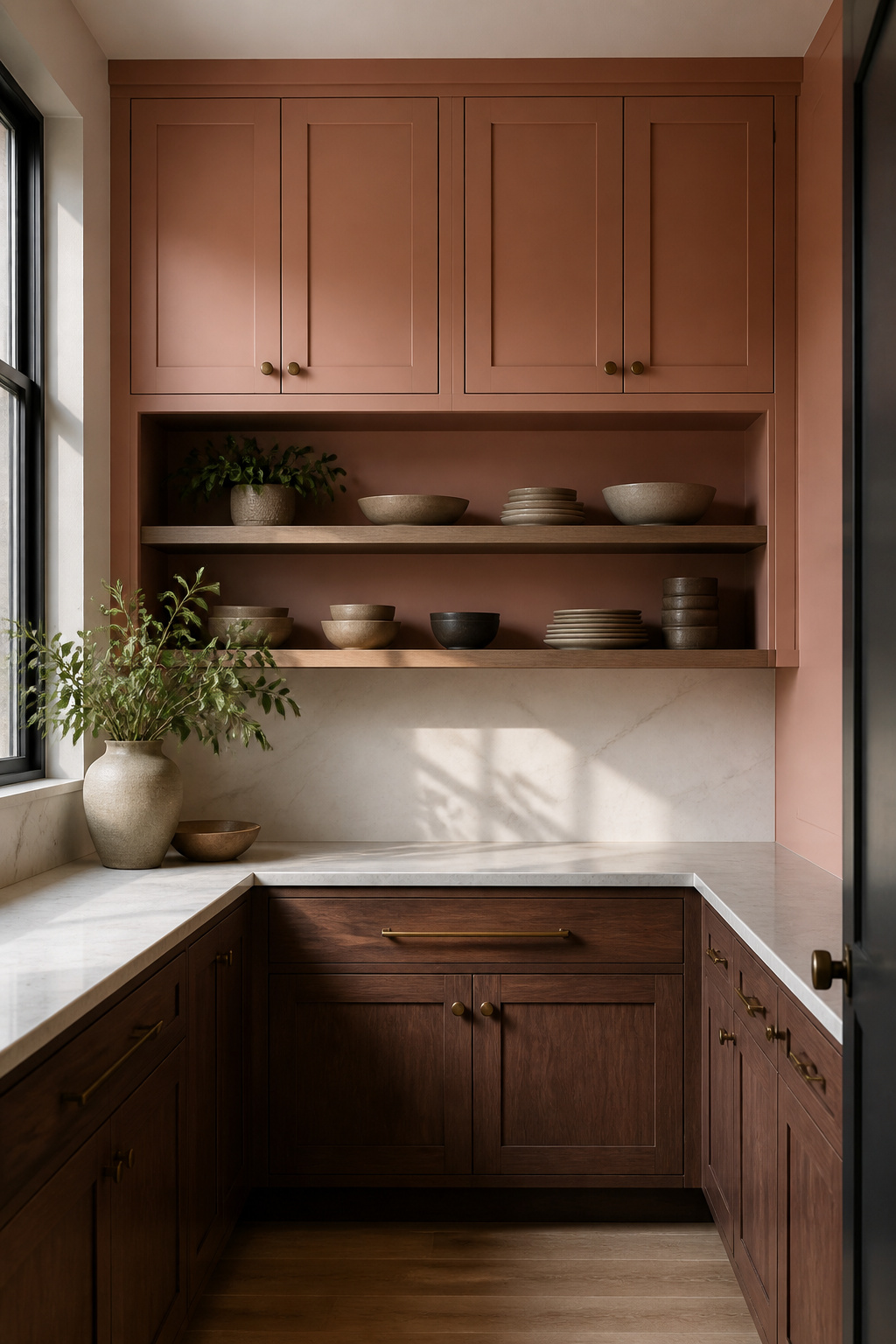
A muted pink lands in the useful middle ground between beige and a statement color. The shade that works for upper kitchen cabinets is closer to terra-cotta than bubblegum, warm enough to keep a gray room from feeling cold without tipping into sweetness.
I noticed this approach in a Nashville butler’s pantry where the architect and designer used that exact mid-tone pink as a thread through the whole house. The cabinets carried the personality while the rest of the palette stayed restrained. The pink reads as color, not as a "pink kitchen."
For a weekend project on a few hundred dollars, this is easier to commit to than a saturated hue you might tire of. Terra-cotta pink pairs with brass hardware and warm wood counters without fighting them, and if you rent, it is distinctive enough to feel like yours and neutral enough that a landlord rarely objects. Two coats of a quality cabinet enamel over a shellac primer covers most existing finishes in a Saturday.
4. Embrace Color
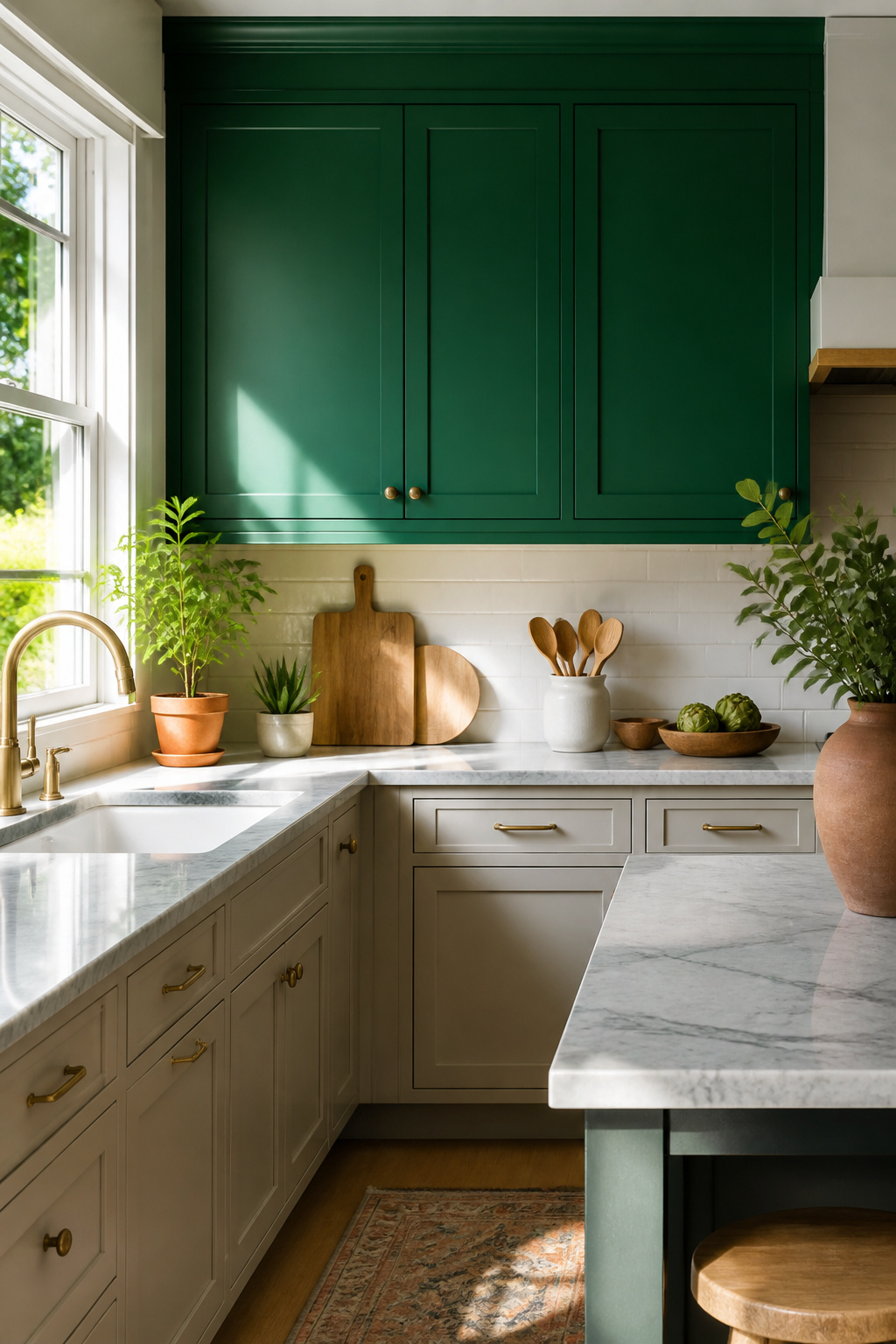
Most kitchens default to white uppers because it feels safe, but the wall above your countertop is where a kitchen actually earns its personality. Saturated color on upper cabinets is a deliberate move, not a whim, and it works when you treat the cabinets as the room’s focal point rather than a background layer.
The bolder approach lets you go warm and organic or dark and intentional without the space feeling like a paint sample board. A sunshiney yellow in a Massachusetts kitchen or a muted terra-cotta pink in a Nashville butler’s pantry both come from the same decision: choosing color with a clear point of view. What matters is committing to one hue and letting it carry the room.
Pick a saturation level and repeat it elsewhere, on a door frame or a shelf edge, so the cabinets read as intentional architecture rather than a cabinet you couldn’t return.
5. Keep It Rich
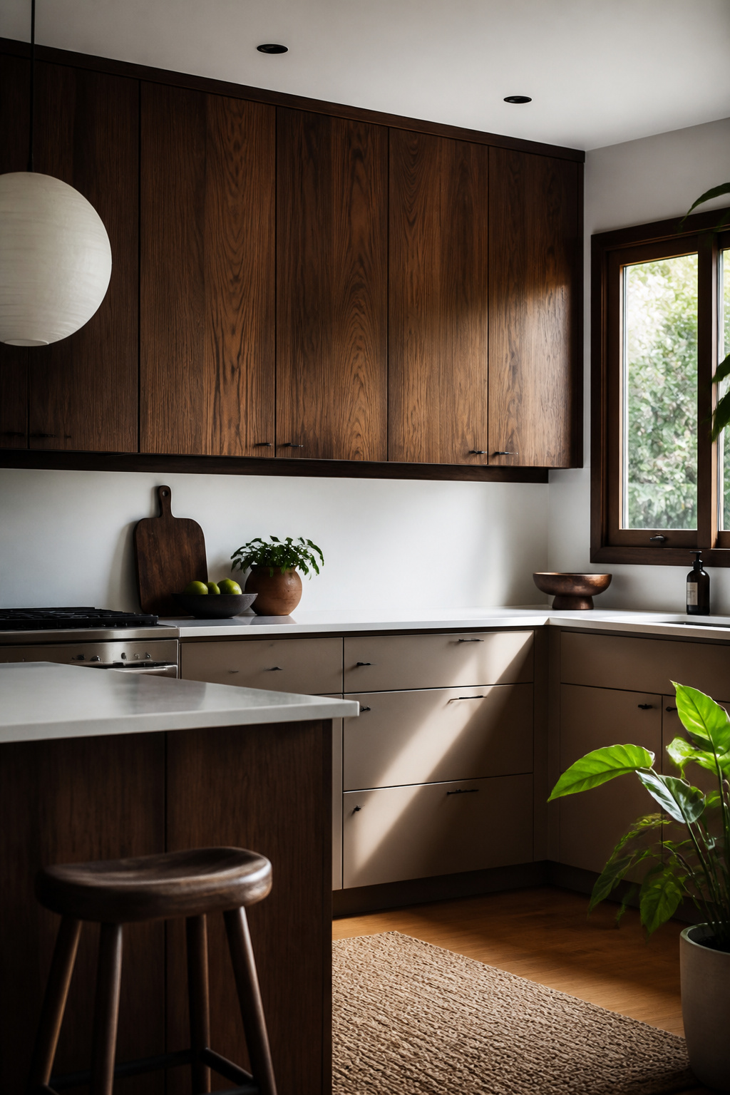
Dark walnut uppers changed how I read a kitchen. In a midcentury renovation I followed, the cabinets sat so deep against white walls that the eye had nowhere else to go; the color did the work of molding or insets. That depth needs light to survive. Without a window or a strong artificial source, saturated uppers flatten to black holes and the room shrinks. With it, they cast subtle shadow lines across the grain that shift through the day.
The risk is real: a friend painted her uppers forest green in a north-facing galley and ended up repainting within the year. The same tone, south-facing, reads as layered and expensive. Test your swatch at the dimmest hour you actually use the kitchen, not at noon. If the light is marginal, keep the saturation but lift the value half a step, or commit to under-cabinet LEDs that throw forward, not just down.
6. Make It Hazy
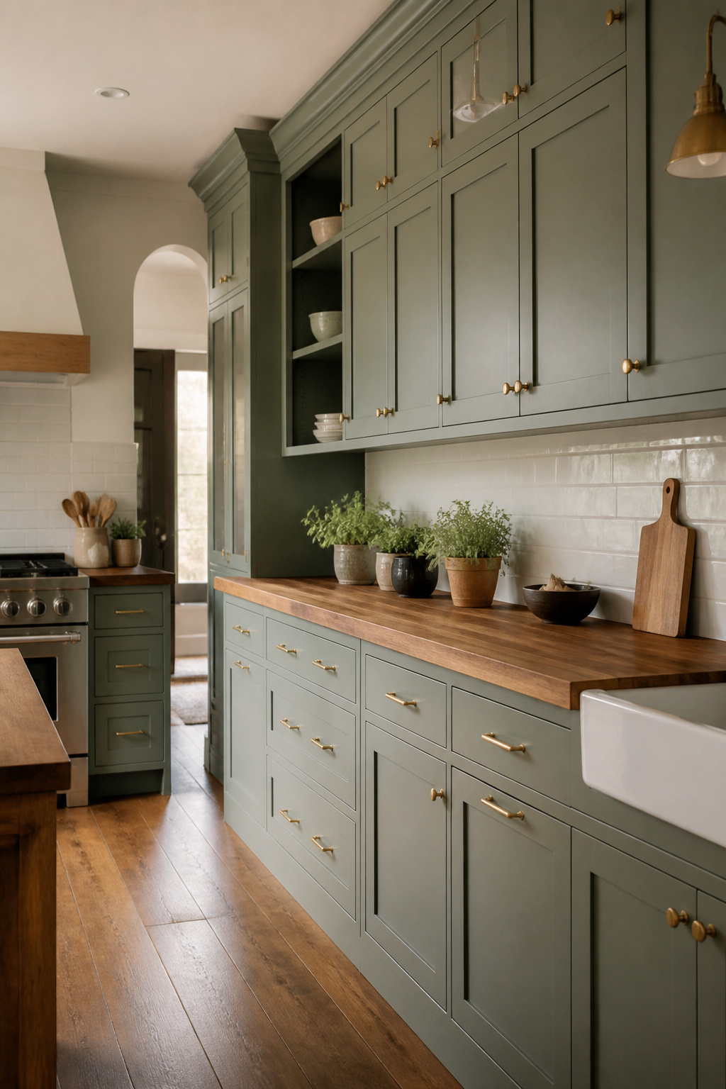
A smoky green-gray on upper cabinets reads as color in morning light and as neutral by evening, which makes it forgiving if your kitchen gets sun at only one end of the day. Benjamin Moore’s Vintage Vogue sits in that middle space, not quite sage and not quite greige, shifting enough that the same wall can look storied at 7 a.m. and settled by dinner. Designer Amanda Jacobs used it in a Kentucky bungalow heavy with original woodwork, and the cabinets held their own against the trim rather than competing with it. For a weekend painter, that adaptability matters more than a color that photographs well at noon and looks flat by six. The risk is pairing it with countertops that lean too warm; the gray in the paint goes cool fast against honey-toned stone. A sample board held up at both ends of the room, morning and evening, will tell you whether your light cooperates or whether the color slips toward mud in shadow.
7. Stick with an Earthy Color Palette
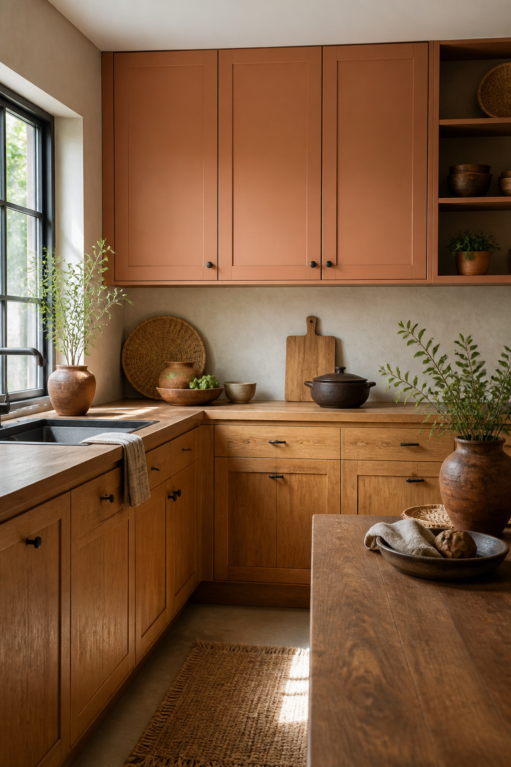
Warm browns, terracottas, sage greens, and clay tones do something specific in a kitchen that pastel or saturated colors cannot: they read as soil and stone rather than sky or flower. That grounded quality matters most on upper cabinets, which sit at eye level and can either recede into the architecture or hover like an announcement.
The distinction from hazy or rich palettes is in the pigment itself. Earthy colors carry the muted irregularity of natural materials, the way Benjamin Moore’s Vintage Vogue reads as smoky green because it carries the mineral dust of actual vintage patina, not because it was simply desaturated in a lab. Amanda Jacobs used it in a Kentucky bungalow precisely because the existing woodwork needed a color that spoke the same language, not one that competed with it.
For renters or first-home owners working a weekend timeline, the practical advantage of earthy uppers is that they forgive mismatched hardware and dated counters. A terracotta or clay upper cabinet bridges warm wood tones and cool stone surfaces without requiring a full material overhaul. The color does the connecting.
Sage works similarly, though the source example pairs it as lowers with white uppers and walnut display shelving lit from within. That reversal, white above and sage below, keeps the visual weight low and the room feeling open, a compact-kitchen move worth stealing if your square footage is limited.
8. Choose a High-Gloss Paint
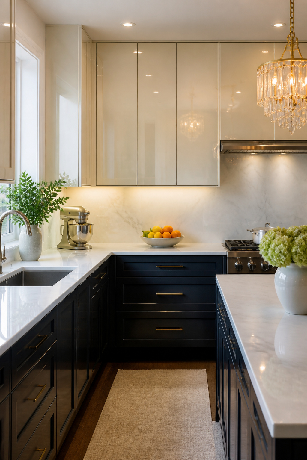
High-gloss paint on upper cabinets does one thing better than any other finish: it throws light back into the room. In a compact kitchen, that reflection can make the space feel larger than its footprint, especially when under-cabinet lighting or a cove ceiling adds a second layer of glow after dark. The maroon cabinets in one Kansas City project matched the Viking range and still managed to brighten the whole wall by acting more like a mirror than a matte surface.
The tradeoff is that gloss shows every imperfection. Dings, brush marks, and uneven joints read loud and clear where a flatter finish would hide them. If your existing cabinet boxes are older or the doors have seen wear, the prep work, sanding, and possible refacing, multiplies fast. Cream gloss with slim bar pulls can look stunning above a marble backsplash, but only when the surface underneath is genuinely smooth. For renters or anyone working on a weekend timeline, this is the judgment call: the light payoff is real, but the surface has to earn it first.
9. Choose a Native Material
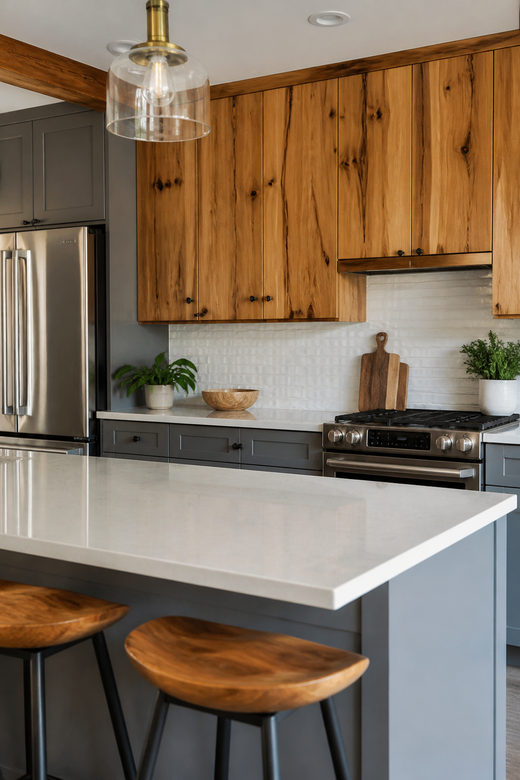
Pecky cypress pulled from Florida wetlands carries the grain and color of that specific place, and choosing a native material like it cuts the decision fatigue of staining or painting because the finish is already decided by the tree. Regional wood or bamboo connects a kitchen to what grows nearby in a way factory-matched colors rarely manage.
The practical side matters too. Local species acclimate to the same humidity your cabinets will live in, which means less seasonal movement at the joints. A cabinetmaker near you probably already stocks a nearby hardwood and knows how it behaves, which trims both shipping cost and the risk of a finish that checks six months in.
Bamboo works the same angle if it grows in your climate zone. It reads as a single material from slab to edge, so you skip the edge-banding step that plywood and MDF demand. That saves labor hours on a weekend project and leaves one less seam to swell if steam from the stove finds it.
The limit is availability. A native material is only native to one place, so the same species that anchors a kitchen in the Southeast reads as imported staging in the Pacific Northwest. Match the material to the map, not the mood board.
10. Keep It Minimalist
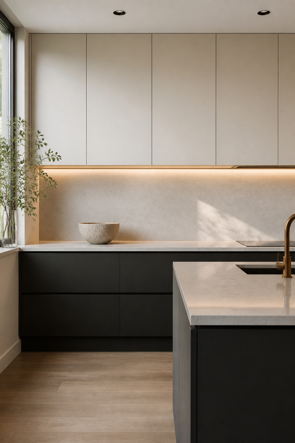
Flat-panel upper cabinets with no visible hardware leave nowhere for a gap or a crooked edge to hide. A sixteenth of an inch reads like a mile when the whole run is one uninterrupted plane. I have watched installers spend an extra morning shimming and re-shimming just to get that seamless face across a ten-foot stretch of uppers.
The sources that hold up best pair those stripped-back cabinets with something warm underneath. Under-cabinet LED lighting tracing the counter edge keeps the room from reading cold, and a single concession to texture, like one glass-panel door or a slatted wood accent nearby, earns its place without breaking the spare mood. Slab doors are easy to live with, no crevices for dust, no mixed materials needing special care, and they take color or stain without fighting the grain. Kelly green, warm cream, or a graphite against crisp white lowers, each works because the form stays quiet.
11. Pair Old and New Cabinetry
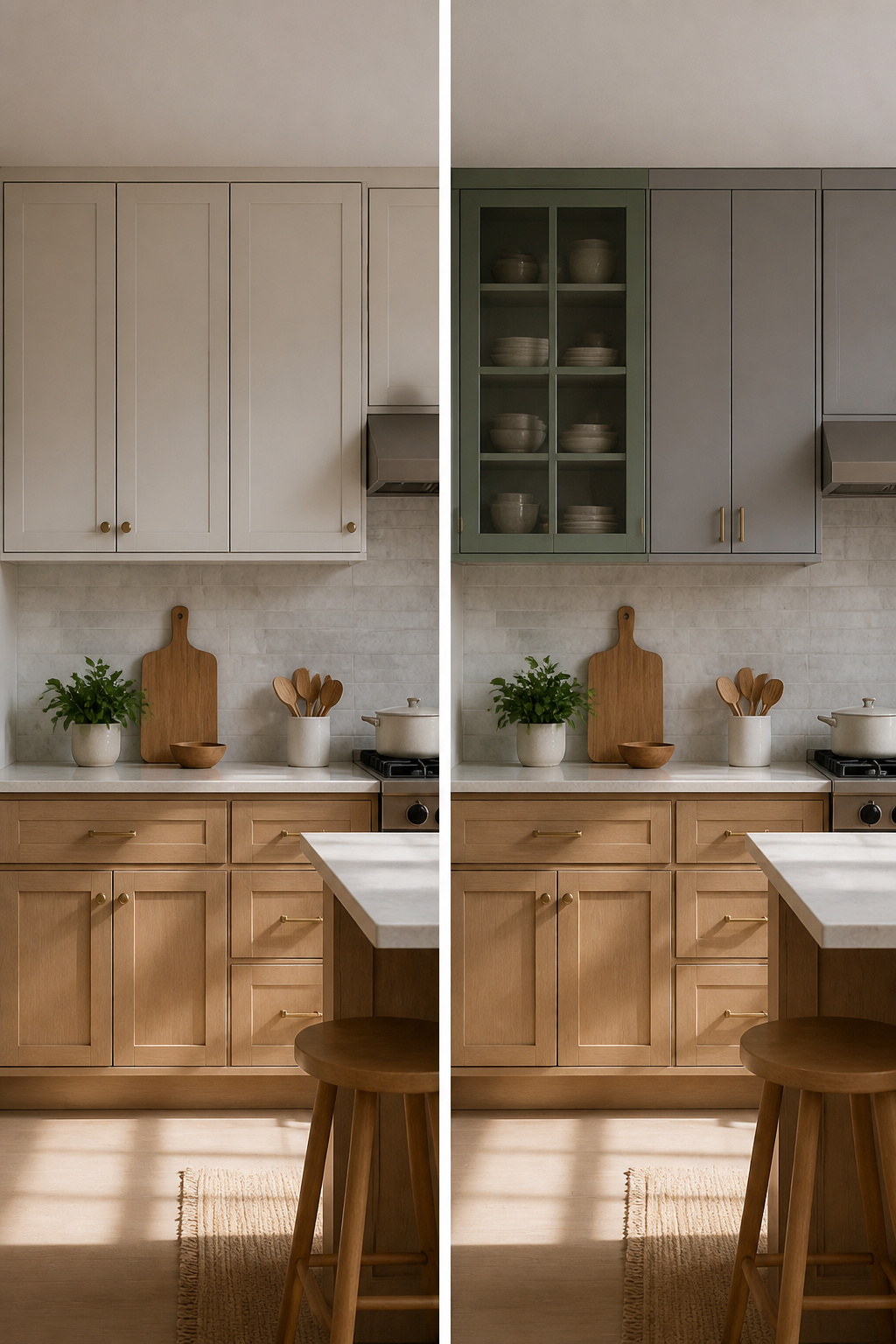
Salvaged upper cabinets from a Habitat ReStore or a relative’s remodel can run a fraction of new boxes, and the mismatch itself becomes the design. The risk is a kitchen that looks accidental rather than collected. What separates the two is the gap between them.
Keep the spacing uniform, even if the cabinet depths or heights differ. A consistent two-inch reveal between every unit reads as intentional rhythm. Paint bridges eras even better: one color across every face, old and new, erases decades of style shifts. I have seen a 1970s honey-oak box sit next to a flat-panel unit from 2022 and read as a single kitchen because both wore the same soft green.
Hardware is the other unifier. Matching pulls on mismatched doors does more than matching doors with mismatched pulls. If the old cabinets have exposed hinges, swap them for concealed ones or commit to the look everywhere. Half-concealed reads as half-finished.
The cost savings shrink if the vintage cabinets need structural work. Check the hanging rails and the shelf pin holes before you haul them home. A warped box will never hang flat, and that gap you cannot close is what the eye goes to.
12. Mix and Match Storage Styles
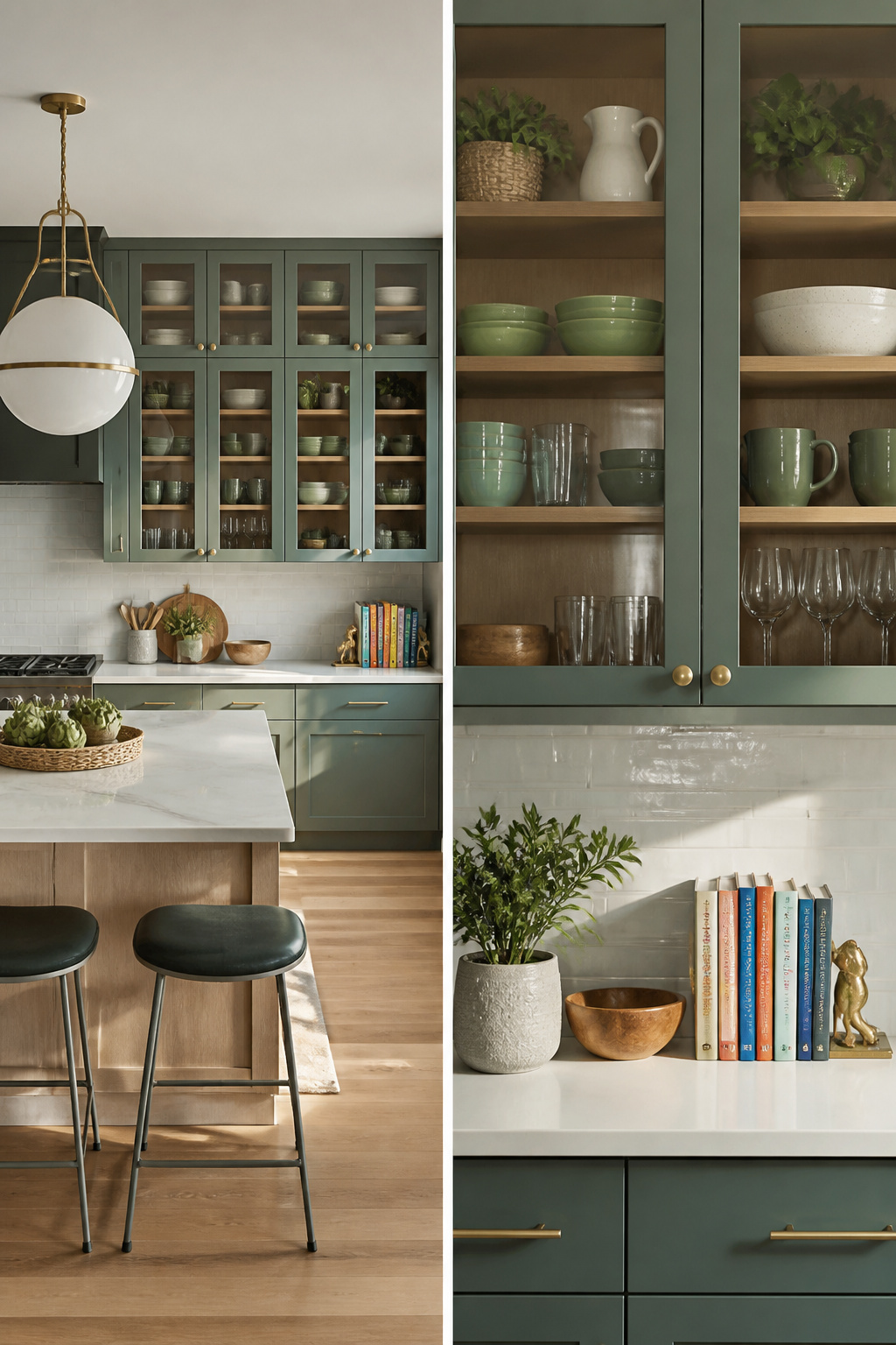
The rhythm of a kitchen wall matters more than matching every door style. In the teal pantry that stuck with me, glass-front uppers sit beside open shelves and closed lowers, and the eye keeps finding new territory instead of settling on one repetitive row. That layered mix is what keeps storage from flattening into a solid block of sameness.
I would not go more than one-third open in a kitchen you actually cook in. The white glass-front wall I keep returning to handles this with brass hardware in two styles and a picture rail across the mid-section, but notice what happens above: solid uppers close off the display and return the wall to practical storage. Morning light catches the copper and brass at an angle that makes the whole wall glow, yet the closed cabinets do the hiding.
For a weekend project on a real budget, start with one run. Replace two uppers with open shelves where you stack the plates you reach for daily, or swap a single cabinet door for a glass front and line the back with a color that reads against your dishes. The mistake is treating it as decoration first and storage second.
13. Mimic Your Architecture
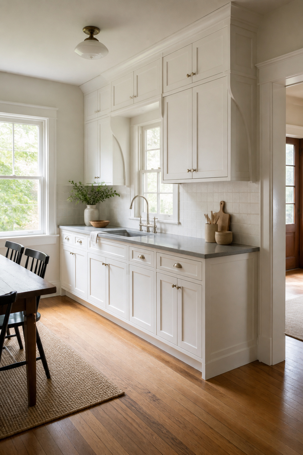
New cabinets that repeat the shape of a window casing or the profile of a crown molding settle in like they were always there. The eye reads them as original construction, not a renovation afterthought. I noticed this first in a 1920s bungalow where the builder had carried the same curved brackets from the dining room beams straight into the upper cabinet corners. The kitchen felt finished in a way that matching paint alone never achieves.
The move is to measure the exact width and setback of your existing trim, then order cabinet doors with a matching raised panel or applied molding. Most semi-custom shops can mill to that profile for a modest upcharge, and the result reads as bespoke without the price of full custom. Where this fails is in houses with no architecture worth echoing: a flat-ceilinged ranch with thin builder-grade casing gives you nothing to work with, and imitating thin trim just makes more thin trim. In those rooms, borrow from a neighboring room with better bones, or skip this approach entirely and let the cabinets stand on simpler lines.
14. Change Up Your Hardware Direction
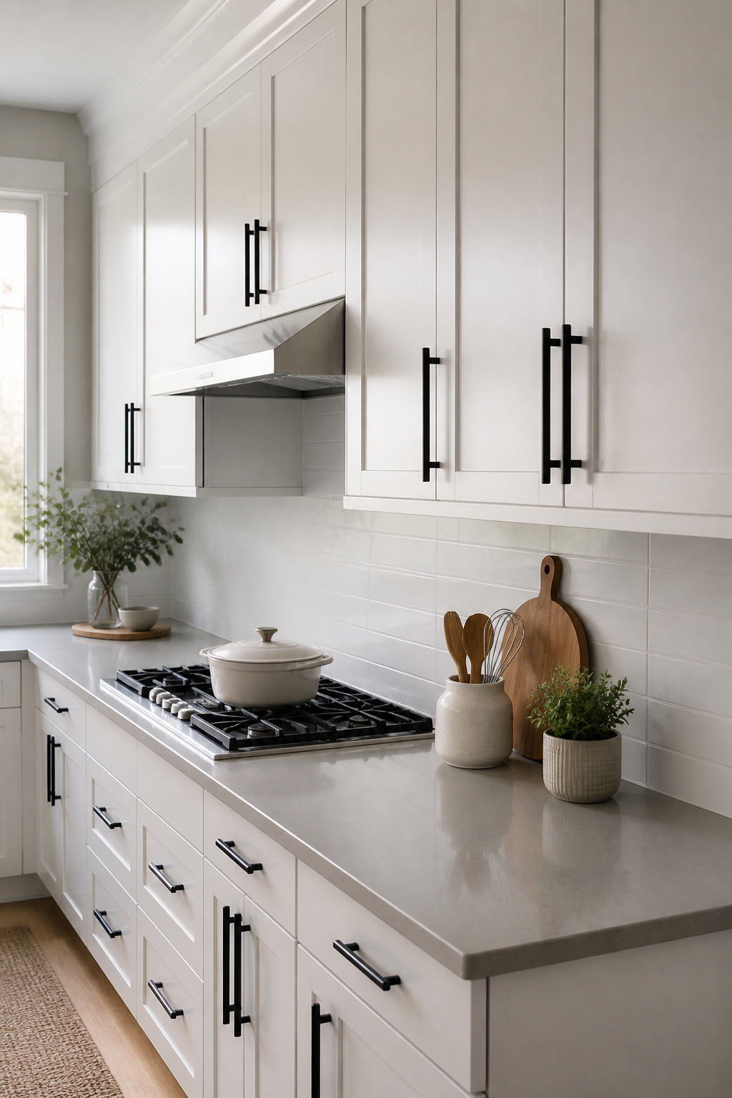
Vertical pulls on upper cabinets read taller than the same hardware hung flat. I noticed the difference first in a friend’s galley kitchen, where she ran slim black bars top-to-bottom on slab doors; the wall looked stretched, not decorated. The trick works best on cabinets that sit alone without a bank of lowers to echo against, since the eye follows the line up and stops at the crown.
Mixing the direction takes more nerve but pays off in small kitchens where every door is the same size. A row of up-down pulls beside a single knob, or one cabinet with its hardware dropped to the lower corner while the rest stay centered, breaks the grid without adding color. The sources point to Wendy Labrum’s kitchen as a working example of controlled mixing: black pulls against gold faucet, copper cookware hung nearby. What saves the combination from chaos is keeping each metal to its job. Barstools share a finish with the pulls; the faucet carries its own. Two metals, not three, and each one repeats at least twice so it reads intentional rather than leftover.
For renters or anyone keeping original cabinets, hardware direction is the cheapest edit that still photographs like a renovation. A drill, a template, and an afternoon replace the whole mood of a wall.
15. Make Space for Oversized Storage
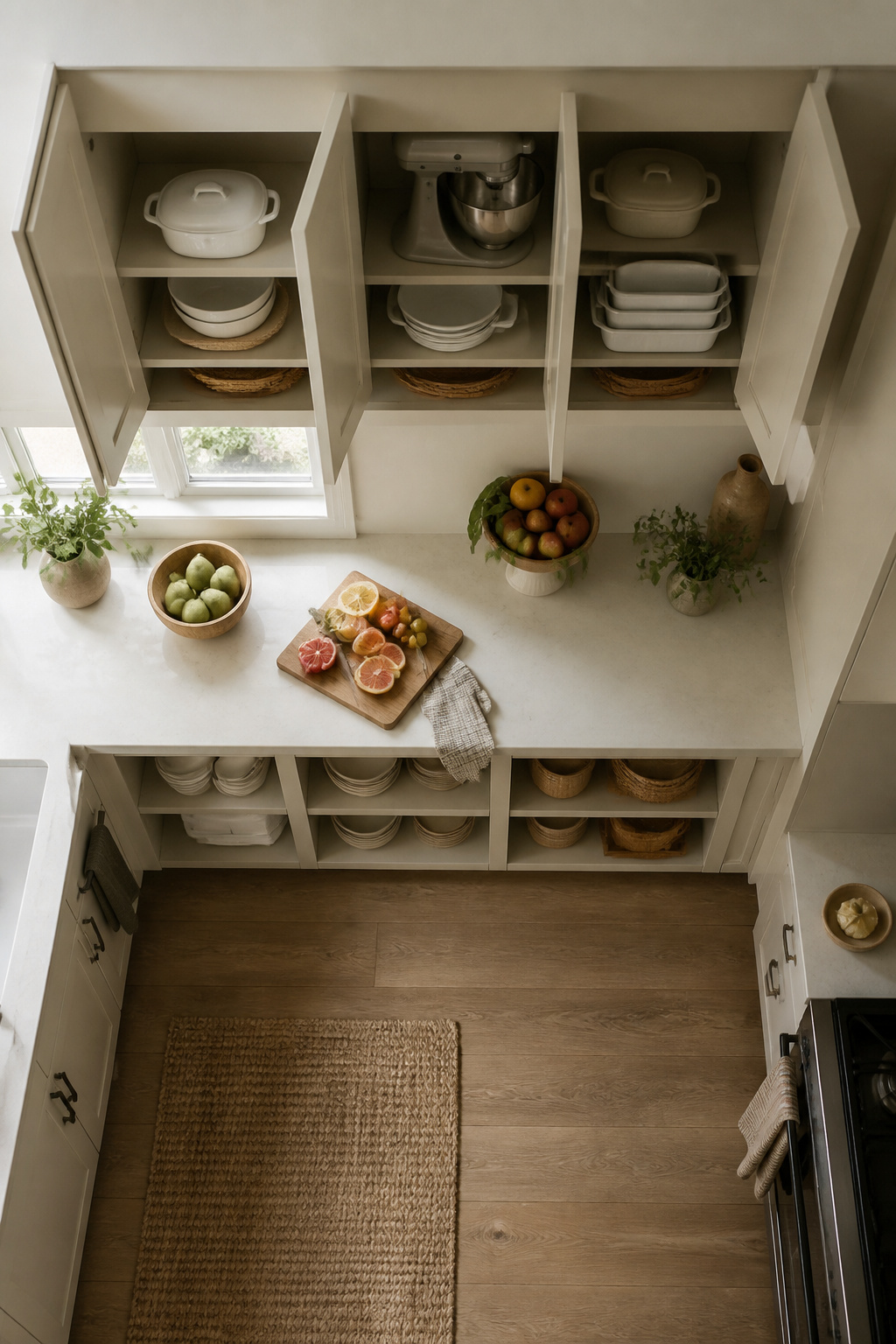
Standard upper cabinets sit 84 to 96 inches tall, which sounds generous until you try to slide a roasting pan or stand mixer onto a shelf. The door shuts, but only if you angle the thing like a Tetris block. That gap between what the cabinet promises and what it actually holds is where oversized storage earns its keep.
Extra depth handles the bulky stuff first: slow cookers, Dutch ovens, the serving platter you use twice a year but refuse to purge. Building one cabinet even three inches deeper than its neighbors, or running a full-height unit floor-to-ceiling, turns dead space into a home for the items that otherwise colonize your countertop. Full-height cabinets also read cleaner visually; the line runs straight up without the usual break between upper and lower boxes.
The tradeoff is real. A deeper upper cabinet projects farther into the room, and at 96 inches the top shelf demands a step stool for most people. I would skip the extra depth on walls where I already feel cramped, but add it without hesitation on a back wall or above a pantry run. The current shift toward fewer standard uppers and more full-height storage makes this easier to justify than it would have been five years ago; the look is intentional now, not eccentric.
16. Add Vented Cabinets
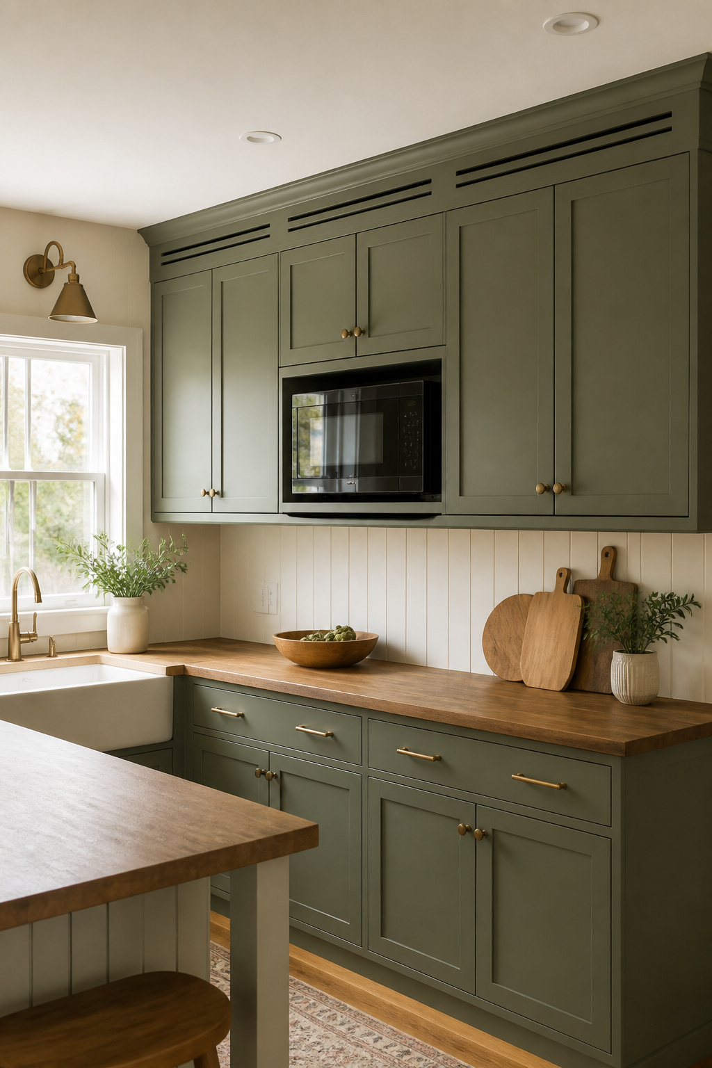
Vented upper cabinets solve the one problem hiding an appliance always creates: trapped heat and moisture. A microwave tucked behind a standard door steams itself into an early grave; a coffee maker left running in a sealed box warps the shelf above it. The vent gap needs to be at the top, where heat rises, not the bottom where it does almost nothing.
Designer Katie Hodges built hers into a Hollywood Hills kitchen with no laundry room to spare, coating the custom cabinets in Farrow & Ball’s Mouse’s Back paint. The appliances disappeared, the kitchen kept its look, and the machines could actually breathe. That same logic works for any heat-producing upper cabinet hideaway, whether it is a microwave, a toaster oven, or a single-serve coffee station.
Installation means planning for airflow before the cabinet goes up. A louvered door panel, a slot cut into the cabinet crown, or a grille worked into the face frame all work; the key is that the vent path stays open after installation, not blocked by trim or paint buildup. Skip this step and the hidden-appliance cabinet becomes a very small, very expensive sauna.
17. Hide Away Appliances
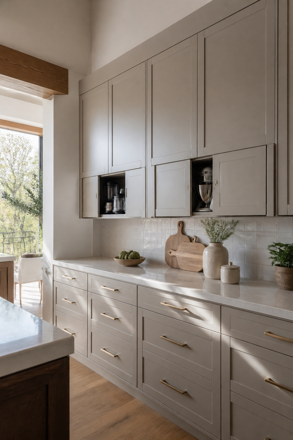
An appliance garage built into the upper cabinet line keeps the coffee maker or toaster from becoming countertop clutter. The door folds up on a hinge and slides back on tracks, so the whole front disappears while you work. Pocket-door uppers work the same way on a smaller scale: the panel glides sideways into the cabinet wall, leaving nothing but the appliance itself in view. The goal is visual disappearance, not ventilation. That distinction matters because a vented cabinet, built to manage heat and grease from a microwave or steam oven, still reads as a cabinet. These hide-away versions read as wall. The tradeoff is depth. Most small appliances sit deeper than a standard twelve-inch upper, so the cabinet box has to step forward or the appliance needs to sit proud, which breaks the illusion. Stepping the box forward by three or four inches costs you counter space below and creates a dust ledge on top. In a galley kitchen that already feels narrow, that step can turn a walkway into a shoulder-brusher. The pocket-door hardware also adds failure points: the slides stiffen with grease, and the hinges sag if the door is solid wood. A laminate slab or MDF panel keeps the weight down and the movement smooth for longer.
18. Split the Lower and Upper Cabinets
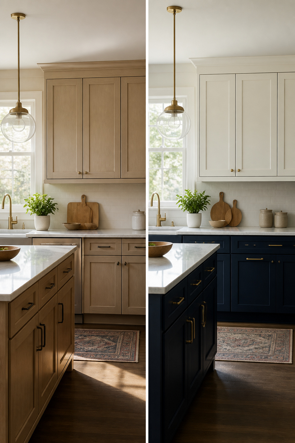
Splitting upper and lower cabinets into two deliberate decisions keeps a kitchen from feeling like a single block of sameness. The upper cabinets can stay quiet, maybe a warm white or a soft cream, while the lower ones carry the color weight. Designer Brian Paquette used this exact move in a southern California kitchen, keeping the uppers white and painting the lowers a deep green that happened to match the barstools. The structure matters more than the specific pairing: two colors chosen on purpose read as intentional, while two colors that almost match look like a mistake in the paint store.
This approach also lets you solve different problems with each zone. Uppers catch light and set the room’s brightness; lowers take the abuse of kicks, drips, and daily contact. A Kelly green wash or a cream slab with wood knobs works on top because you handle those doors gently. Down below, the same finish might age fast. The contrast becomes the style, not a detail layered on top of it.
19. Mix It Up
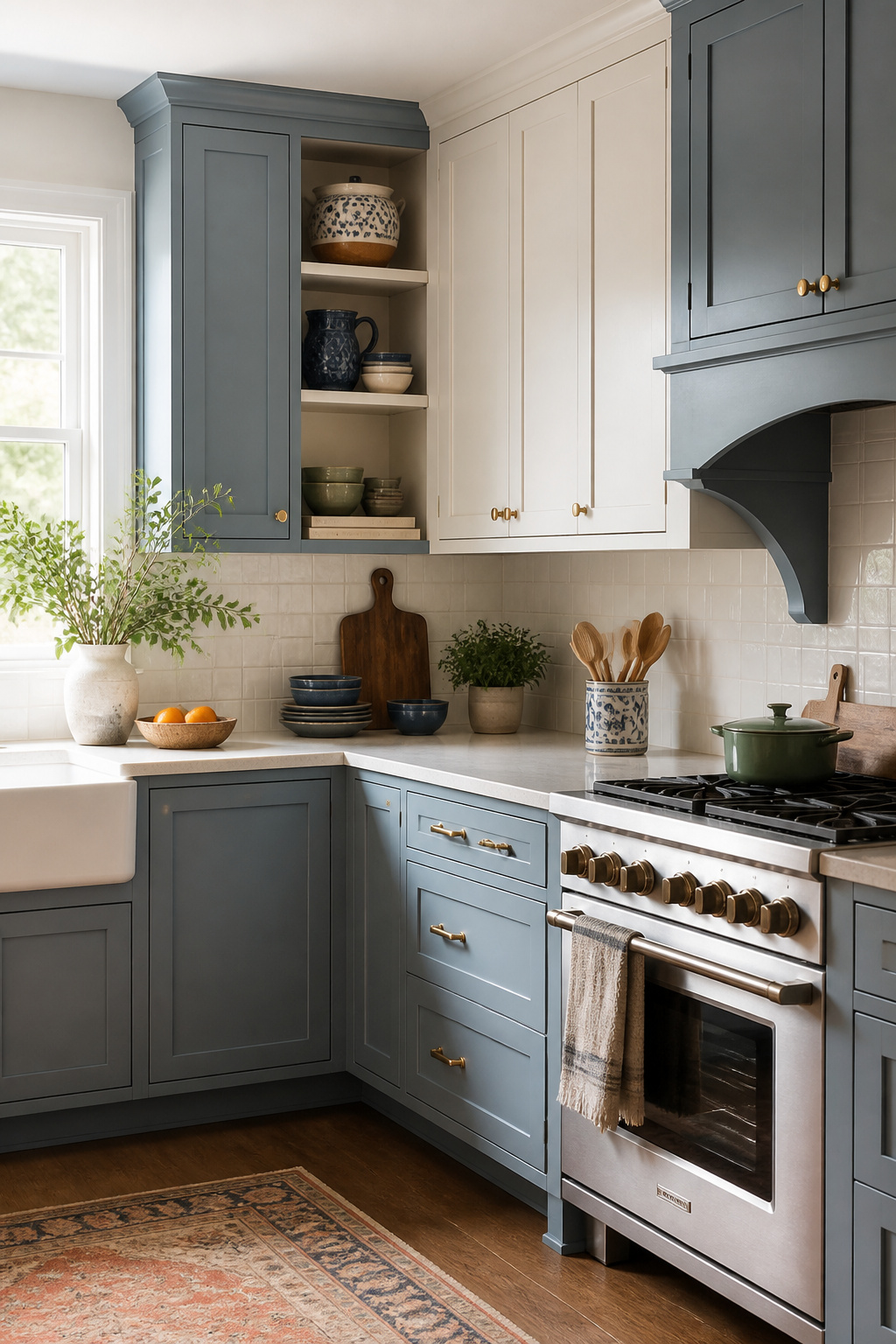
Upper cabinets are the easiest place to experiment because you can change one without tearing out the whole kitchen. Last spring, a friend replaced just the two cabinets flanking her stove with open shelves she built from pine boards, leaving the rest of her uppers alone. The mismatch bothered her for about a week, then she stopped noticing, and now guests always ask who designed her kitchen.
That is the spirit of it: trying one thing in one spot and letting the rest stay as-is. Maybe you paint the corner cabinet a muted blue and leave the run above the sink white. Maybe you swap glass fronts onto the cabinets that face the living room and keep solid doors where the mess lives. The variation itself becomes the design, not a mistake you need to fix.
What keeps it from looking accidental is intention in the placement. Pair the change with something consistent, like matching hardware across every door, so the eye reads the difference as deliberate rather than half-finished. My rule is to make the odd element the one you want people to notice: the cabinet you changed is the one they will look at twice, so put it where you actually want attention, not where you had a leftover can of paint.
20. Use Your Cabinets to Embrace Kitchen Trends
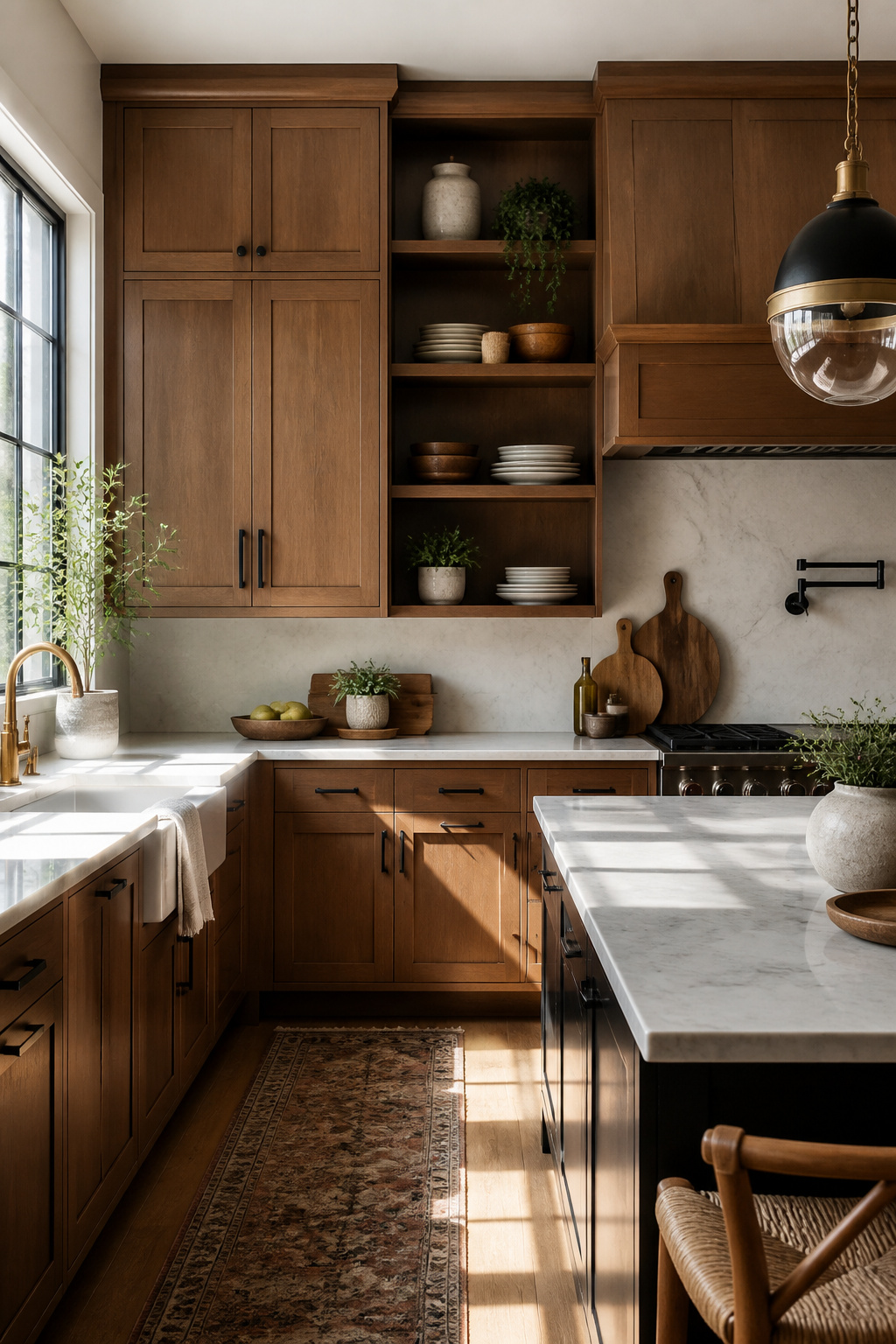
Upper cabinets sit above the work zone, which makes them the safest place to test a trend you are not ready to live with for fifteen years. A full kitchen repaint runs into the thousands and commits every base cabinet to the same statement. Swapping out uppers, or even just their fronts, costs a fraction of that and keeps the experiment contained where guests notice it first.
Mixing metals is the trend that translates best to this scale. One designer paired darker pulls on the uppers with black barstools below, then let the faucet and hanging rod carry glittering gold. The upper cabinets become the anchor that lets the rest of the kitchen hold multiple finishes without chaos. The same logic works for color: painting only the upper cabinets in a moody tone or a warm organic shade tests the palette against your light, your dishes, your morning habits. If it tires you in two years, the bases never changed.
Doorless uppers offer another low-stakes entry point. Removing the fronts takes an afternoon and a screwdriver, and the trend toward open display works precisely because the footprint is small. A few color-coordinated vessels or kitchen-friendly greenery on those shelves reads as intentional, not cluttered, because the upper cabinet frame still gives it structure. Renters can reverse it before a move-out inspection.
Frequently Asked Questions
What are some upper kitchen cabinet ideas?
Bright colors like cheery yellow or muted terra-cotta pink, soft neutrals such as warm greige, and dark saturated tones like walnut or forest green all work well on uppers. You can also mix old and new cabinetry, add glass fronts or open shelves, choose high-gloss paint for light reflection, or use native materials like regional wood. For 2026, hazy green-grays and earthy palettes that bridge warm and cool elements are particularly strong choices.
How do I choose the right color for my kitchen cabinets?
Test your swatch at the dimmest hour you actually use the kitchen, not at noon. South-facing rooms can handle darker, more saturated uppers while north-facing spaces need lighter values or supplemental lighting. If you rent or are buying your first home, soft neutrals like greige offer flexibility to change hardware and accessories without repainting. Bold colors work best when you commit fully and repeat the saturation elsewhere in the room.
What are the benefits of glass-front cabinets?
Glass-front uppers allow you to display dishes while keeping the kitchen feeling open and airy. They break up solid walls of cabinetry and let morning light catch copper, brass, or ceramic at angles that make the whole wall glow. Limit glass or open storage to about one-third of your kitchen if you cook regularly, and pair it with solid closed cabinets above to maintain practical hidden storage.