
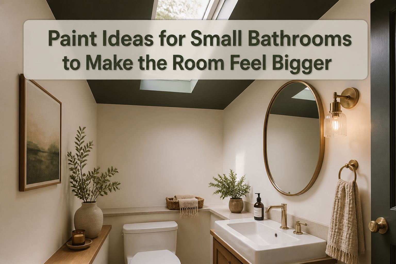
The right paint ideas for small bathrooms range from warm off-whites that forgive uneven edges to dark colors that reward a single bright sconce. What decides between them is not the square footage but how long you stand in the room and what light hits the walls.
A windowless powder room can handle Benjamin Moore’s Black Forest Green with brass hardware, but the same shade in a bathroom where you apply makeup every morning would fight you by day three. The ceiling is the move that surprises people: painting it instead of defaulting to white erases the boxy feeling and adds height you cannot build.
1. Off-Whites
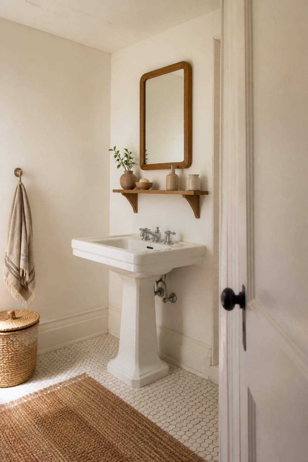
Off-whites hit a sweet spot that pure white misses: they bounce light around a small bathroom without turning it sterile. Benjamin Moore’s Simply White (OC-117) and White Dove (OC-17) both carry enough warmth to keep a tiny space from feeling like a clinic, but stay clean enough to read as genuinely bright. I have watched both colors shift from morning to evening in rooms with no windows at all, and they hold up because the undertone adds depth instead of flatness.
The real win for a weekend project is forgiveness. A warm white forgives a slightly uneven ceiling line, a brush mark you missed, old caulk that did not come out clean. Two gallons, a roller, and six hours of work later, the room feels like someone bothered with the details. That is the difference between a color that works on paper and one that survives your actual Saturday.
2. Soft Pinks
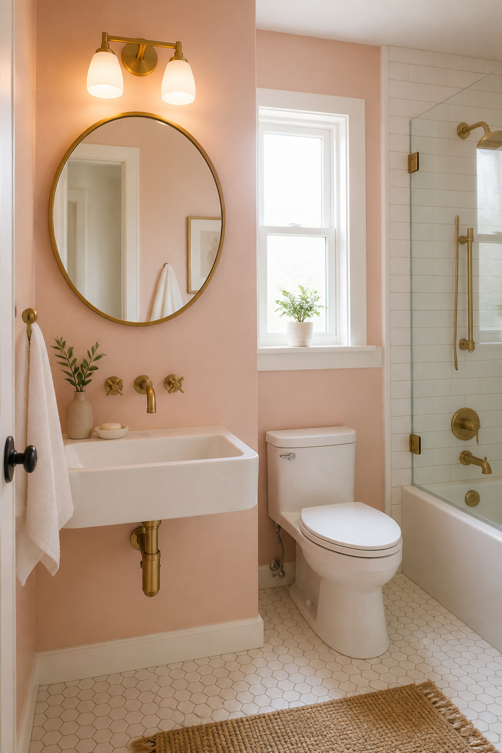
Soft pink reads as warmth without drifting into nursery territory, and that balance matters in a bathroom the size of a closet. Benjamin Moore "First Light" (2102-70) carries just enough gray to keep it grounded; under the flat, cool cast of most vanity bulbs, it turns rosy rather than orange, which is the difference between something you want to live with and something you paint over in six months. "Cream Puff" (2174-70) sits a shade lighter, closer to a flushed off-white, and it handles artificial light by reflecting more of it back into the room rather than absorbing it into the walls. The effect is less about making the space feel larger in a literal sense and more about making it feel inhabited, like a room someone chose rather than inherited. I would use "First Light" if the bathroom has a window, even a small one, because the natural variation through the day keeps it from flattening out. "Cream Puff" works better where the only light source is overhead and you need every lumen to bounce. Both colors pair well with brass hardware, which reads as intentional against pink rather than accidental, the way chrome sometimes can.
3. Light Blues
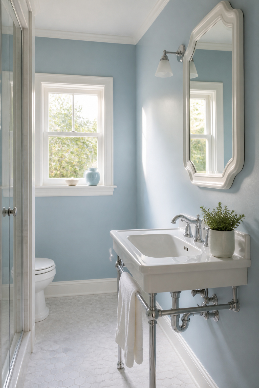
Light blue paint does something in a small bathroom that white alone rarely manages. The color recedes, letting the walls appear to push back rather than close in, and the effect is quietly calming without feeling cold.
Benjamin Moore’s Breath of Fresh Air (806) sits in that useful middle ground, pale enough to read as neutral in dim light but carrying enough pigment to feel intentional. For a slightly moodier version that still keeps the airy quality, November Skies (2128-50) layers in a whisper more gray while still reflecting plenty of light around the room.
Both colors work because they share a family trait with sky tones, the kind of blue that expands visually rather than contracting. Pair either with white fixtures and the contrast stays gentle, no harsh edges chopping up the already limited space. The white stays crisp, the blue stays soft, and the room reads as larger than its measurements suggest.
Where this can go wrong is in bathrooms with warm artificial lighting only. These blues lean cool, and under a yellow bulb they can turn flat or slightly sickly. If the window is small or faces another building, test a swatch at night with the overheads on before committing.
4. Greens
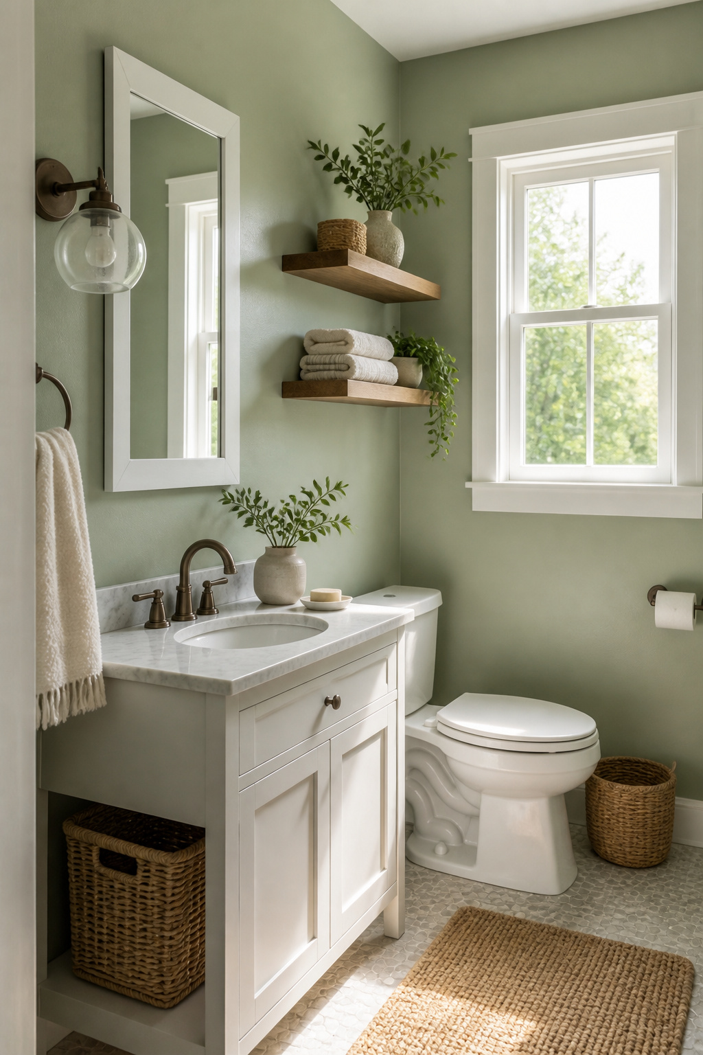
Sage greens read as nature first and paint second, which is why they do not shrink a small bathroom the way a flat beige might. Sherwin-Williams Sea Salt (SW 6204) sits right in that pocket: enough gray to stay quiet, enough green to feel like something grew there. Two designers I read kept naming it for small baths specifically, and I see why. It catches morning light like a plant would.
Benjamin Moore’s Van Alen Green (HC-120) runs deeper, from their Historical Collection. In a powder room with a window, the color holds without turning cave-like. The trick is keeping the ceiling and trim in something cleaner so the green has a frame to push against. Without that contrast, even a mid-tone green can flatten and close in.
Green bridges what people want from a bathroom: the clean of a white fixture and the calm of something living. The muted ones do this best. A saturated emerald fights the space; a washed sage cooperates with it.
5. Dark Colors
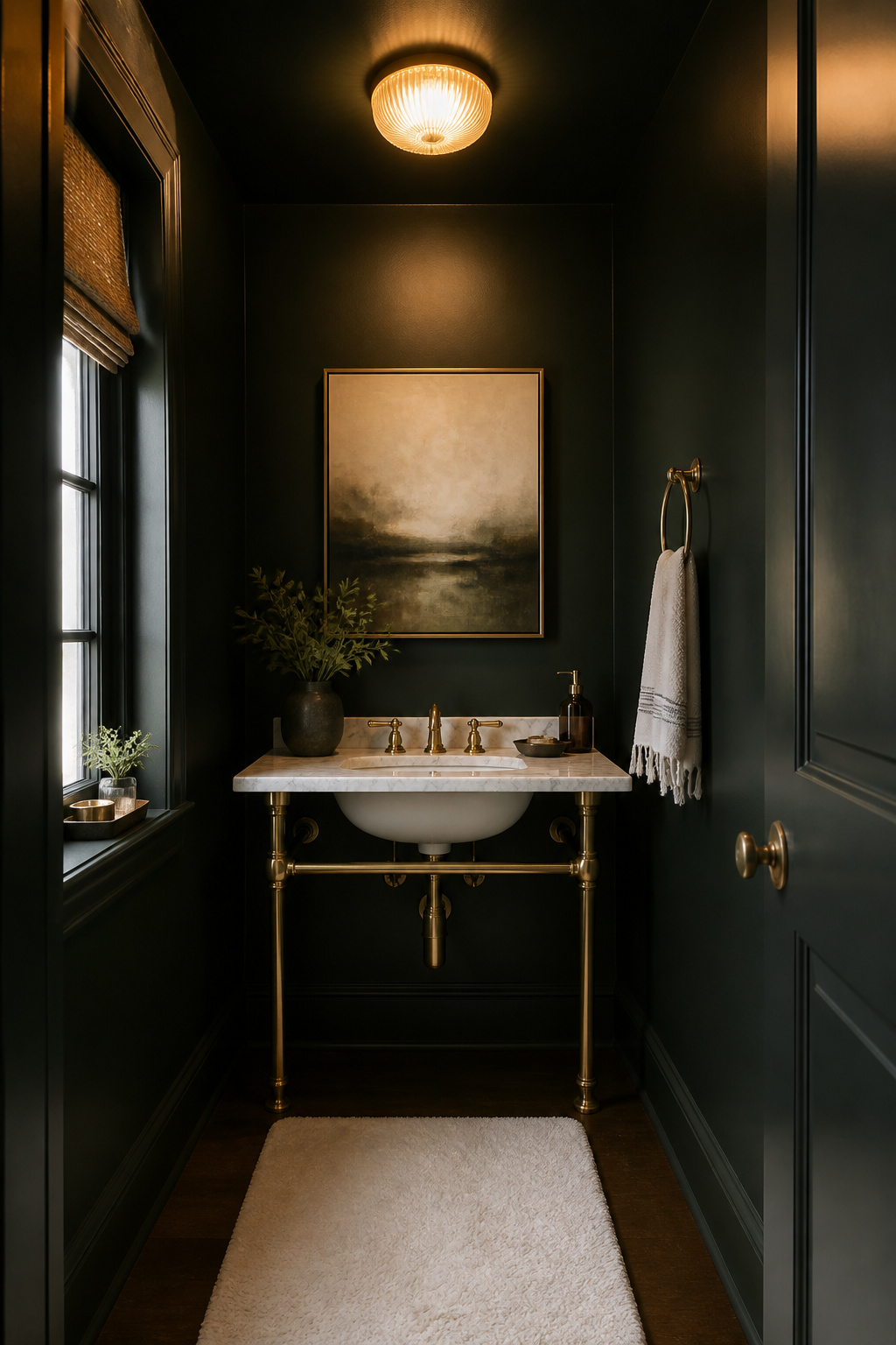
Dark colors in a small bathroom sound like a mistake until you see one done right. Powder rooms especially reward the gamble. With no shower steam to fight and usually just a single overhead fixture to plan around, the risk drops and the payoff sharpens.
Benjamin Moore’s Black Forest Green (HC-187) never fails to stop people at the door. The color reads as near-black in low light but keeps enough green to feel alive rather than cavernous. Pair it with warm brass or aged bronze hardware and the room suddenly has the gravity of a much older house.
For something cooler, Deep Space (2125-20) sits in that charcoal band between navy and true black. It works against white subway tile or a vintage pedestal sink without the harsh contrast that pure black can bring.
The catch is the lighting. Dark walls swallow shadows whole, so a single dim bulb will flatten everything into mud. A powder room needs either a bright sconce flanking the mirror or a flush mount with real output, not a decorative glow. Without that balance, the drama tips into gloom.
6. Jewel Tones
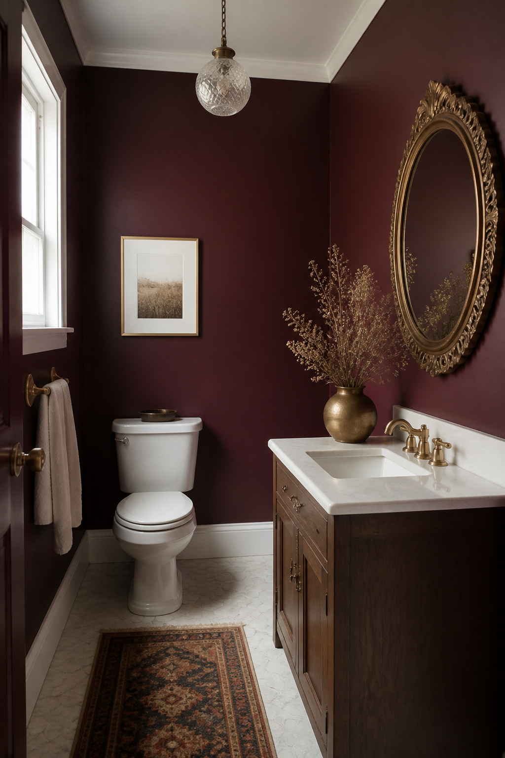
Saturated colors usually get ruled out of small-bathroom conversations, and that is a mistake worth correcting. Jewel tones do not expand a room, but they give it a reason to be small, turning tight square footage into an intentional mood rather than a problem to solve.
Benjamin Moore’s Dark Burgundy 2075-10 and Etruscan AF-355 are two that reward the risk. Dark Burgundy reads nearly black in low light, so it needs a plan: pair it with high-contrast trim in pure white, or commit to a single accent wall where a mirror can bounce light back into the color. Etruscan carries more brown in its base, which softens the drama just enough for a space with only one small window.
The real limit is daylight. Both colors flatten and lose their depth in dim bathrooms, so they work best where a window, a skylight, or strong vanity lighting hits them directly. In a windowless powder room, they will read as black paint with expensive regrets. Gloss and semi-gloss finishes are the usual choice for bathroom durability, though Benjamin Moore’s Aura Bath & Spa offers a matte option with mildew resistance built for high-humidity spaces. That matte softness against a saturated jewel tone is where the luxury actually lives, if the light is there to support it.
7. Terracotta
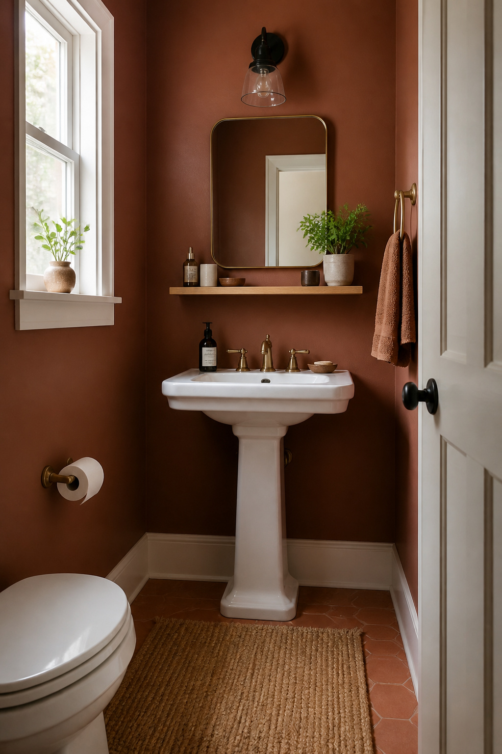
Terracotta carries a warmth that can turn a cramped bathroom into a space you actually want to step into. The trick is choosing a shade with enough earth in it to stay grounded. Farrow & Ball’s Etruscan Red hits that mark, a muted clay rather than a shout, and it reads as cozy rather than closed-in when the light is limited.
The risk with any trending color this saturated is overcommitment. Four walls of deep terracotta in a five-by-eight-foot room will swallow the space whole. Two walls, or even one behind a pedestal sink, gives you the glow without the cave effect. Pair it with warm white trim and a natural wood shelf, and the color recedes just enough to let the room breathe.
The colors that are more effective at adding both a sense of space and a touch of luxury are usually warmer or considerably deeper than most of us would consider using in a bathroom.
What this means for a weekend project: skip the safe white, but do not go full cave. Terracotta works when you treat it as an accent the architecture can handle, not a blanket.
8. Neutrals
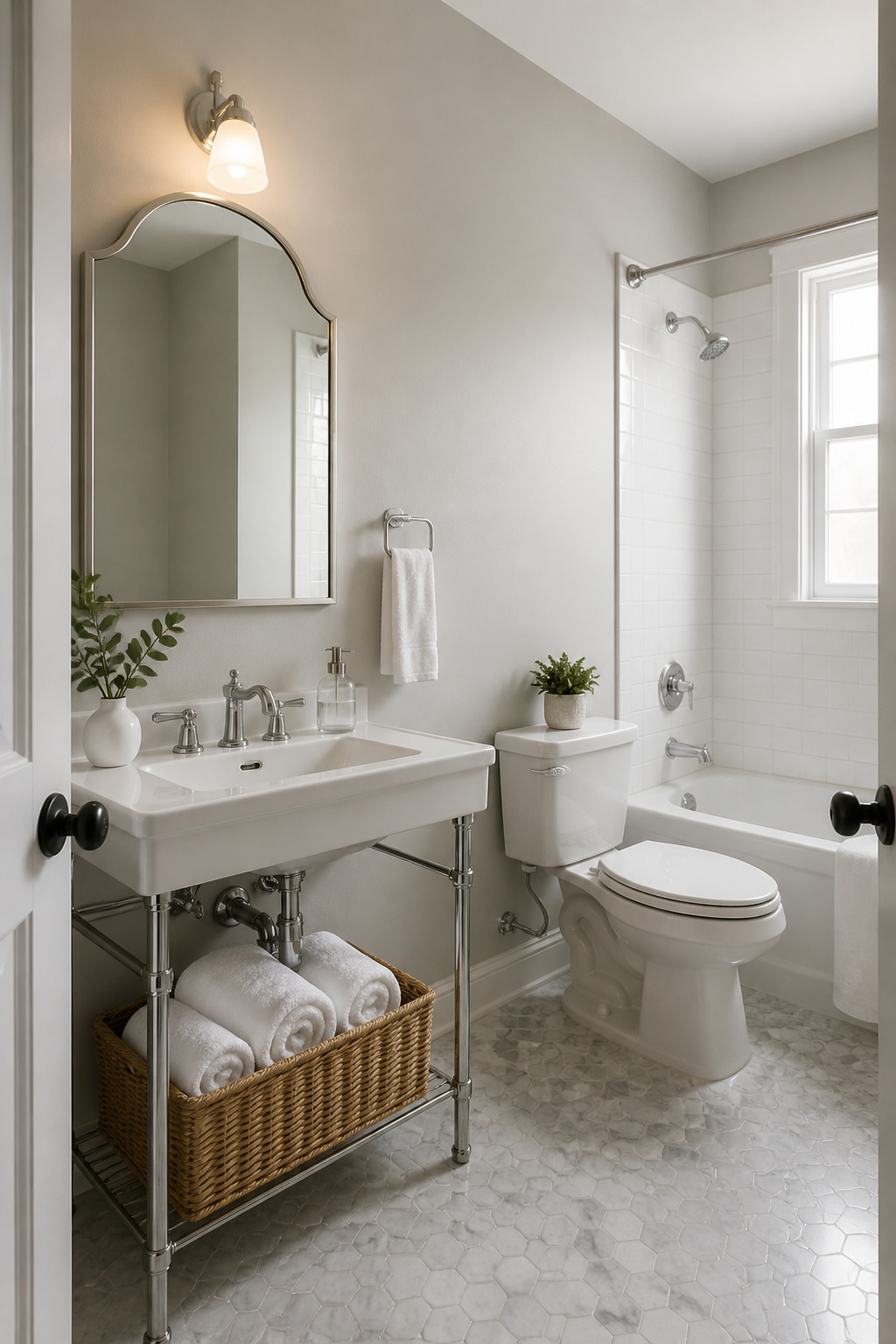
Light grays and beiges do the heavy lifting in small bathrooms because they hide water spots and scuff marks that show up faster on pure white, and they pair with chrome, matte black, or brass without fighting. Dunn Edwards Cotton Field (DE 6253) sits in that useful middle ground, a warm light gray that reads neutral under both morning window light and yellow evening bulbs. For something closer to beige, Benjamin Moore Pale Oak adds enough depth to keep the walls from feeling sterile while still bouncing light around the room.
Renters tend to land here for practical reasons. These colors forgive the dings that accumulate between lease years, and they make hand towels, shower curtains, and even that landlord-special vanity look intentional rather than tolerated. A weekend of painting with either shade means not having to repaint before move-out, and that matters when the security deposit is on the line.
9. Bold Colors

Small bathrooms are where bold color pays off, because the risk is low and the payoff is immediate. A powder room, especially one without windows, is the right place to try something that would swallow a larger space. I painted my own windowless powder room in Sherwin-Williams Palm Leaf, a dark olive green that goes on the walls, trim, and ceiling for a fully saturated, almost enveloping effect. The ceiling is the move that surprises people; drawing the eye up with color instead of defaulting to white erases the boxy feeling and adds height you cannot build.
The tradeoff is real. Dark colors absorb light, and even with an overhead fixture and two sconces, visibility stays limited. That works fine in a powder room where you are in and out in minutes, but it would frustrate anyone trying to apply makeup or shave daily. For a full bathroom you use to get ready, keep the bold color to a single element: the vanity, one wall, or the ceiling against lighter surroundings. Forest green cabinetry with brass hardware and creamy whites nearby gives the drama without the darkness closing in. The strategic placement matters more than the color itself.
Choosing Colors for Small Spaces
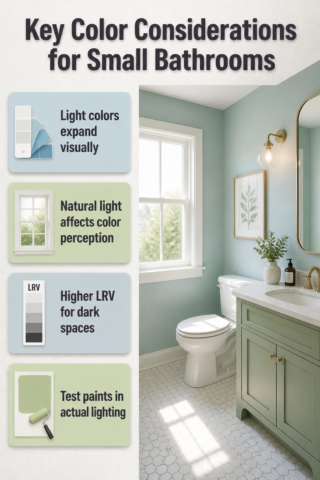
Light colors expand a wall visually because they reflect more light back into the room; dark colors recede, pulling the surface away from the eye and making the space feel enclosed. That is the basic rule, but a small bathroom rarely gives you basic conditions to work with.
Natural light changes everything. A color that reads as a soft blue in morning sun can flatten to gray under a single ceiling fixture. In a windowless bathroom, even mid-tone colors drop several shades darker than the chip suggests. I have seen Benjamin Moore Southern Vine, a mossy green that looks rich in daylight, turn nearly black on a wall with no windows. The lack of natural light will make any color feel darker, so shoot for a higher LRV if you want the actual wall to match the swatch in your hand.
Artificial light has its own bias. Warm bulbs throw yellow, cool LEDs throw blue, and both will shift your paint after the first coat is dry. The only reliable test is to paint a large swatch, two feet square at minimum, and live with it through a full day of your actual lighting. Small chips held at arm’s length lie; your wall does not.
The sources split on whether to follow the expand-with-light rule strictly. Powder rooms, being small and briefly used, can handle bold or dark choices that would overwhelm a larger space. A deep green or aubergine like Farrow & Ball Brinjal creates intimacy rather than claustrophobia, especially with reflective surfaces to bounce light around. The decision comes down to function: a bathroom you step into for ten minutes can risk drama, a bathroom you dress in every morning needs the lightness to feel generous.
Accent Colors and Color Combinations
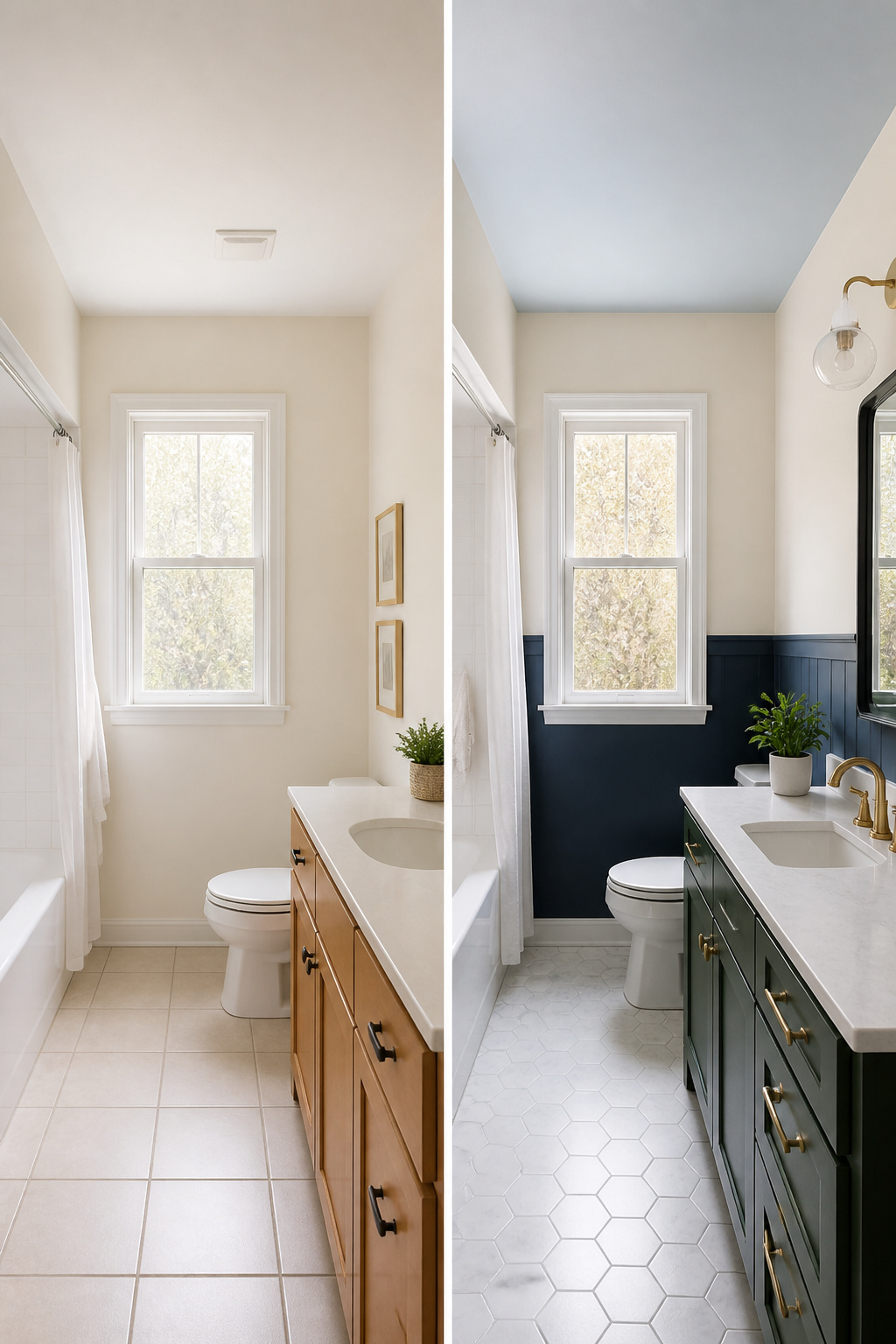
A different ceiling color draws the eye up and gives a small bathroom actual architecture to notice. Benjamin Moore pairs like Cloud White walls with Cumulus Cotton overhead, or Sebring White with October Mist, and the effect is a room that feels finished rather than boxed in. The ceiling becomes a feature instead of a forgotten fifth wall.
Cabinetry is where bold color belongs in a tight space. Forest green on a vanity adds depth you cannot get from wall paint alone, especially against brass hardware and creamy whites that keep it from closing the room down. The same logic works for two-tone walls: navy against gray, black against white, teal against gold. These pairings create movement, but the stopping point is what saves the look. One bold move per room, two at most. A painted ceiling, a green vanity, and contrasting walls together turn a small bathroom into a visual argument. Pick your statement and let the rest go quiet.
The Finish That Actually Matters
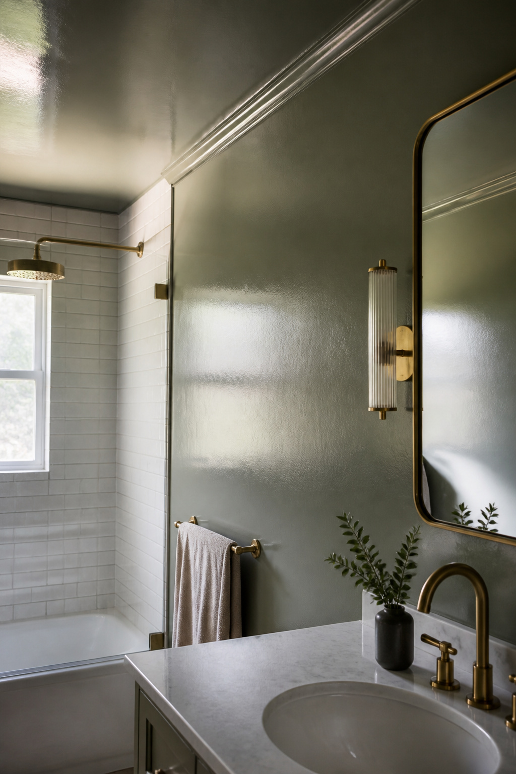
Semi-gloss and satin are the two finishes that hold up in a bathroom you actually use. Both stand up to wiping down, which matters when toothpaste splatter and mirror fog are part of the morning routine. Flat paint soaks up that same moisture and gives mildew a foothold; within a year, the wall near the shower starts looking chalky and tired.
Eggshell can work in a half-bath with no tub or shower, though even there I would rather spend the extra few dollars on satin and not think about it. The sheen difference is subtle once the color is up, but the cleanability gap is real.
Satin is the practical ceiling for most weekend projects: enough shine to repel water, not so much that every roller mark shows. Semi-gloss steps up the durability and reflects more light, which helps a small room read larger, though it also shows every bump in old plaster. If the walls are already rough, satin forgives more.
Mood and Atmosphere
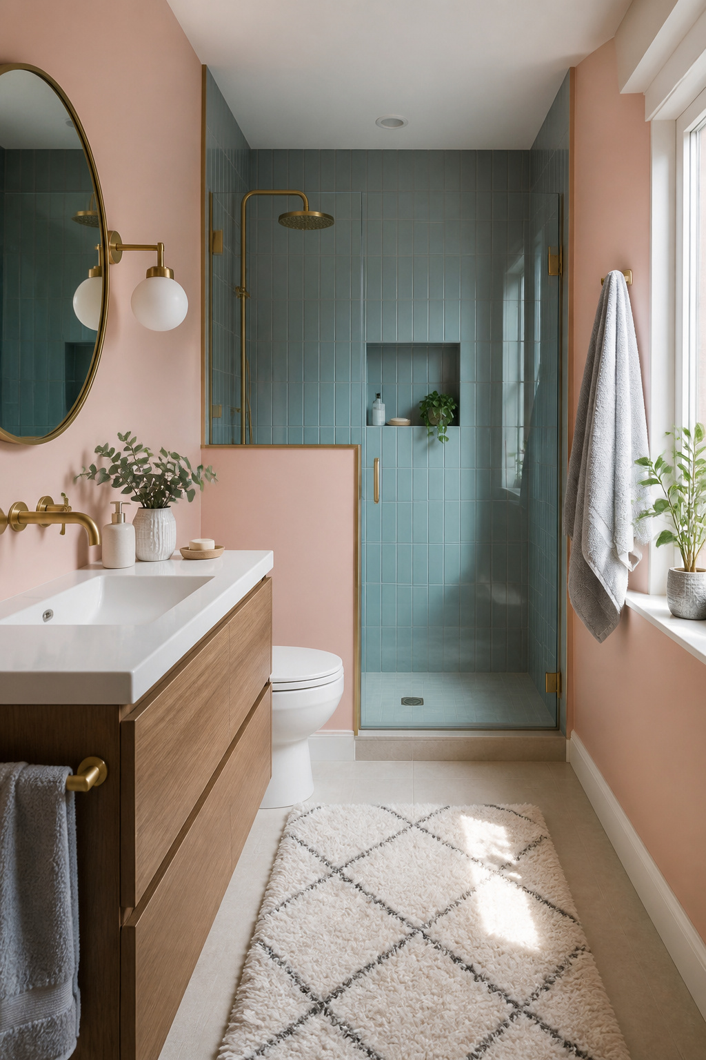
Color sets the emotional temperature of a small bathroom more than anything else you can change in a weekend. Soft pinks pull the room toward warmth without the flatness of beige, which matters in a space that gets used at two completely different speeds. Morning use is rushed, almost accidental, the light still low, the body not yet convinced. In that hour, a blue-leaning tone slows the pulse too much; the pink keeps enough energy to move you through the routine. Evening is the reverse. The same bathroom becomes a wind-down space, and here a muted blue earns its place, lowering the mental volume after a long day.
The real trick most sources skip is matching the color to the actual use pattern, not the aspirational one. If you are honest about which version of yourself shows up in that room more often, the paint stops fighting your life. A spa-like sanctuary sounds good on a label, but a bathroom that sees frantic weekday mornings needs a color that meets that reality. Warmer tones carry you through the rush; cooler ones reward the rare slow evening. Pick for the version you actually live, not the one you post.
Frequently Asked Questions
What are some popular paint ideas for small bathrooms?
Off-whites like Benjamin Moore Simply White and White Dove, soft pinks such as First Light and Cream Puff, light blues including Breath of Fresh Air, and sage greens like Sea Salt all rank among the most popular choices. These colors balance warmth with light reflection, keeping a tiny bathroom from feeling sterile or closed in.
How can I make a small bathroom look bigger using paint color?
Lighter colors expand walls visually by reflecting more light back into the room, while the right undertone adds depth so the space does not flatten out. Warm off-whites, pale blues, and soft greens bounce light around without the coldness of pure white, and painting the ceiling the same bold color as the walls can erase boxiness by drawing the eye upward.
What type of paint finish is best for bathrooms?
Satin and semi-gloss are the practical choices for bathrooms you actually use, since both stand up to wiping down moisture and toothpaste splatter. Semi-gloss reflects more light to help a small room read larger, though it also shows wall imperfections; satin forgives rougher surfaces while still repelling water. For high-humidity spaces, Benjamin Moore Aura Bath & Spa offers a matte finish with built-in mildew resistance.
Can dark colors work in small bathrooms?
Yes, dark colors reward the gamble especially in powder rooms where you spend only minutes and there is no shower steam to fight. Benjamin Moore Black Forest Green and Deep Space create drama without cavernous gloom when paired with bright lighting and warm hardware. The catch is that dark walls swallow shadows, so a single dim bulb will flatten everything into mud; you need a bright sconce or high-output flush mount to balance the depth.