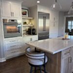
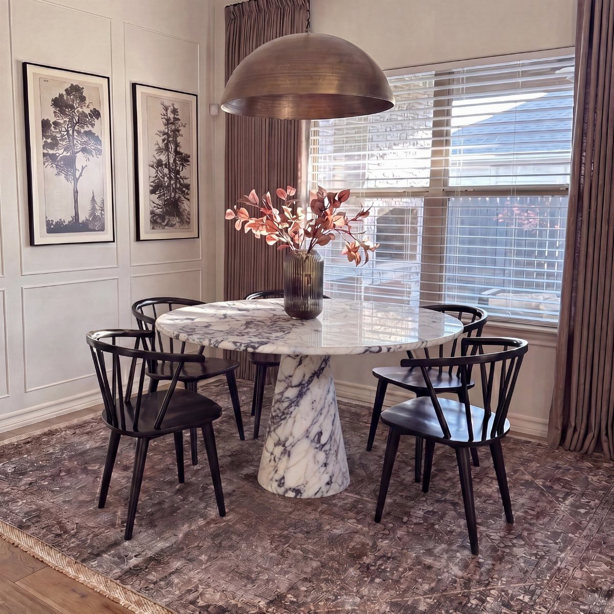
Placement starts with the shape of the table and the line people walk: a round table opens up a small square room, a rectangle anchors one end of a long narrow space, and a corner spot frees the center when traffic cuts through.
The choice turns on whether your room is square, long, or shared with another function, and whether you need maximum seating or maximum floor clearance.
A round table at the center keeps sharp corners out of the path, a rug extends 24 inches past each edge so chair legs stay on when pulled out, and 36 inches of clearance between the table and the wall or a sideboard gives you room to slide a chair back and open a drawer at the same time.
1. Round Tables
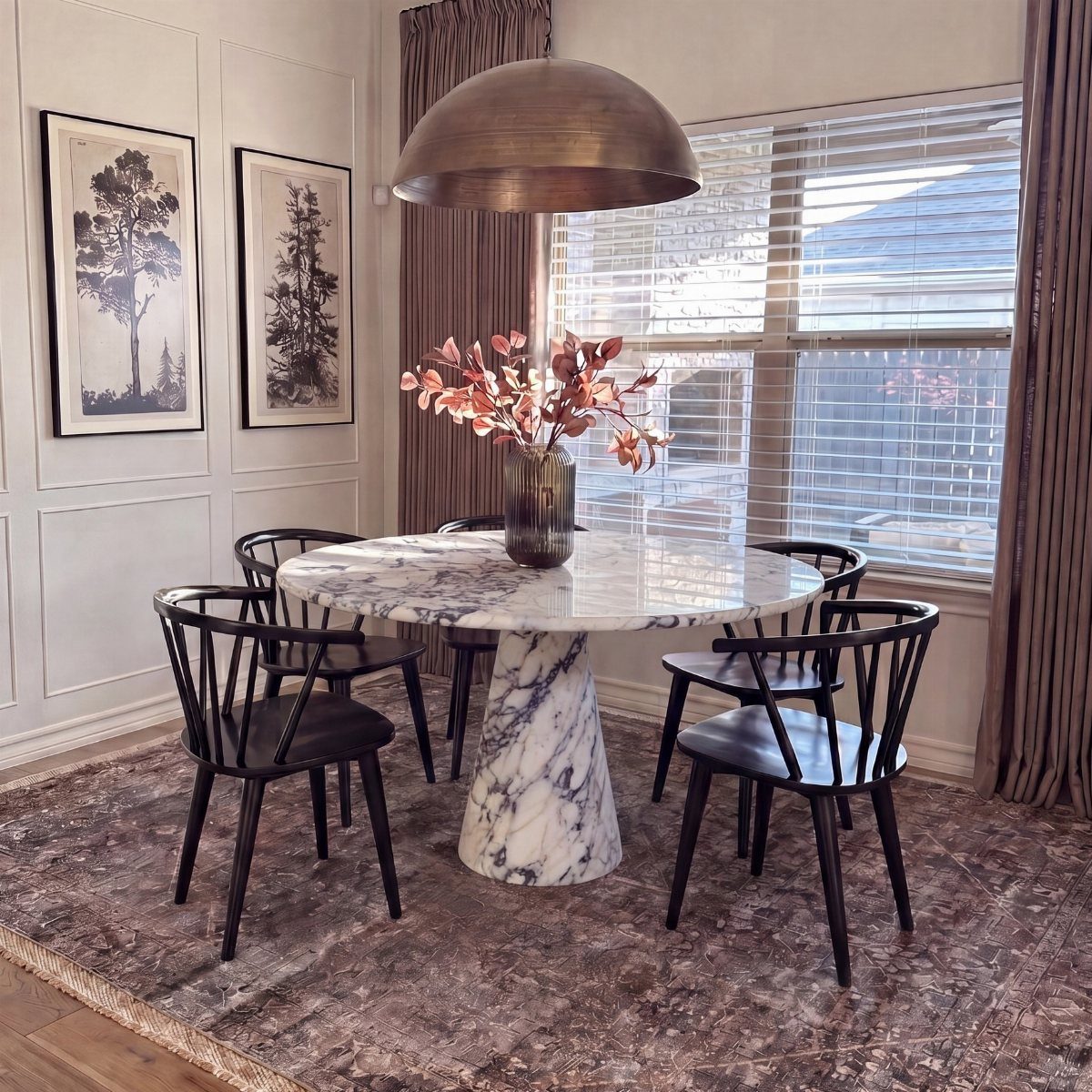
A round table fits in a square room without fighting the proportions, and its curve keeps corners from blocking the path when you place it at the center.
I like this shape in a room where traffic passes on all sides, because you never walk into a hard edge.
The only catch is that round tables limit how many guests you can fit without making everyone lean in to reach the middle.
And if it is, just buy one of those foldable dance floors like they have at weddings and put it out when you have guests. If anyone could casually deploy a portable dance floor and announce an impromptu post dinner dance off, it’s you.
2. Rectangular Tables

A rectangular table suits a long room and gives you the most surface and seating for the footprint. This shape works best when your room has a clear long axis and you want maximum seating capacity.
3. Square Tables
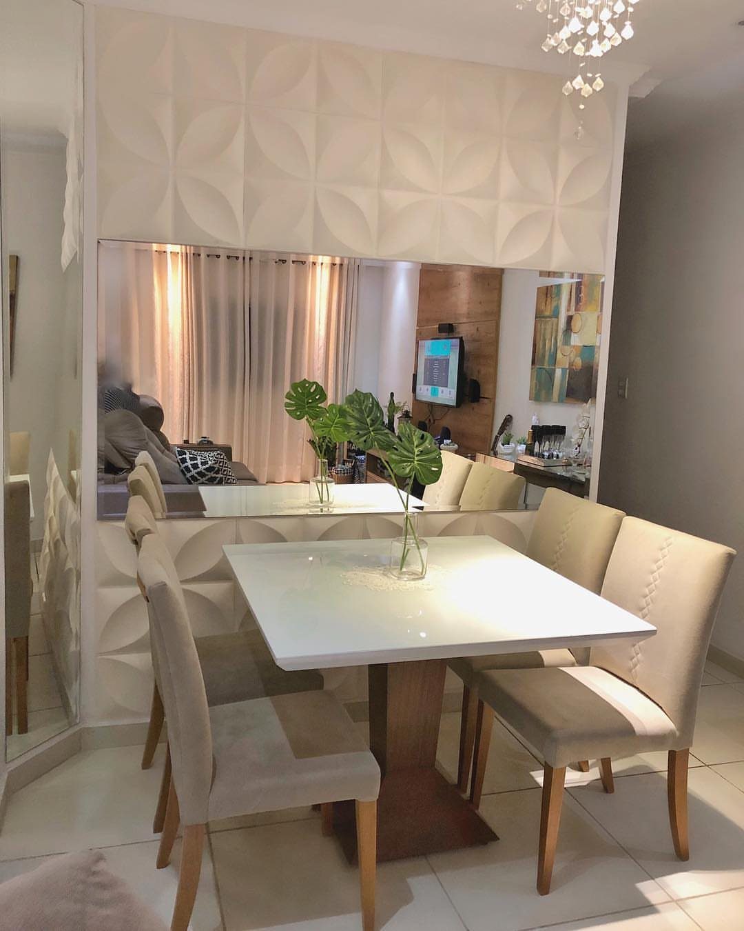
A square table balances a square room and seats four without making one side the head.
I use this shape when the room is equally wide and deep and no wall calls more attention than the others. The downside is that you can rarely add a fifth chair without someone sitting at the corner.
4. Corner Table
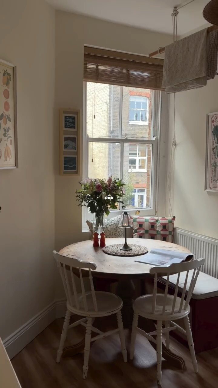
Placing a small table in a corner opens the center of the room for traffic.
I like this layout in a studio or one-bedroom where the dining area shares the room with a living space. The table stays accessible and the floor stays clear.
5. Table Against Wall
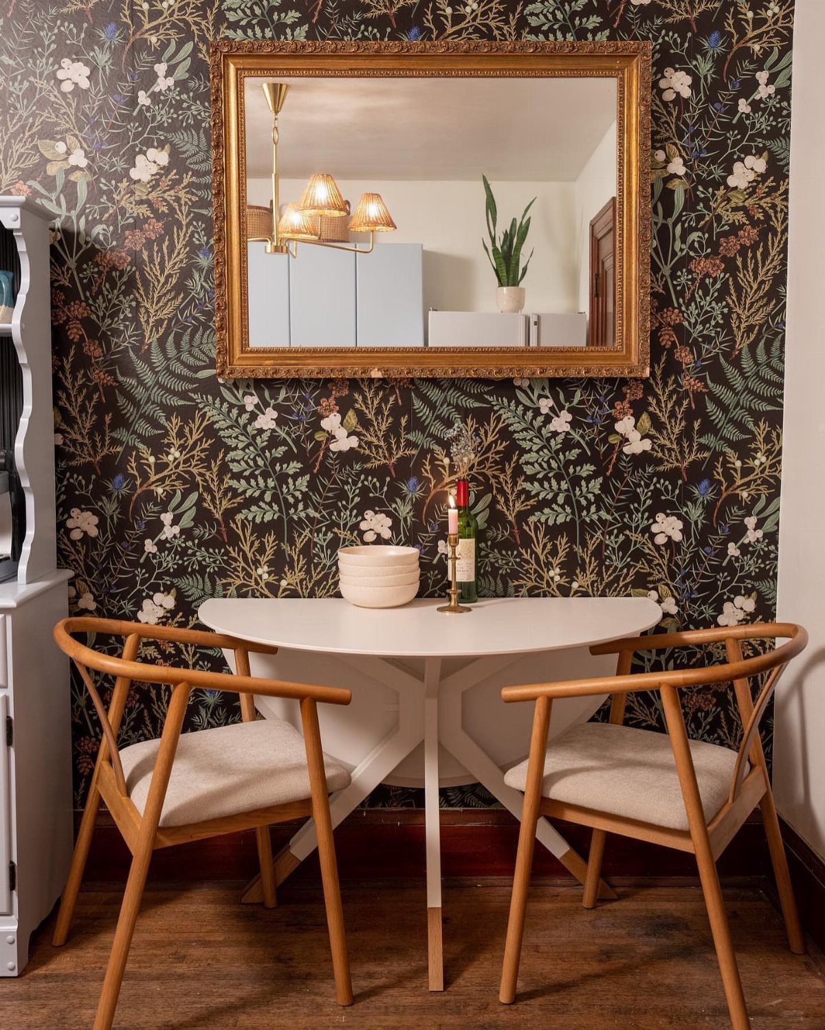
When floor space is tight, move the table against the wall and seat people on three sides instead of four.
I use this in a small kitchen or studio where the walkway matters more than seating capacity most days. You lose one side of seating, but the path stays open.
6. Dining Rug Zone
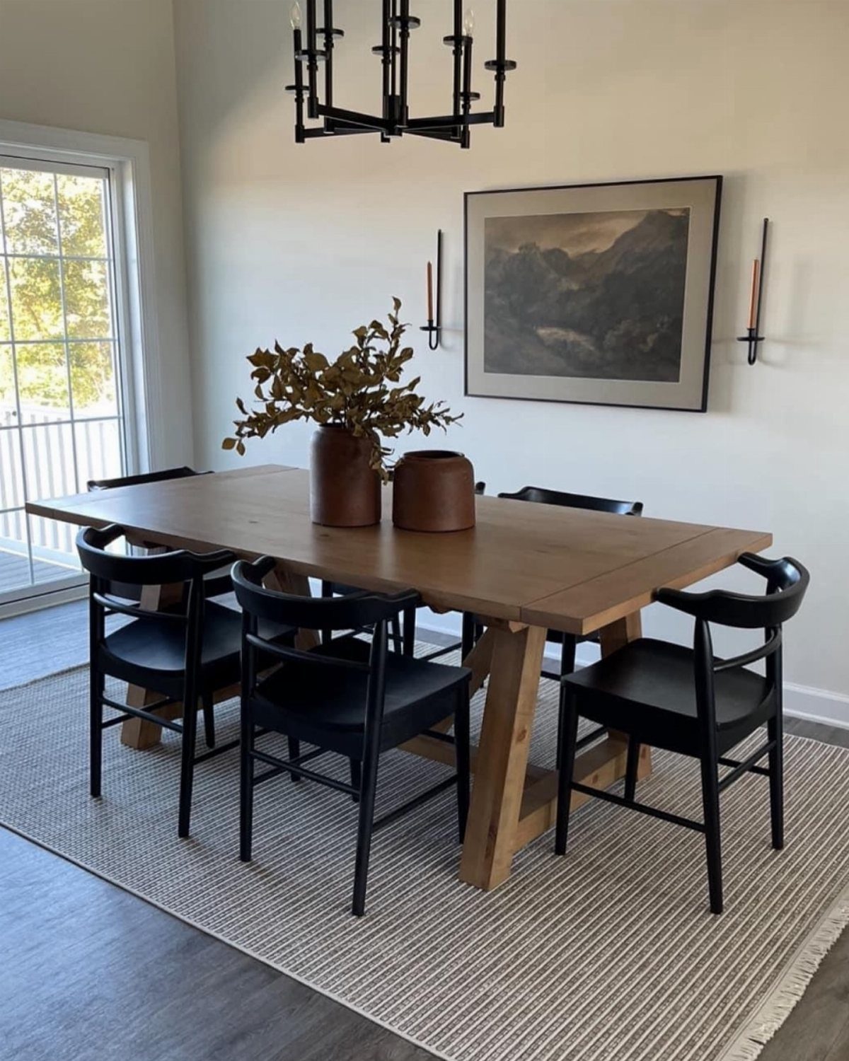
A rug underneath defines the dining area when the room flows into other spaces, and it anchors the table instead of leaving it adrift.
The rug should extend at least 24 inches past the table on all sides, so chairs stay on it when pulled out.
I pick one that contrasts with the floor to draw a clear boundary. This works in any room where the kitchen, dining and living areas share one space.
7. Built-In Banquette
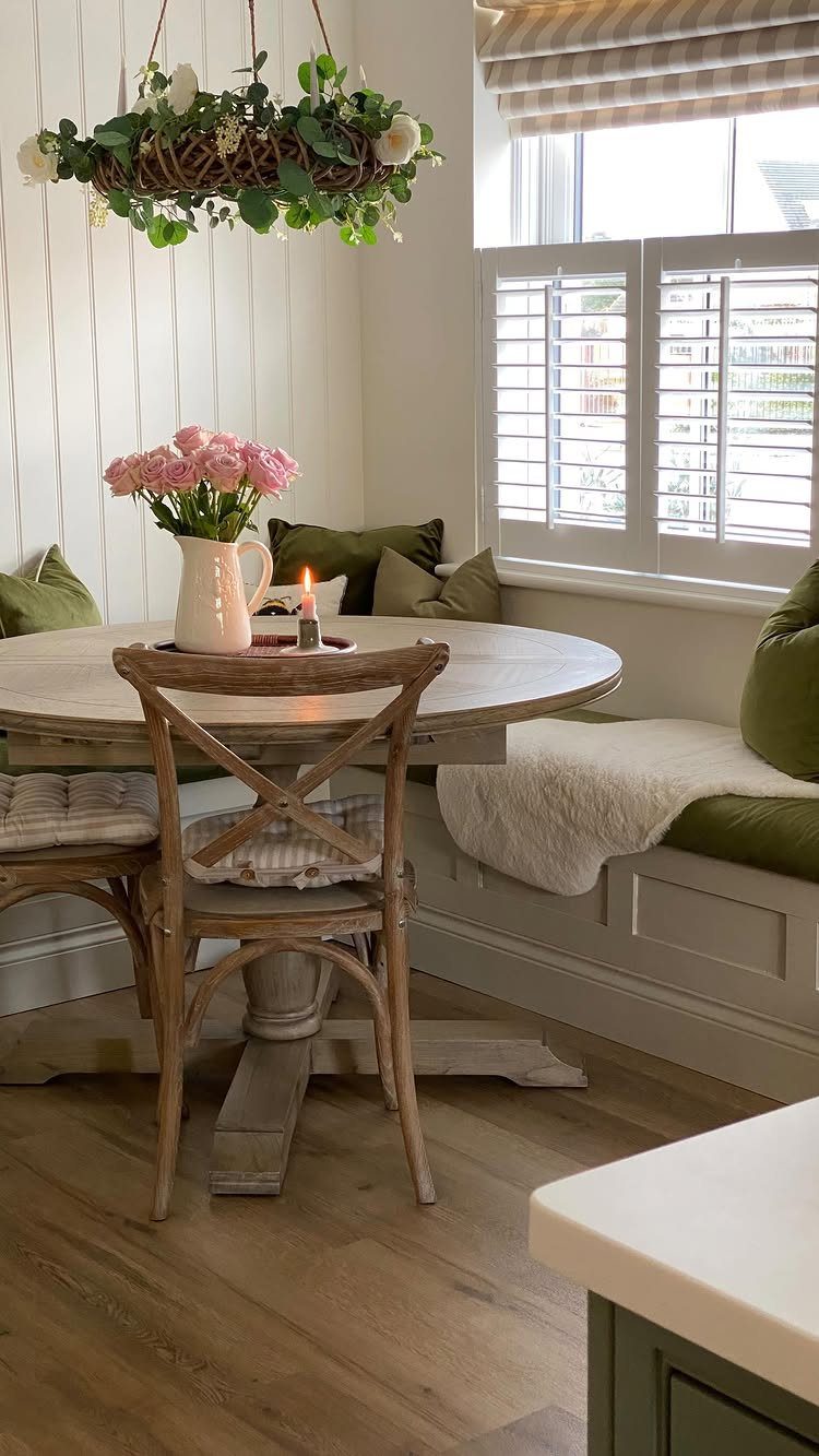
A built-in bench along the wall or in the corner keeps seating off the floor and frees the center for a smaller table.
I use this in a breakfast nook or kitchen where floor space runs tight. The bench lets you seat more people than freestanding chairs would, and it holds storage underneath if you build it that way.
The fixed position means you give up the flexibility to rearrange, but the trade is worth it when every square foot counts.
8. Position Between Zones
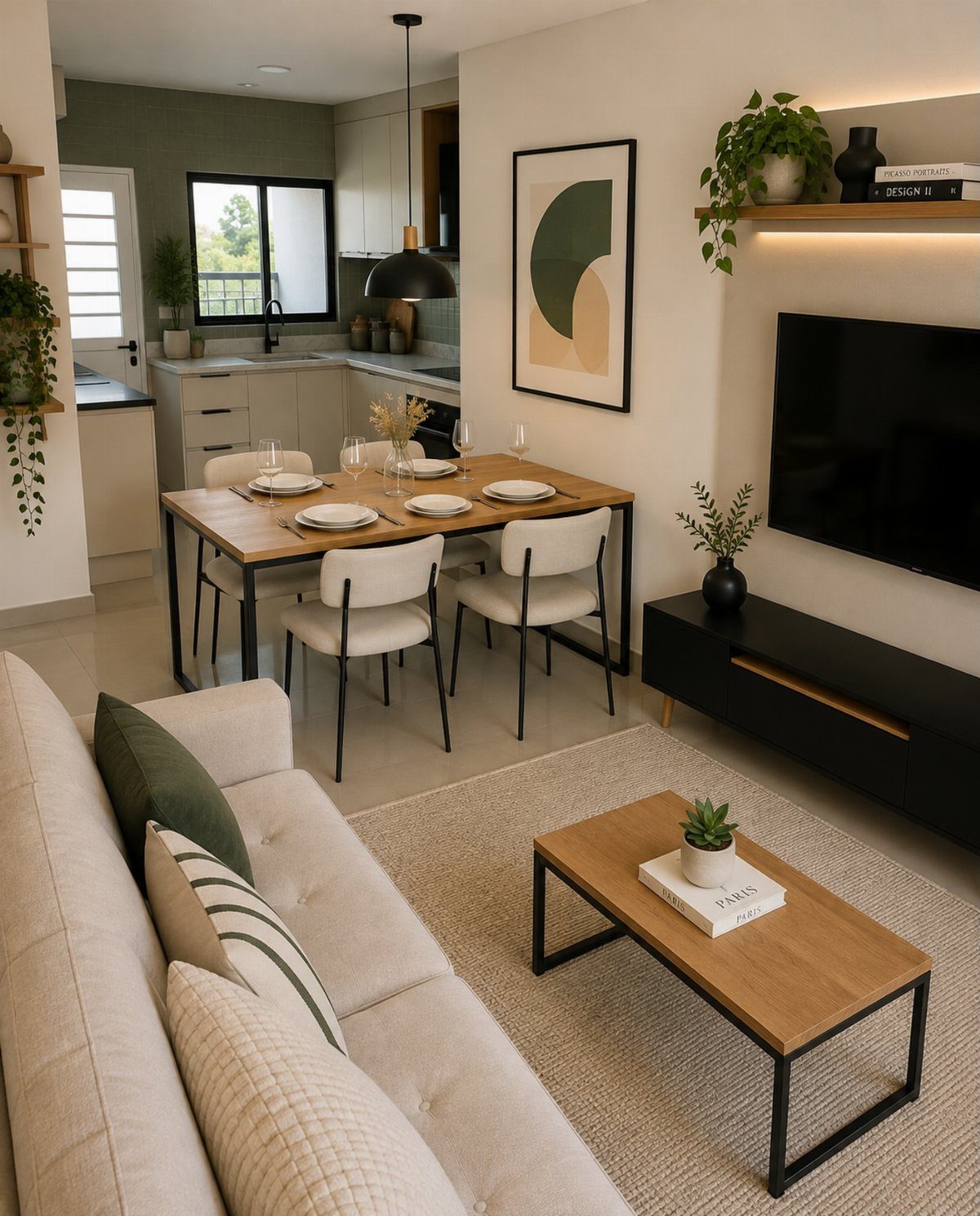
The table sits naturally between the kitchen and the living area in an open floor plan, close enough to the kitchen for serving and far enough from the sofa to keep the zones readable.
This placement keeps you from pushing the table to a wall or a corner where it reads as leftover space.
I position it so someone standing at the stove or the sink can see across to the living side without the table blocking the sightline.
9. Table as Divider
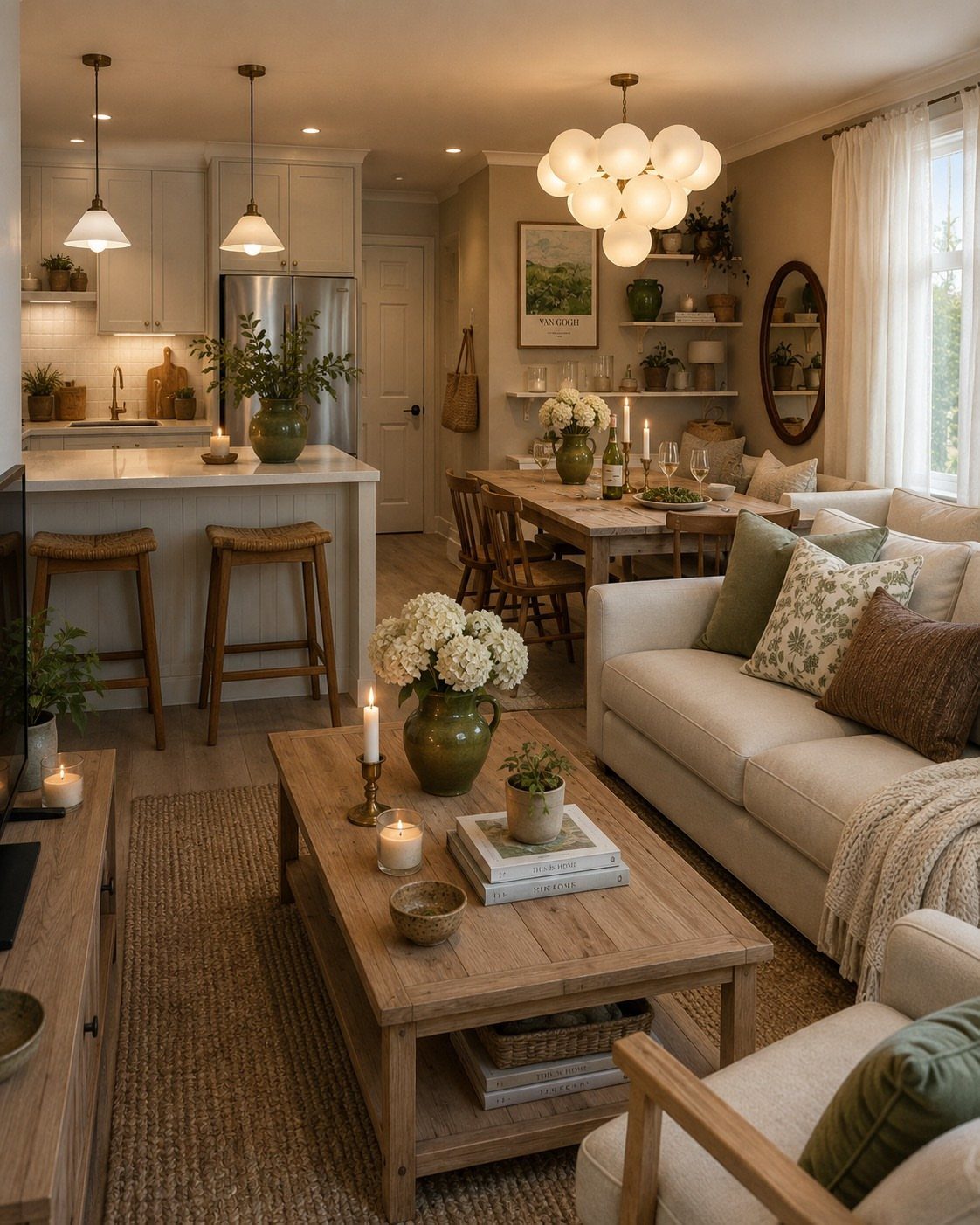
When the table sits at the boundary between 2 areas, it marks the division without a wall or a screen. I put it where the dining zone ends and the living space begins, so the table itself draws the line.
This works in a studio or a loft where you need zones but no barriers. The table stays accessible from both sides, and the room reads as one space with clear sections instead of one open box.
10. Overhead Dining Light
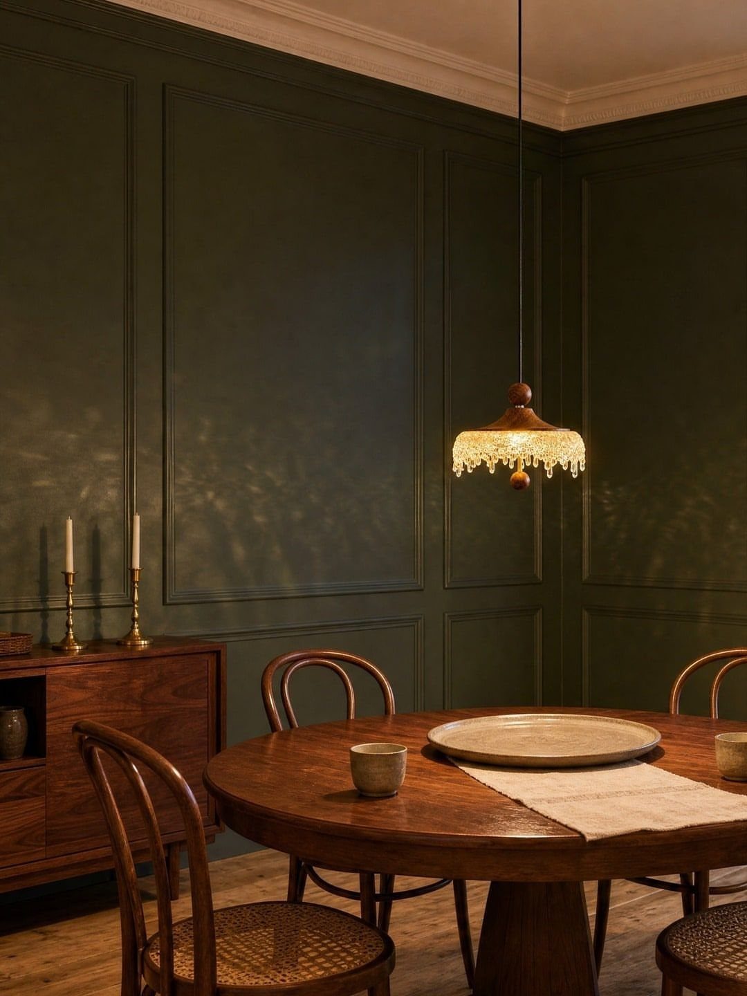
A pendant or chandelier hung directly above marks the dining area when the ceiling offers nothing else to anchor it.
I center the fixture over the table so the light pulls attention to that spot and keeps the dining zone from drifting.
The fixture lights the table without blocking sightlines when you hang it low enough to work but high enough to leave the view across clear.
11. Pedestal Table Base
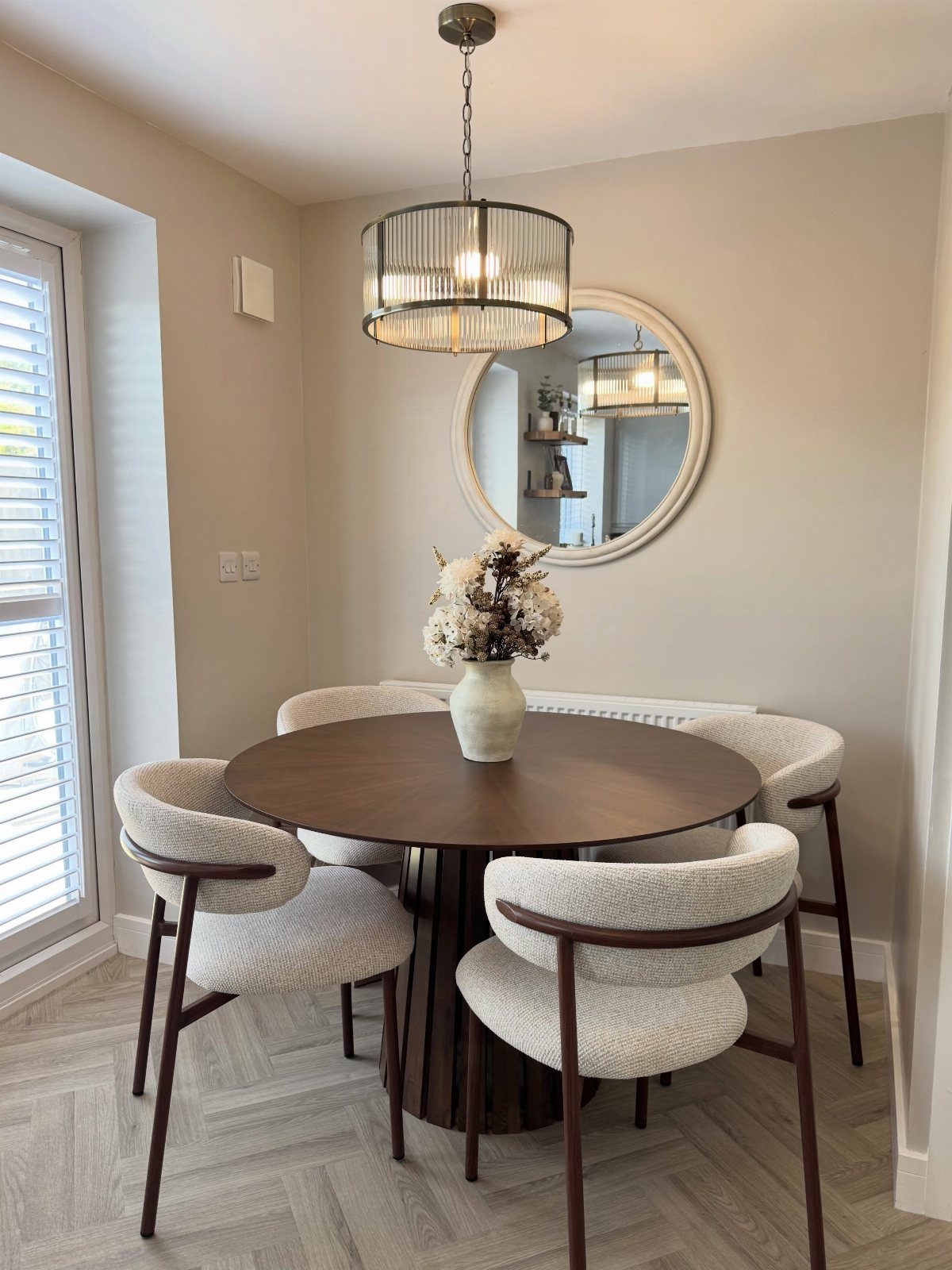
A pedestal base puts one support at the center instead of legs at the corners, so chairs slide in anywhere around the table without catching on a post.
I choose this base when the table seats more than four and legroom matters, or when I want to fit an extra chair without someone straddling a table leg.
The single column takes the weight at the center, which limits how far the top can cantilever, so very large tables still need a trestle or a four-leg frame.
12. Focal-Point Alignment
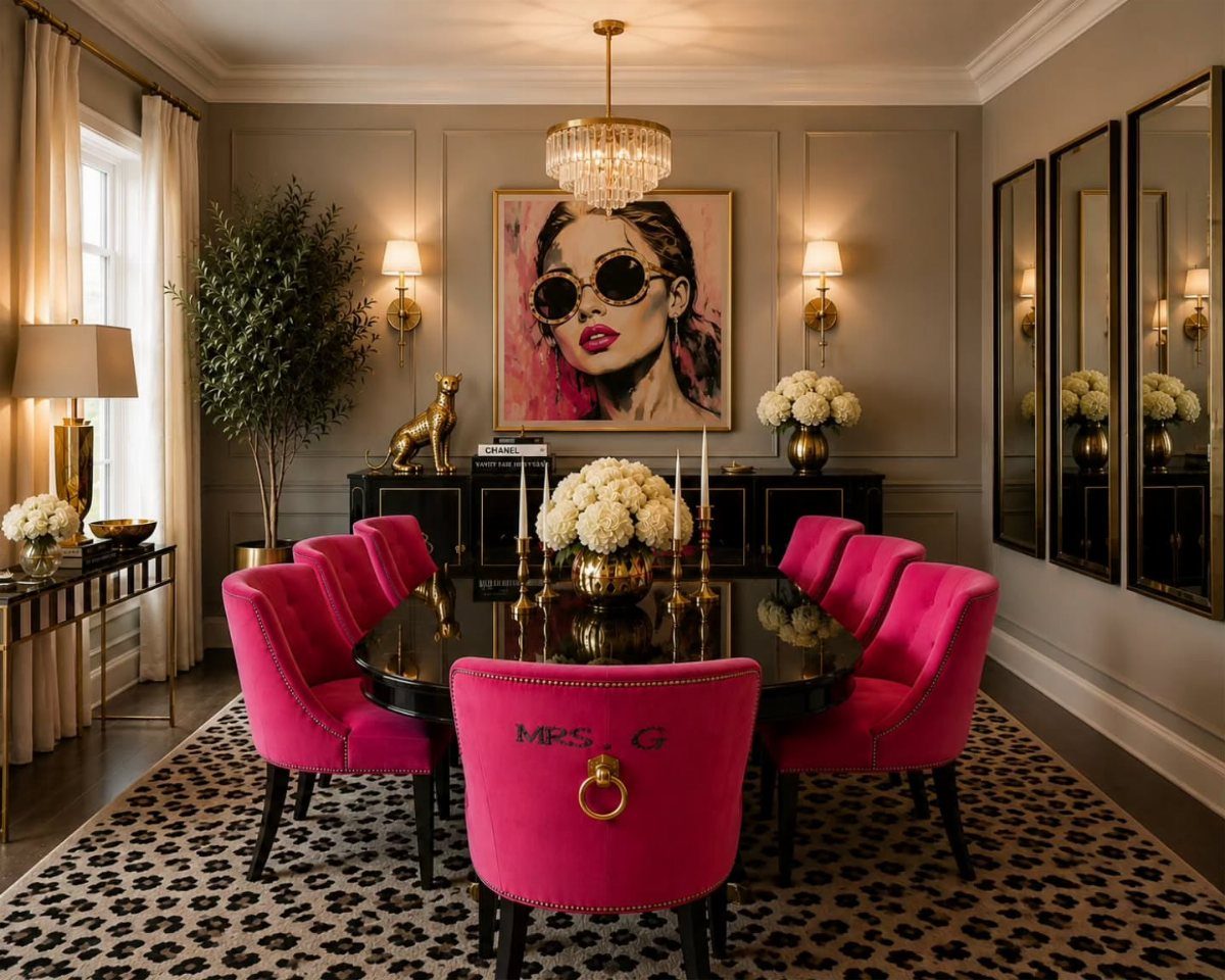
Align the table with a window, a fireplace, or a piece of art instead of centering it purely by the walls.
I use this when the room has one feature worth anchoring to, and the math puts the table slightly off-center from the floor plan.
The table reads as placed with purpose rather than dropped wherever it fit, and the layout works with what the room already gives you instead of fighting it.
This works best when the feature sits on the wall you face from most seats.
Room Flow and Access
Measure from the table edge to the nearest door swing, and leave at least 36 inches so the door clears when someone stands to pull out a chair.
When a buffet or sideboard sits along the wall, measure from its front face, not the wall itself, and keep 36 inches between it and the table so drawers open and someone can serve from the top without asking diners to scoot in.
A table centered in the room by the walls can still block the natural path if the entry sits off-center.
Walk the route you take most often before you commit to the placement, and adjust toward the less-traveled side when the room forces a choice.
Room Style and Materials
If the room already holds wood cabinetry and trim in warm tones, a table in a contrasting material, such as glass, metal, or colored acrylic, keeps the space from reading as one continuous wood surface.
The table stands out as its own piece instead of blending into the background.
When the palette runs to white, gray, or other cool colors, a table in natural wood adds warmth and weight.
The grain and tone anchor the dining area without introducing a new hue that every other piece has to work around.
Match the table’s form to the room’s character. A sleek, modern space calls for clean lines and minimal profiles, while a traditional room supports more substantial proportions and turned or carved details.