
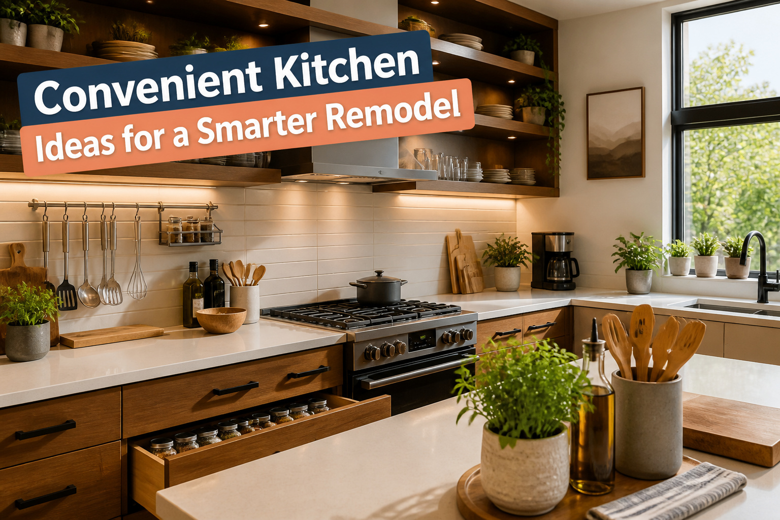
A smart kitchen remodel in 2026 runs from a $20 kickplate drawer to a $3,800 wall removal, and the right spend depends on whether you own the place or answer to a landlord. The projects that actually get finished share one trait: they were planned before the cabinets arrived, not patched in after. Even the toe-kick vacuum opening, which turns a broom sweep into a dustless vanishing act, needs central vacuum lines roughed in during framing. That detail alone decides whether it belongs in your build or someone else’s.
1. Kickplate Vacuum Openings
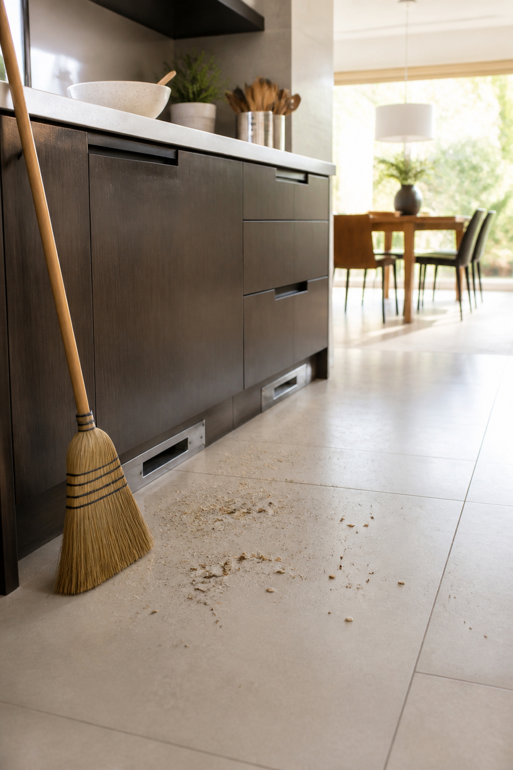
The toe kick at the base of kitchen cabinets is usually dead space, but a vacuum opening routed into that kickplate turns it into a sweep-and-done cleanup tool. The vent ties into a central vacuum system, so crumbs and dry debris go straight into the pipe instead of a dustpan.
This setup works best for kitchens that see constant light mess: toast crumbs every morning, flour dust from weekend baking, the kind of debris that never quite justifies hauling out the full vacuum. A quick sweep with a broom or brush, and the debris disappears.
One caveat worth weighing: sweeping stirs particles into the air before they drop through the opening. For anyone tracking indoor air quality, a central vacuum with a HEPA filter still outperforms this for deep cleaning. The kickplate slot is a convenience play for daily tidying, not a replacement for proper suction on rugs and crevices. It suits homeowners already running central vacuum lines, or those planning a remodel where the routing is easy. Retrofitting into finished cabinets is a heavier lift, and the payoff drops fast.
2. Kickplate Hidden Drawers
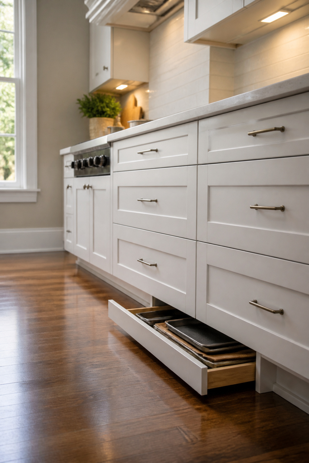
The recessed strip at the base of kitchen cabinets, usually just dead space behind a finished board, can hold a thin drawer for flat items that otherwise slide around or disappear into the back of standard cabinets. Cookie sheets, cutting boards, and shallow cleaning supplies fit here because the kickplate area offers only a few inches of vertical clearance. A pull-out step stool works too, though anything bulky or deep will bind or refuse to close.
This is almost always a custom add-on rather than something found in prefabricated cabinetry, which means planning it during a remodel rather than retrofitting later. The payoff is storage that hides in plain sight; most people do not think to look below cabinet level, so it can even double as a discreet spot for valuables.
3. Integrated Waste Solutions
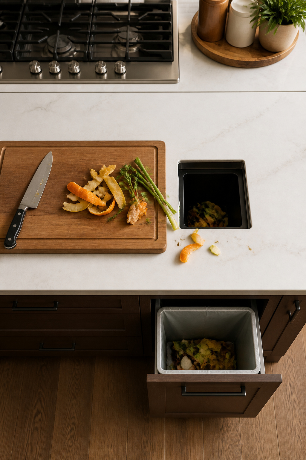
A compost opening cut directly into the counter keeps scraps invisible from the moment they leave the cutting board until you lift the bin below. I have watched friends sweep onion peels into a discreet slot beside their sink, the same motion they use for brushing crumbs, and the scraps simply disappear. No ceramic crock taking up prep space, no lid to lift with an elbow when both hands are wet.
The opening leads to a concealed bin that pulls out from inside the cabinet. Most cabinet manufacturers now offer these as dedicated pull-out systems, so the feature no longer demands a custom build. You prep, you sweep, the bin slides out when full.
A toe-kick opening connected to a central vacuum serves the same philosophy for dry debris. Sweeping directly into the recessed base of the cabinet removes the dustpan from the equation entirely. I would note the same reservation I have seen raised: sweeping stirs fine particles into the air in a way vacuuming with a HEPA filter does not. The kickplate option works best as a quick cleanup after cooking, not as your primary method.
4. Gliding Rails and Cabinetry
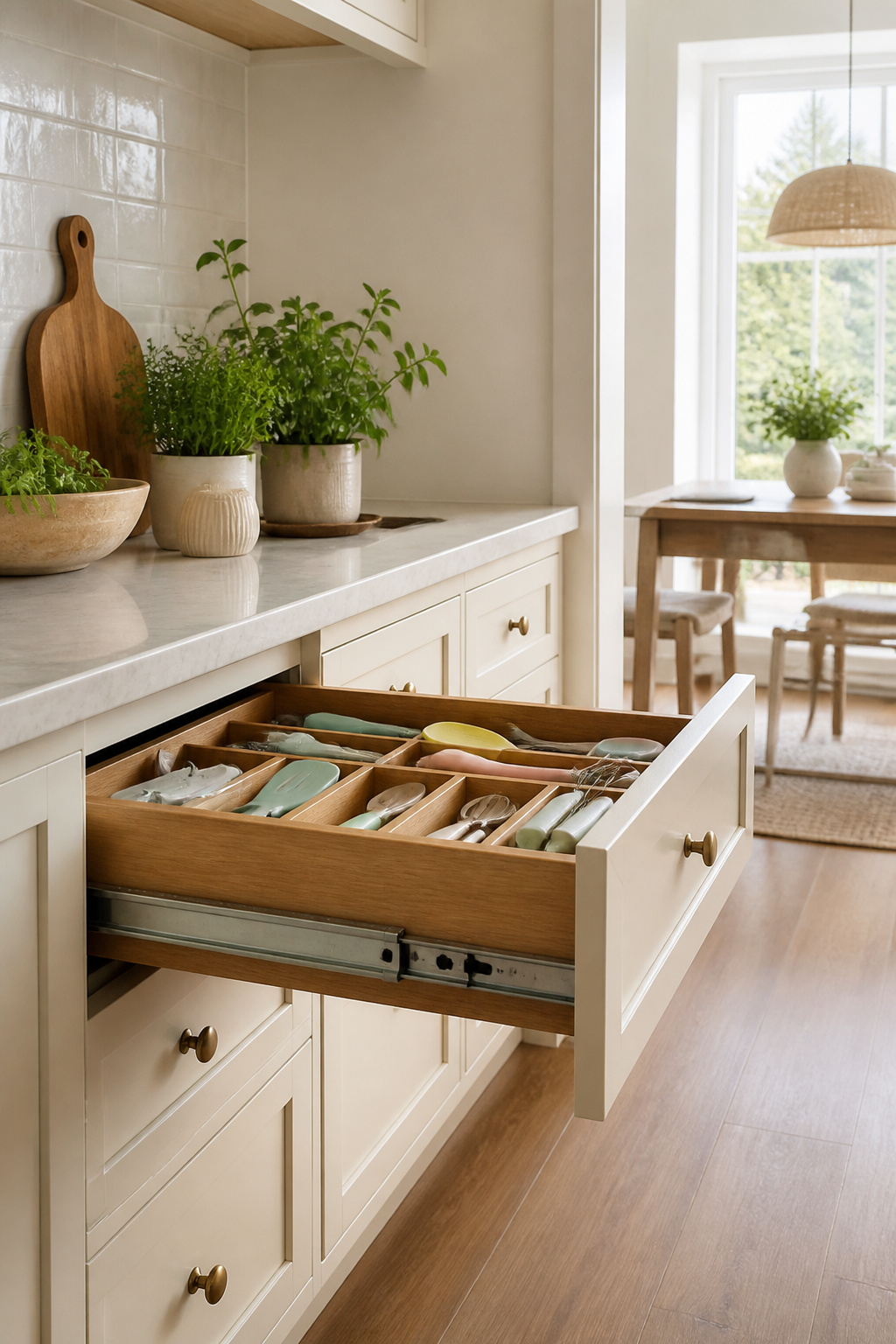
Full-extension drawer slides with soft-close dampening change how a kitchen actually works. The drawer rolls out until the back corner is in daylight, not a guessing game, and a hydraulic brake finishes the close so the box never slams. Retrofit or specify them from the start: new cabinets let you order the rail length and side-mount type matched to the box, while retrofits mean pulling the old drawer, measuring the side clearance, and buying a slide set rated for the load — pots and pans need a higher weight class than the silverware drawer. Blum, Hettich, and Salice are the names that keep coming up in professional kitchens for a reason; the hardware outlasts the finish on the face. I spent the extra on a mid-tier rail in my last rental refresh and the difference was immediate. The old three-quarter extension slides left spatulas and backup batteries in permanent shadow. The new ones brought everything forward. Cost spreads thin when you open that drawer twenty times a day and it still glides like butter twenty years later.
5. Tall Item Storage
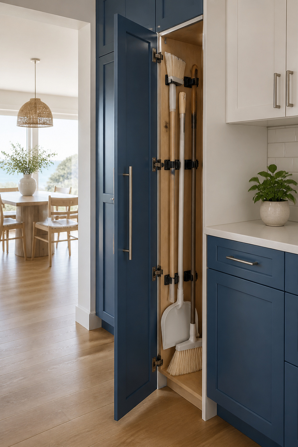
A vertical pull-out cabinet turns the dead six-inch gap beside your fridge into upright storage for brooms, trays, and the handheld vacuum that otherwise lives on the floor. The cabinet face looks like any other panel, but pull the handle and the whole column rolls forward on glides, hooks or clips holding each item so nothing topples when you move it.
Narrow gaps between appliances or cabinets are where these work best. That space between the wall and the refrigerator, or the sliver left where cabinet depths don’t quite line up, becomes a full-height pantry for platters and baking sheets that never stack neatly anyway. The hardware costs more than a basic shelf, though in a small kitchen the square footage you reclaim is square footage you do not have to find elsewhere.
I would not bother with one if the gap is under four inches; you are storing broom handles, not chopsticks, and the mechanism itself needs room. For renters, this is only practical if you are already replacing cabinetry or have a landlord who will let you remove a filler panel without fuss.
6. Appliance Garages
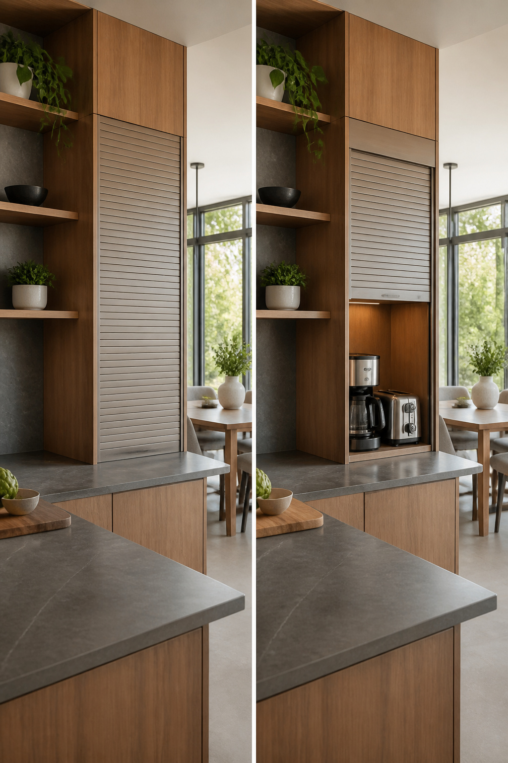
Counter space disappears fast when the toaster, coffee maker, and blender all claim permanent real estate. An appliance garage tucks them into a dedicated compartment with a roll-up or lift-up door, so the counter reads as clean surface instead of cluttered staging area.
The door style matters more than I expected at first. A tambour door, the kind that rolls up into a pocket above the opening, stays out of your way while you plug in or pour. A standard hinged door would block the work zone every time you reached for the morning coffee. That sliding mechanism is what makes the storage actually usable, not just hidden.
Not every appliance earns this kind of built-in home. The ones you use daily, the coffee maker you touch before speaking to anyone, the toaster for the one kid who only eats bread warm, those are worth the cabinet depth and the door hardware. The blender you run twice a month can live in a regular cabinet or the pantry. The garage is for frequency, for the ritual tools that otherwise colonize the counter permanently.
In a smaller kitchen, the payoff is visual room to breathe. Gabriela Eisenhart used one in an Atlanta historic home to keep a tighter footprint functional without stripping out the early twentieth-century character. The appliances stay plugged in, stay accessible, and stay out of sight. That last part is what makes the kitchen feel finished rather than merely organized.
7. Disguise Storage
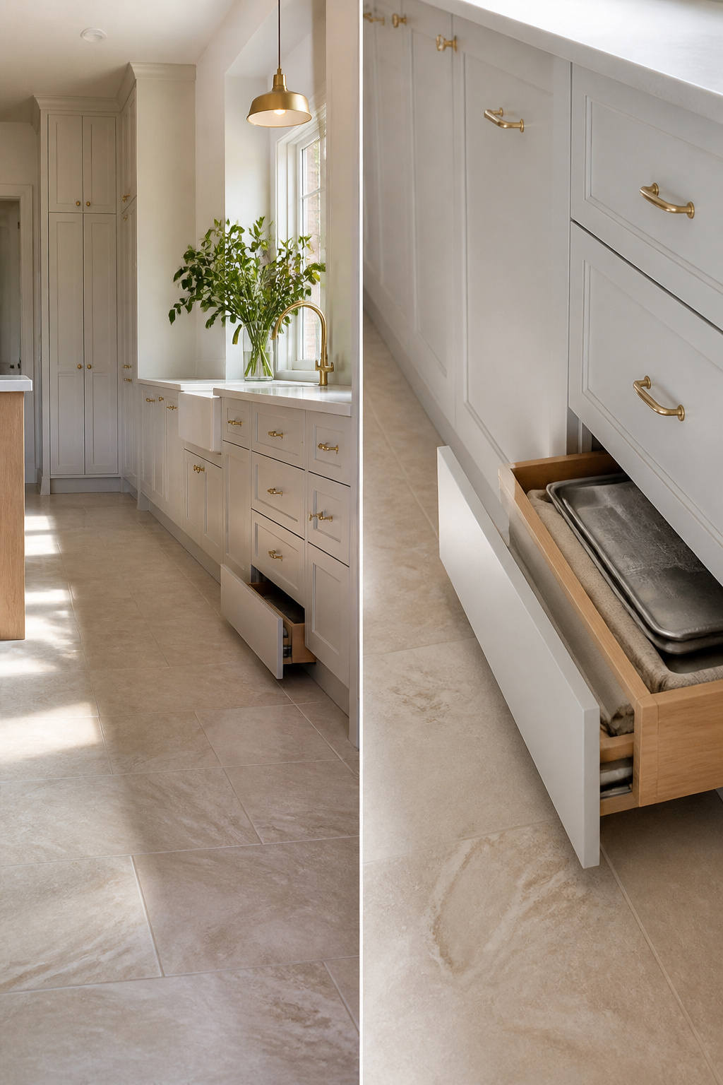
The best storage is the kind the eye skips right over. A toe-kick drawer, for instance, sits where most cabinets dead-end into the floor, turning that wasted four-inch gap into a shallow tray for baking sheets or dish towels. The face reads as ordinary baseboard until you nudge it with a toe.
Panel fronts do the same heavier lifting. A refrigerator wrapped in cabinet-matched panels becomes indistinguishable from the wall beside it, and the visual break of stainless steel disappears. The same treatment on a dishwasher or microwave housing quiets the room without shrinking the appliance count.
For walls with no run of cabinets to hide behind, floor-to-ceiling cabinetry painted to match the surrounding plaster reads as architecture rather than furniture. One designer working a studio kitchen used cerused slate grey cabinets specifically to disguise what he did not want to see, letting the storage sink into the wall plane while open white oak shelves handled the display.
Camouflage pays off most in small or open kitchens, where every visible cabinet competes for attention. The trick is committing to the illusion: mismatched hardware or a slight color shift undoes the effect faster than plain exposed storage would.
8. Carve a Thin Nook
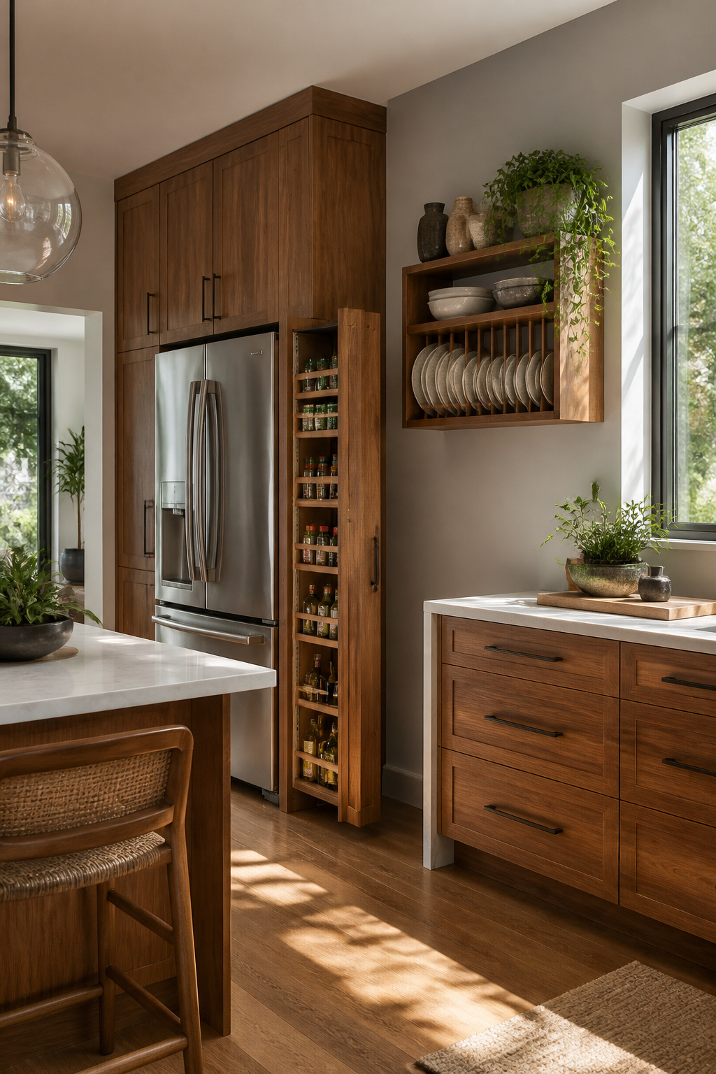
The six-inch gap beside most refrigerators is dead space until you turn it into a pull-out rack for oils and spices. I built one from a flat-pack cabinet and a set of drawer slides, mounted to the side wall instead of the fridge itself so nothing rattled. The front panel matched the existing cabinets, which made it invisible until you pulled the handle.
Six inches is enough for standard spice jars laid flat or small bottles on their sides, but my first try used full-extension slides and a heavy MDF box. The weight made it sag after three months, and the bottom scraped the floor every time. Swapping to a lighter plywood shell and three-quarter-extension hardware fixed it; the shorter travel actually keeps the contents from tipping anyway.
Between open studs you get the same depth with no cabinet box at all. A shallow shelf screwed to blocking between the studs holds cleaning tools with a broom clip, or a slim rack for foil and wrap boxes. The face sits flush to the drywall line, painted the wall color so it reads as trim rather than storage.
9. Install a Pot Rack
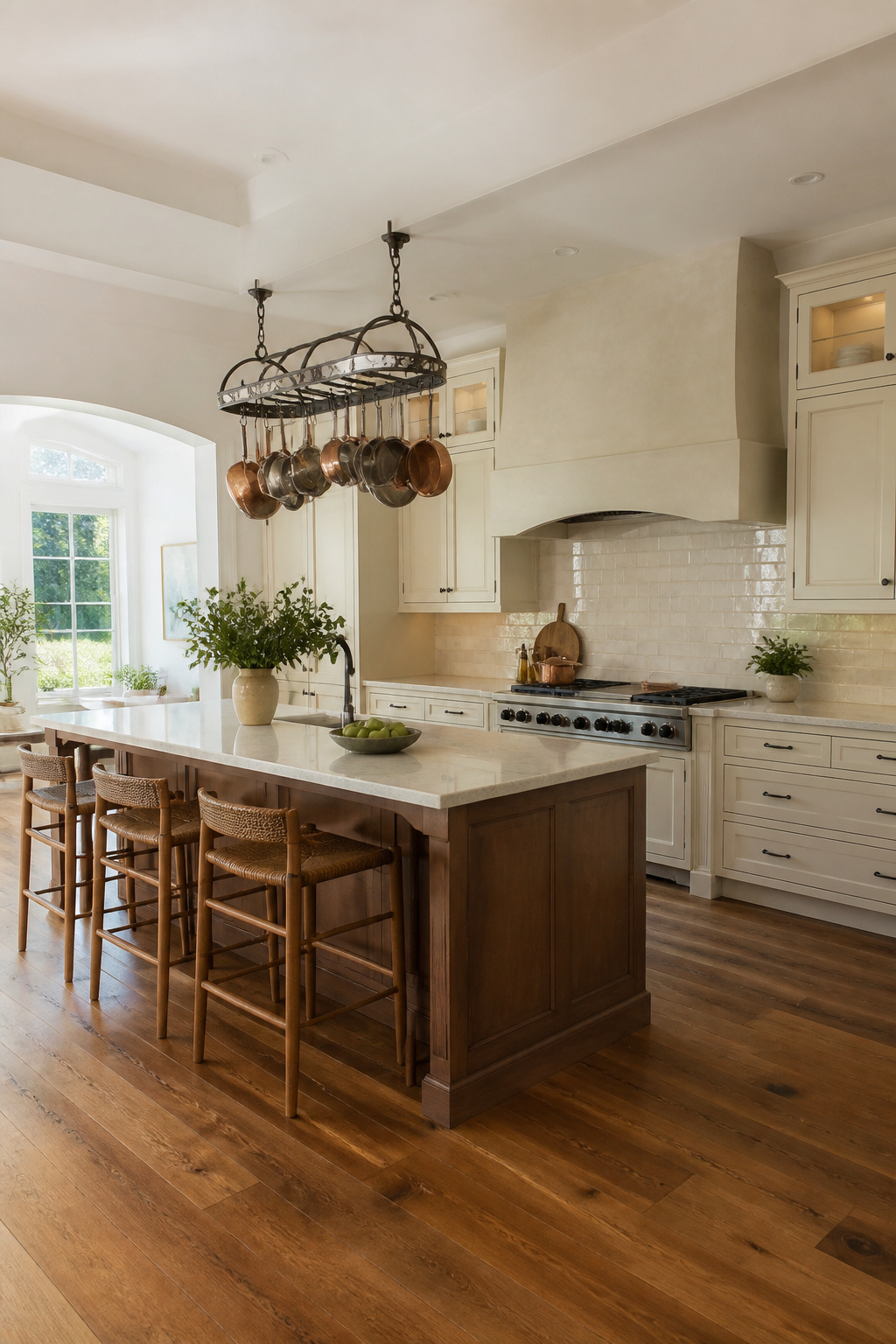
Ceiling-mounted pot racks eat up the vertical space most kitchens ignore and free the cabinet shelf you were stacking pans on sideways. The chain or rod system needs to hit ceiling joists, not drywall alone, or the whole thing comes down once you load it. My first attempt was a wall-mounted grid over the stove, which seemed smart until every sauté session coated the lower hanging pieces in grease. Wall-mounted racks belong on an empty wall, not the cooking line. Weight limits printed on the bracket matter more than you think; I once hung a full cast-iron set on a rack rated for half that, and the lag bolts started pulling out of the stud within a month. For plaster ceilings, you will need toggle anchors sized to the load, and the drop length has to clear the tallest person’s head by a few inches or you will duck every time you cross the room. The pans you reach for daily belong on the rack; the Dutch oven you use twice a year can stay in the cabinet it just vacated.
10. Forgo Upper Cabinets
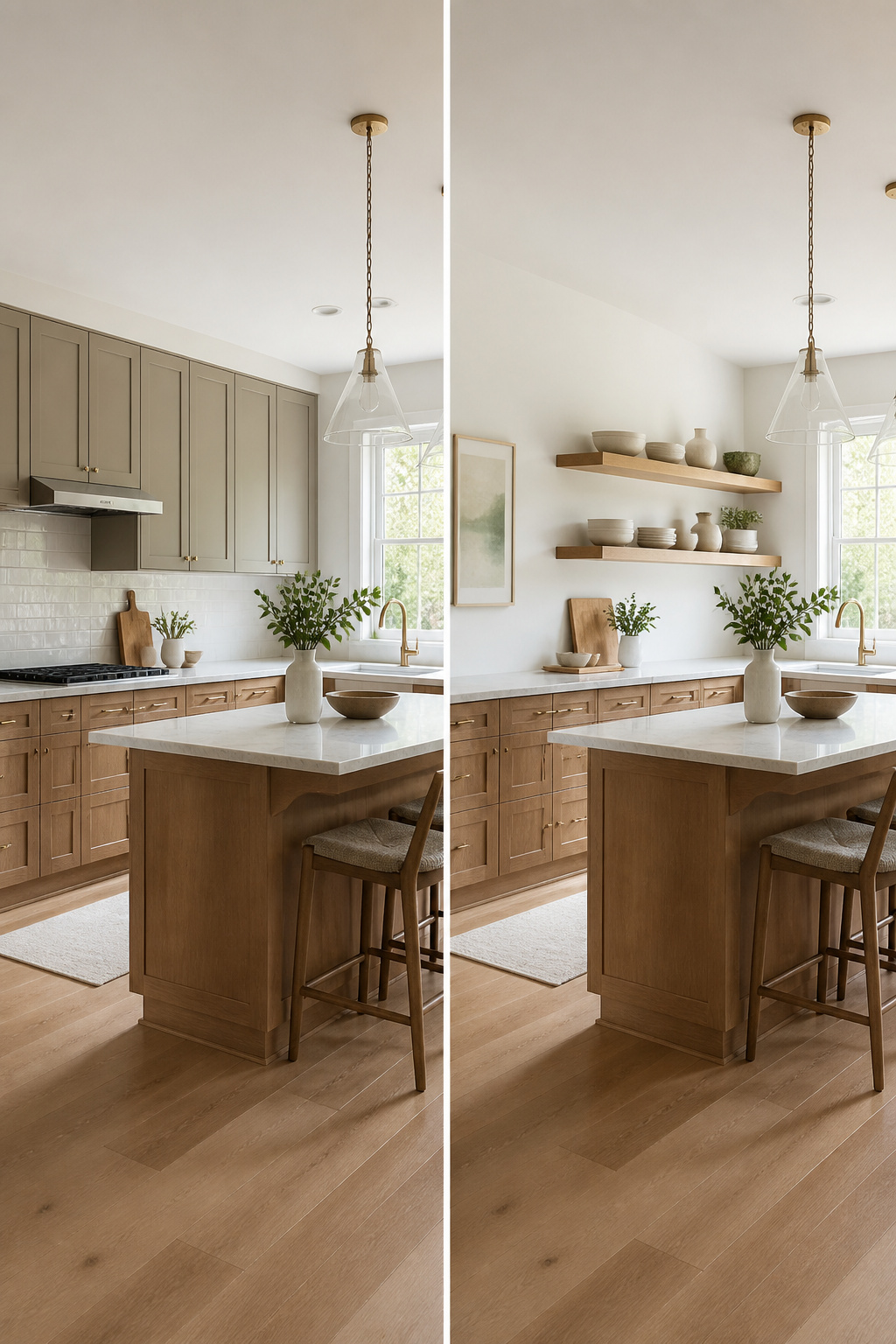
Upper cabinets at eye level swallow light and air in a kitchen that already feels tight. Removing them, or skipping them entirely, trades that boxed-in feeling for wall space that can hold a window, a single piece of art, or nothing at all. The room reads larger because your eye travels to the end of the wall instead of stopping at a cabinet face.
The storage does not disappear; it relocates. Floating shelves keep dishes accessible and reflect more light than solid boxes, though everything sits in the open. A cool white paint on the remaining walls, like the contrast Ashley Maddox and Hilary Walker used against dark lower storage, bounces what natural light you have. What you give up is hidden capacity: the clutter you could shove behind a door now needs a drawer or a disciplined edit. For a weekend remodel with a few hundred dollars in lumber and paint, the swap is workable. For someone who cooks daily with mismatched gear spilling from every shelf, the openness becomes a second job.
11. Use a Reflective Backsplash
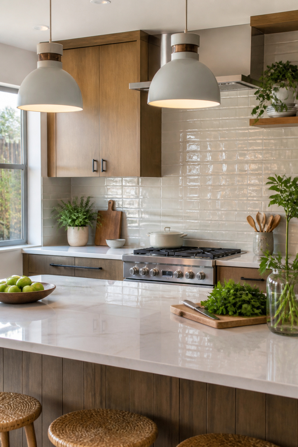
Glossy tile, glass, and metal backsplashes do more than protect walls. They bounce available light through a dark galley or a kitchen with a single window, stretching what little daylight the room receives. In a narrow layout, that reflection keeps the space from feeling like a corridor.
A reflective backsplash made from stone or tile is the safer play over mirrored panels. Mirrored glass looks dramatic in photos, but a single chip or grease splatter turns it into a maintenance headache, and the safety risk near a cooktop is real. Shiny black tile gives much of the same spatial lift without the fragility.
High-gloss cabinet finishes and stainless steel appliances amplify the effect if you are already replacing those. If not, the backsplash alone still changes how the room reads at 6 p.m. in January. I would skip the metallic mosaics that trend on Pinterest. They read dated fast, and the grout lines turn dark with cooking grease. A large-format glossy tile with minimal grout cleans easier and reflects more evenly.
For renters, peel-and-stick glass tiles exist, but the adhesive tolerates heat poorly near gas ranges. Test a corner behind the kettle before committing the full run.
12. Open the Layout
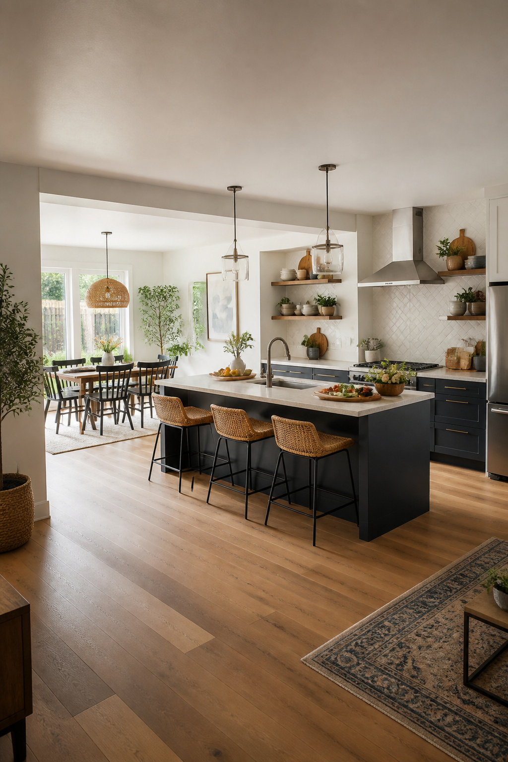
Opening a kitchen wall changed how I actually use the space more than any cabinet or appliance ever could. My own project stalled for three weeks because I assumed the wall between my kitchen and dining room was load-bearing; it turned out to be a simple partition framed with 2x4s, but the only way to know is to look at the joist direction and check for a continuous beam below. A structural wall carries weight from above down to the foundation, and cutting it without adding a header or post risks serious damage. I hired a structural engineer for a two-hour consultation to confirm what I suspected, then brought in a contractor for the actual beam installation because the permit required it. Widening a doorway instead of full removal costs less and still gains you sightlines and conversation across rooms. For renters, this is obviously off the table, but a wide cased opening with no door can mimic the feel without touching structure. My total outlay ran about eight hundred dollars for the engineer and the permit, plus another three thousand for the contractor’s beam work; the partition removal I did myself over a long weekend with a reciprocating saw and a lot of plastic sheeting.
13. Hide Your Appliances
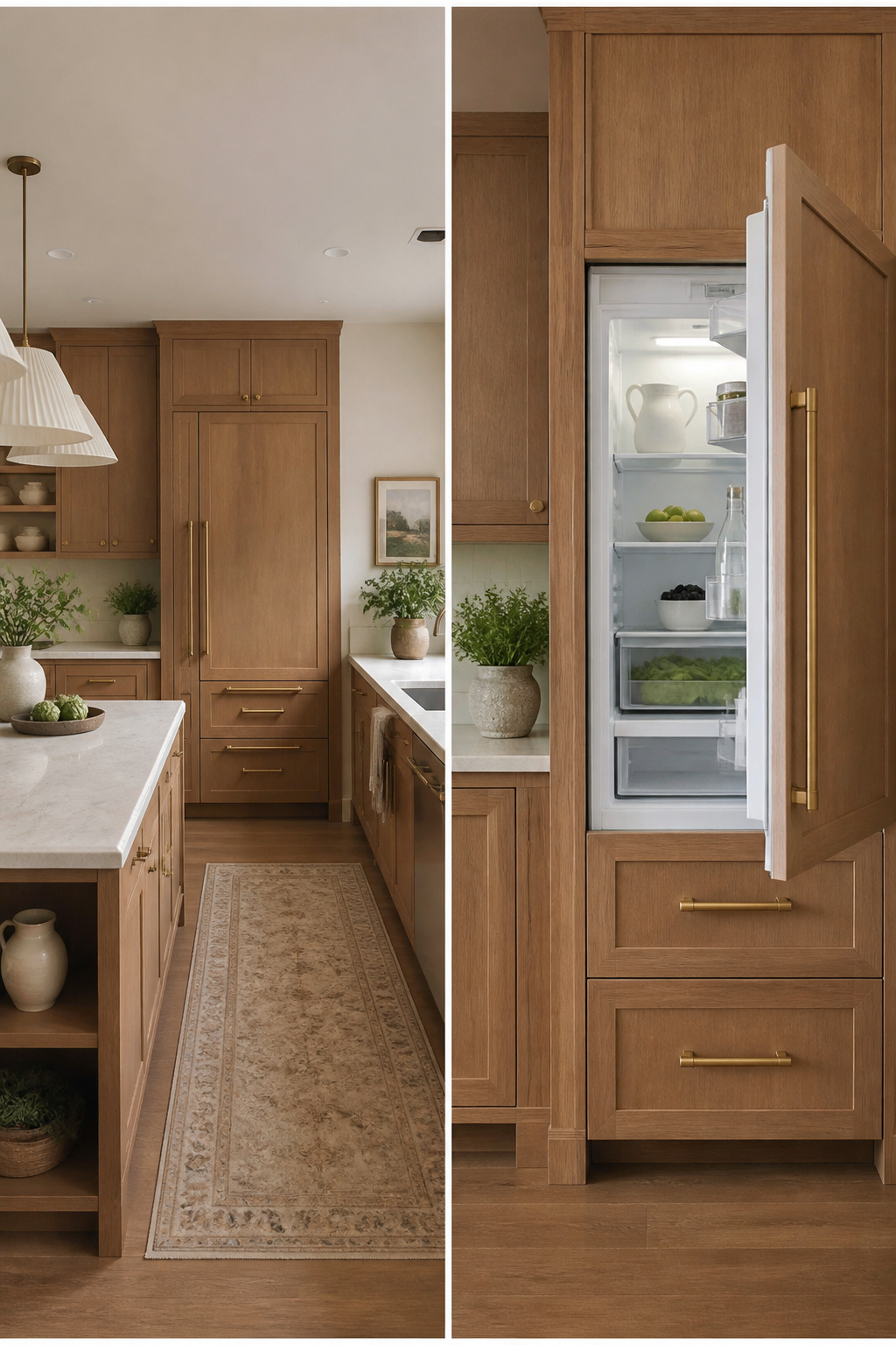
Panel-ready refrigerators let you bolt on a cabinet face so the appliance vanishes into a run of millwork. The same idea works for dishwasher drawers slipped under a counter at knee height, and for range hoods boxed in with crown molding to look like a furniture hutch. I priced this out twice. In my rental, the upcharge for the panels and the custom framing ate most of my budget, and the landlord still made me rip it out on move-out. The fridge looked built-in, but I could not take the carpentry with me. In the house I bought two years later, the math flipped. The panel-ready units cost more upfront than standard stainless, but the seamless wall of cabinetry raised the resale appraisal enough to cover the difference. Hoods are the easy win; they need only a surround, not a special appliance. Drawers are the luxury pick. I skipped them in both places and used the savings on better pulls and hinges instead.
14. Add Millwork to Your Island
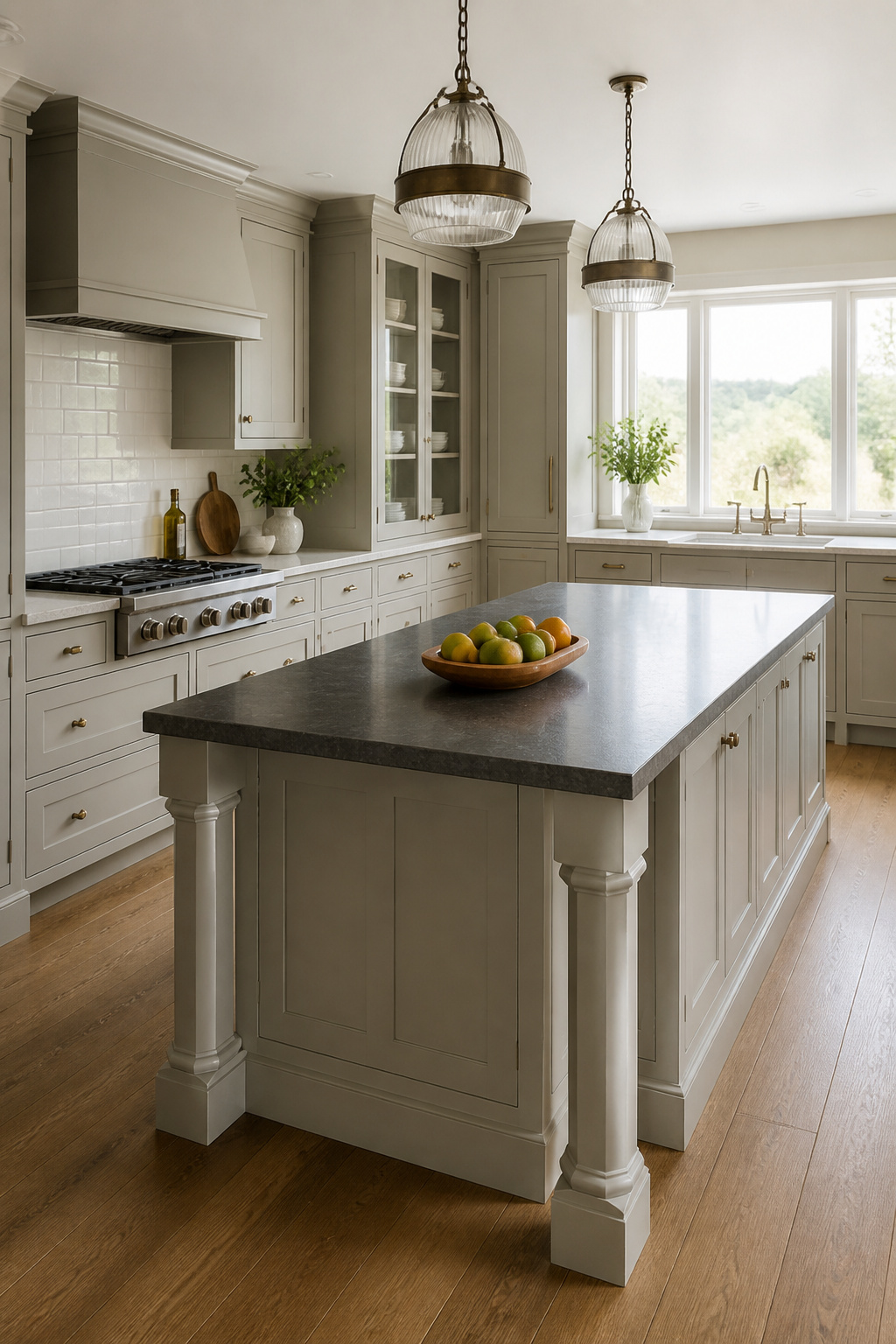
Stock islands sit like boxes dropped in the middle of the room. Millwork is what fools the eye into thinking someone built the thing on site.
I added a simple baseboard around the toe kick on mine first. Cost almost nothing, took an hour, and suddenly the island talked to the cabinets instead of floating alone. Crown molding on top did more of the same, though I learned the hard way that MDF crown on an island takes a beating from mop water and swells at the corners. Paint-grade poplar holds up better for the same price.
Furniture-style legs at the corners were the biggest upgrade. They lift the cabinet body off the floor visually, and they hide the fact that the island is three prefab cabinets screwed together. Mine are straight 4x4s turned on a neighbor’s lathe, but store-bought bun feet work fine.
The sag came later. I tried a decorative bracket under the overhang, ornate and curvy, and the weight of leaning elbows on the countertop slowly pulled its screws through the particleboard side panel. A plain corbel, screwed into the cabinet frame itself, would have been the stronger choice. Live and learn.
15. Paint Cabinets Two Different Colors
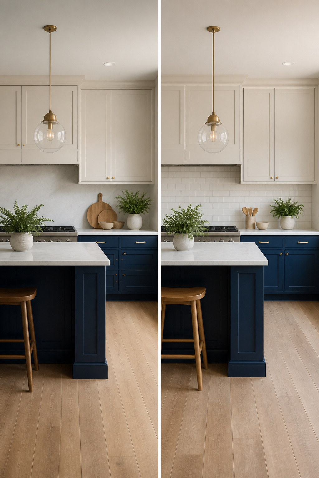
Two-tone cabinets split the job into zones that make sense: uppers against lowers, island against perimeter, or body against trim. The first option I tried was navy lowers with warm white uppers, and the contrast did exactly what it was supposed to do. The dark color anchored the room at eye level while the lighter shade kept the walls from closing in. What aged badly was a gray-green island against cream perimeter cabinets. The undertones fought for two years until I repainted.
The combination that holds up pairs a rich, muted color below with a warm neutral above, or reserves the bold shade for the island and keeps perimeter cabinets quiet. Calm neutrals at the focal point, strong color on the perimeter: that hierarchy keeps a small footprint from feeling busy. Glossy or lacquered finishes on the darker tone add depth without extra square footage, though matte paint hides the fingerprints that show up at kid height.
16. Choose Shorter Cabinets
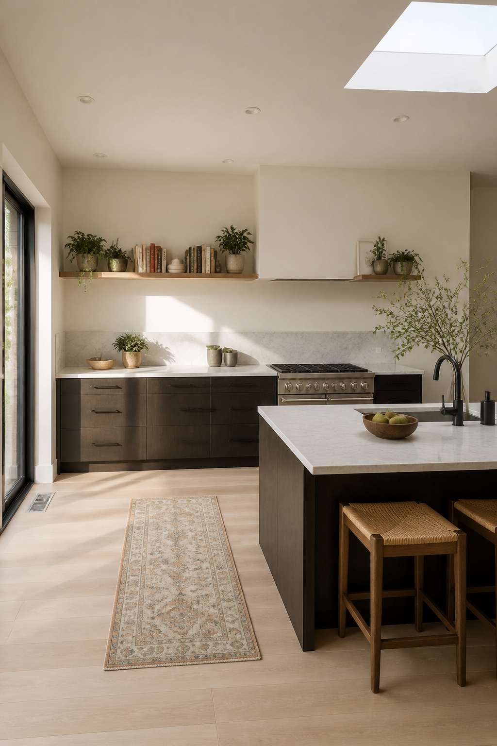
Wall cabinets that stop at 30 or 36 inches leave a band of open wall above them that the standard 42-inch run erases entirely. That gap becomes usable real estate: a shallow ledge for plates you reach for daily, a row of small windows if your sink faces an exterior wall, or just breathing room in a kitchen that otherwise boxes you in on all sides.
The trade is storage, obviously. I moved my lesser-used serveware and the extra coffee mugs into the base cabinet by the stove, which actually made more sense once I thought about who grabs what where. The everyday glasses stayed at eye level; the holiday platter I use twice a year went down low. Reaching a little lower for the occasional thing beats staring at a solid wall of cabinet every morning.
The sweet spot is 36 inches for most kitchens, which still handles standard dinner plates upright while buying you that upper zone for something better than more painted MDF. In my own redo, the open stretch above became a narrow shelf for cookbooks and a trailing pothos that gets better light than I do. The kitchen feels taller, and I notice the ceiling now instead of a cabinet crown molding I never asked for.
17. Build Into the Wall
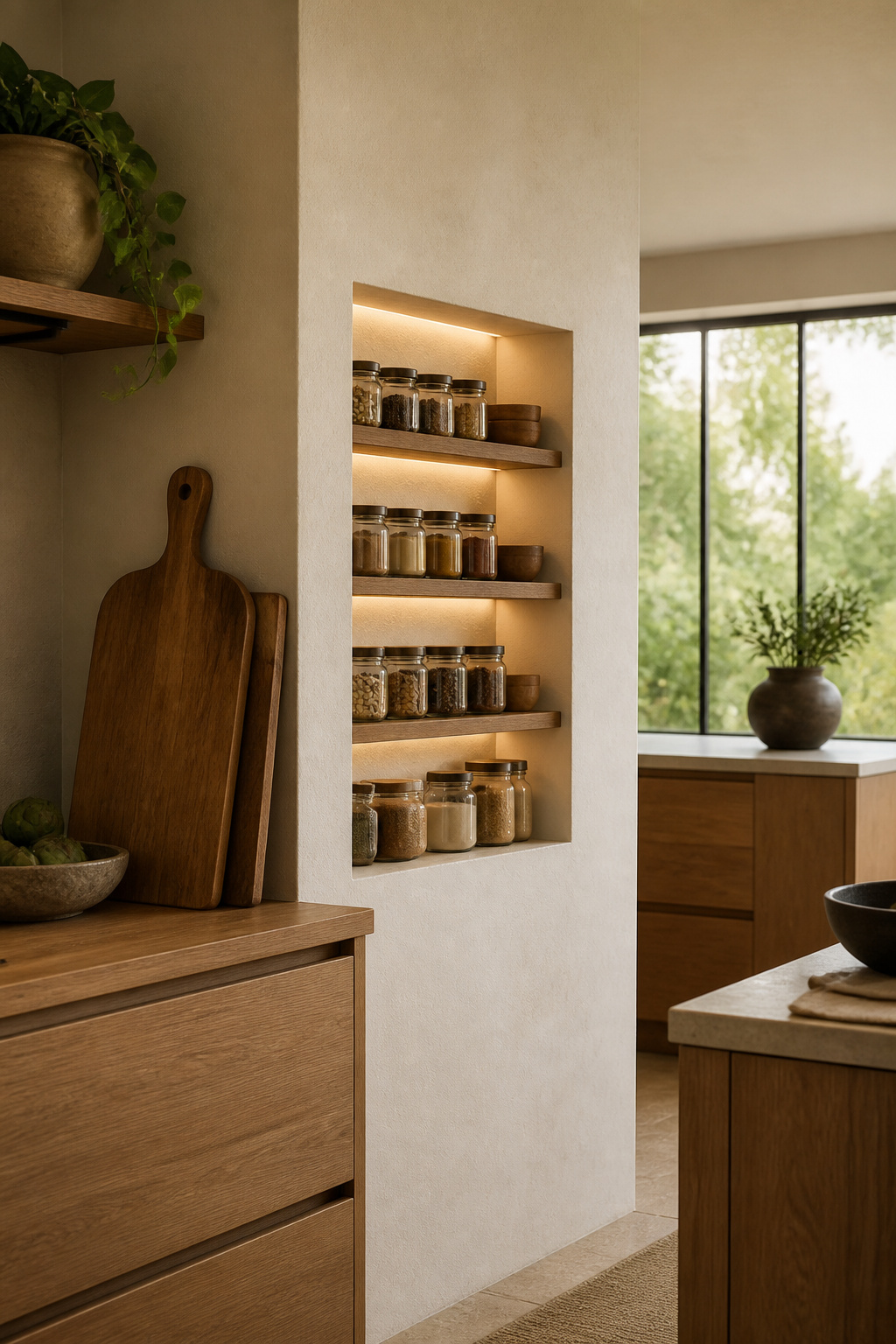
The space between wall studs runs about 14.5 inches deep in standard construction, and most of that sits empty behind drywall. Cutting into it for a recessed niche gives back storage without stealing floor space or counter depth. I have watched this go wrong enough to know the wall tells you where you can work.
Studs sit 16 inches apart on center, but the cavity between them fills fast. Electrical runs vertically, often at switch height or along the base plate. Plumbing stacks travel the same channels, especially on walls backing a bathroom or laundry. A stud finder marks the wood; it does not mark what is inside. The only way to know is to cut a small inspection hole first and look, or use an endoscope camera if you want to keep the drywall repair small.
Spice storage works in a shallow recess, maybe 3 to 4 inches deep after you add a back panel. Magnetic knife strips mount directly to the stud face if you strip the drywall back. A shallow pantry needs more depth, so you chase the niche only until the first obstruction, then box it in. The projects I have seen fail came from assuming the cavity was clear because the stud finder said "stud here, stud there." The tool was right about the wood. It said nothing about the drain line.
"Built-in storage played a central role in that balance… They give the eye a place to land and offer room for everyday objects that add warmth without creating clutter."
That balance only holds if the recess is usable. A niche cut through a plumbing wall becomes a leak waiting to happen, and a spice shelf behind a live wire run is not worth the electrician’s bill. The wall you want is the one with nothing in it, or the one where you can reroute around a single stud bay. Check before you cut, and build only where the wall lets you.
18. Choose a Curved Island
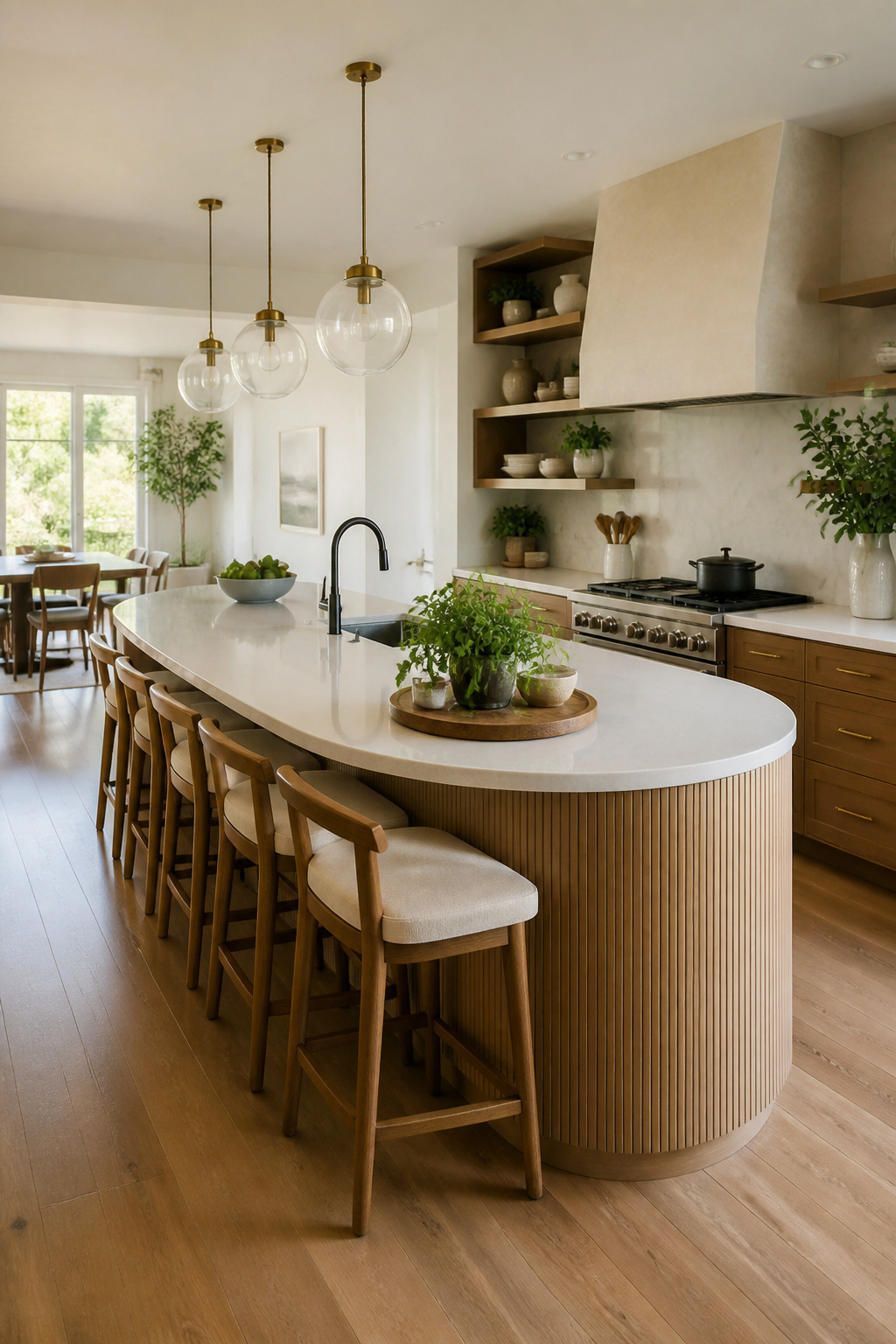
Rounded edges on a kitchen island buy you more usable square footage than the drawing suggests, because the traffic path doesn’t have to clear a hard corner. In a tight kitchen, an elliptical overhang lets two stools tuck in where a rectangle would jut into the walkway. The curve also softens the approach from multiple angles, which matters when more than one person is cooking or a kid cuts through at speed.
Where the geometry fights you is at the dishwasher. A curved counter that sweeps too far past the dishwasher door creates a pinch point; the open door and the stool leg and the person loading plates all want the same six inches. A kitchen peninsula layout, when a full island will not fit, can avoid this entirely by angling the seating away from the appliance zone, but if you are committed to the island, keep the curve shallow on the dishwasher side or accept that one seat will stay vacant when the machine is open.
19. Choose Light Wood
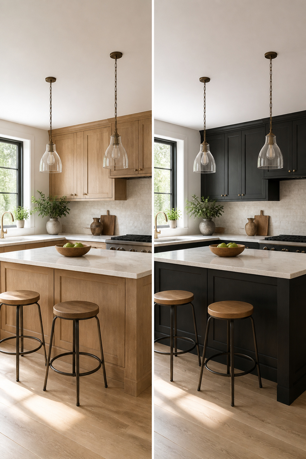
Pale oak, maple, or ash finishes bounce light around a kitchen in a way painted cabinets never quite manage. The grain adds warmth without weight, and the pale tone keeps walls from feeling like they’re closing in on you. I learned the hard way that not every light finish stays light. My south-facing kitchen sat in direct afternoon sun, and the cream-painted cabinets I started with yellowed within two years. The light wood cabinets I replaced them with aged more gracefully; the tone shifted slightly, but it never looked dirty or dated. If your kitchen faces south, skip the painted route and go straight to pale wood. The upfront cost runs about the same, and you will not be repainting in twenty-four months.
20. Make It Monochromatic
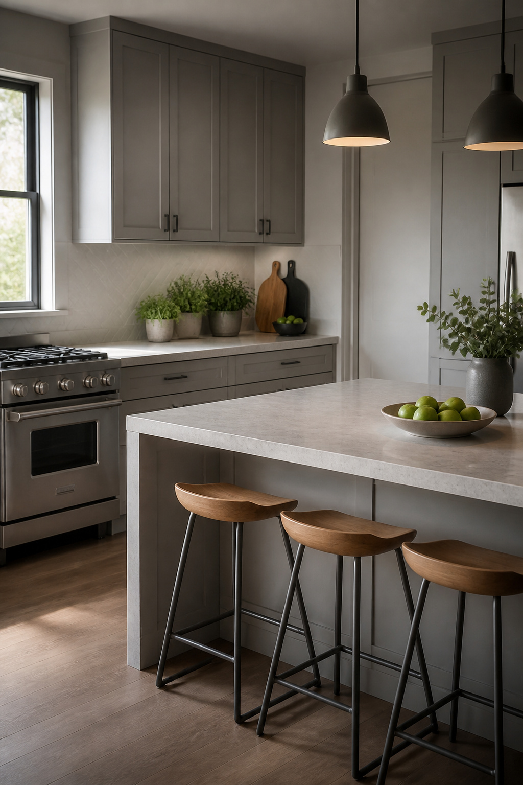
A single color running from cabinets to trim erases the edges that chop a small kitchen into smaller pieces. I went with a soft gray after testing a few swatches, and the walls finally stopped feeling like they were closing in on the stove. The trick is keeping the value consistent enough that the eye glides past the joints. Where I missed was the ceiling: same gray, same sheen, and the room turned flat instead of calm, like a photo with the contrast slider pulled too low. A half-shade lighter on the overhead plane would have kept the lift without breaking the scheme. Pastels work the same way, powder blue or sage green, as long as the cabinets, walls, and trim share the exact same base. Matte black fixtures against that quiet field add just enough punctuation without cluttering the read.
Frequently Asked Questions
How can I make a small kitchen feel bigger?
Use light colors, reflective surfaces, and open shelving. Glossy tile, glass, or metal backsplashes bounce light through narrow galleys, while swapping upper cabinets for floating shelves lets your eye travel to the wall instead of stopping at a solid box. A cool white paint on remaining walls amplifies whatever natural light the room already receives.
What are some clever storage solutions for small kitchens?
Carve into dead spaces most people ignore. Toe-kick drawers hide flat items like baking sheets at cabinet base, thin pull-out racks turn the six-inch fridge gap into spice storage, and vertical pull-out columns claim the sliver beside appliances for brooms and trays. Between open studs, shallow shelves hold cleaning tools without stealing floor space.
How do I choose the right color scheme for a small kitchen?
Pair a rich, muted color below with a warm neutral above, or reserve the bold shade for the island and keep perimeter cabinets quiet. Navy lowers with warm white uppers anchor the room at eye level while preventing walls from closing in. Avoid gray-green against cream; undertones can fight for years.