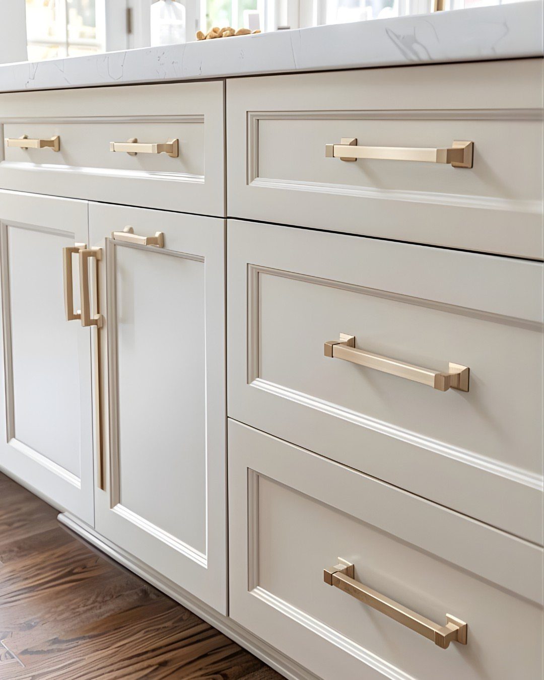
Gold hardware matches cabinet finishes from stark white to deep black, and the pairing changes how formal or relaxed the kitchen feels.
Cabinet color determines how gold reads in the space, so pick one that supports the finish rather than fighting it. Match the gold tone to other metals in the room so everything reads as one palette instead of competing finishes.
1. White Cabinets with Gold
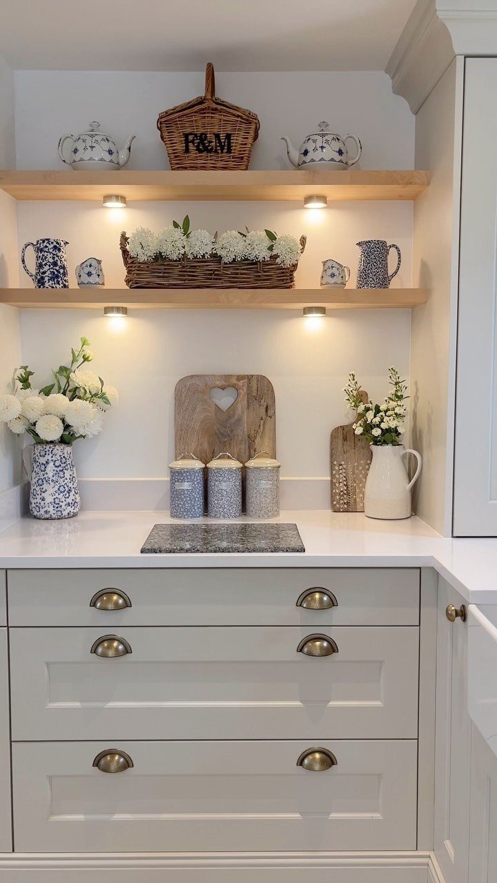
White cabinets let gold hardware take center stage without competing for attention. The finish reflects light around the room, which makes gold pulls or knobs feel deliberate without looking cluttered.
I’d match the gold tone to other metals in the space.
If your faucet or light fixtures lean warm, brushed or satin gold keeps everything cohesive. Polished gold reads more formal and suits kitchens with traditional cabinets and detailing.
White shows fingerprints and kitchen grime faster than darker finishes, so plan on wiping down doors near the stove and sink more often.
2. Wood Cabinets with Gold
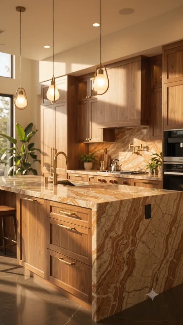
Wood grain brings texture that contrasts with the smooth finish of gold hardware. Lighter woods like oak or maple make gold feel warm without overwhelming the space, while darker walnut or cherry create more drama.
The grain pattern affects how much the hardware stands out.
Straight grain keeps the focus on the gold, while figured or knotty wood competes visually. I’d choose simpler hardware shapes on busier wood to keep the look balanced.
Oil or wax finishes on wood need reapplication every few years to prevent drying and cracking near the hardware.
3. Green Cabinets with Gold
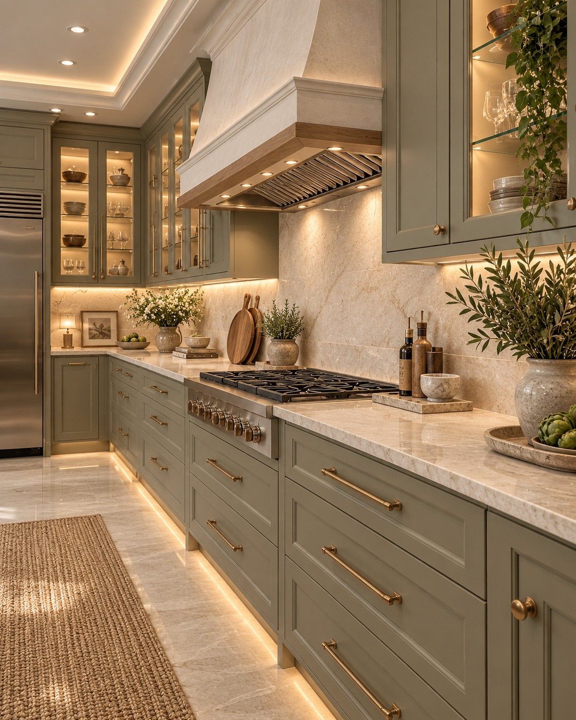
Green cabinets give gold hardware a backdrop that feels either bold or soft depending on the shade. Sage or olive tones lean traditional and keep the space calm, while emerald or forest green make a stronger statement.
Gold reads as the natural metal pairing for green because the warmth complements cooler or earthy tones.
Gold stands alone best, though it can share a kitchen with black, stainless, or chrome when the supporting metal stays quiet and gold takes the lead.
Test paint samples in your actual kitchen light before committing. Green shifts between morning and evening, and what looks soft in the store can read too bright or too grey once it’s on the wall.
4. Blue Cabinets with Gold
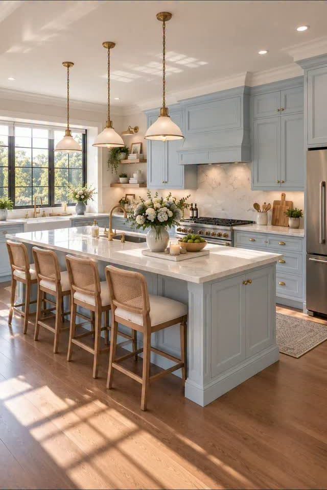
Blue cabinets give gold a colorful setting that changes mood with the shade. Light blues like powder or sky keep the room airy, while navy or cobalt create contrast that makes the hardware pop.
Gold hardware pulls blue kitchens toward traditional or coastal depending on the other finishes. Pair it with white countertops and backsplash for a lighter feel, or go with darker stone for something more grounded.
Cooler blues can make gold look too yellow if the undertones don’t match. I’d choose a blue with slight warmth or grey in it rather than a pure or icy shade.
5. Beige Cabinets with Gold
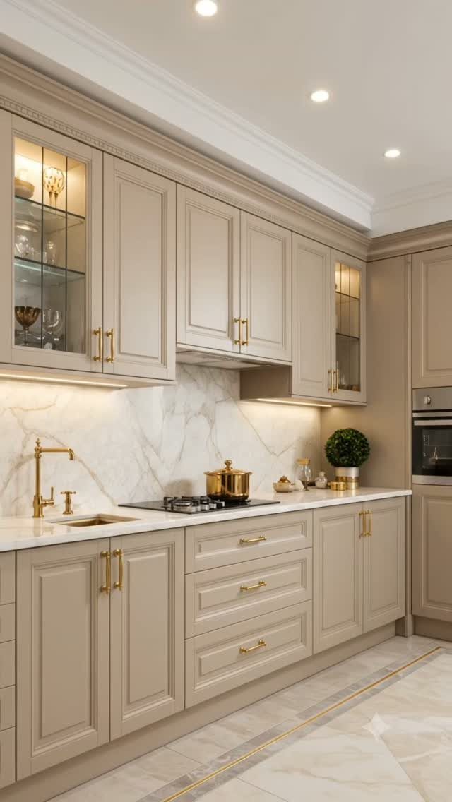
Beige sits between white and wood, giving gold hardware a neutral setting with more warmth than stark white but less grain than natural wood. The muted backdrop keeps gold from feeling too formal or flashy.
Beige cabinets work in kitchens where you want the space to feel settled without committing to a strong color. I’d pair them with white or light stone countertops to keep the room from reading too tan or yellow.
The downside is beige can look dated if the undertone leans too peach or orange. Test samples next to your flooring and countertops to make sure the warmth reads current.
6. Black Cabinets with Gold
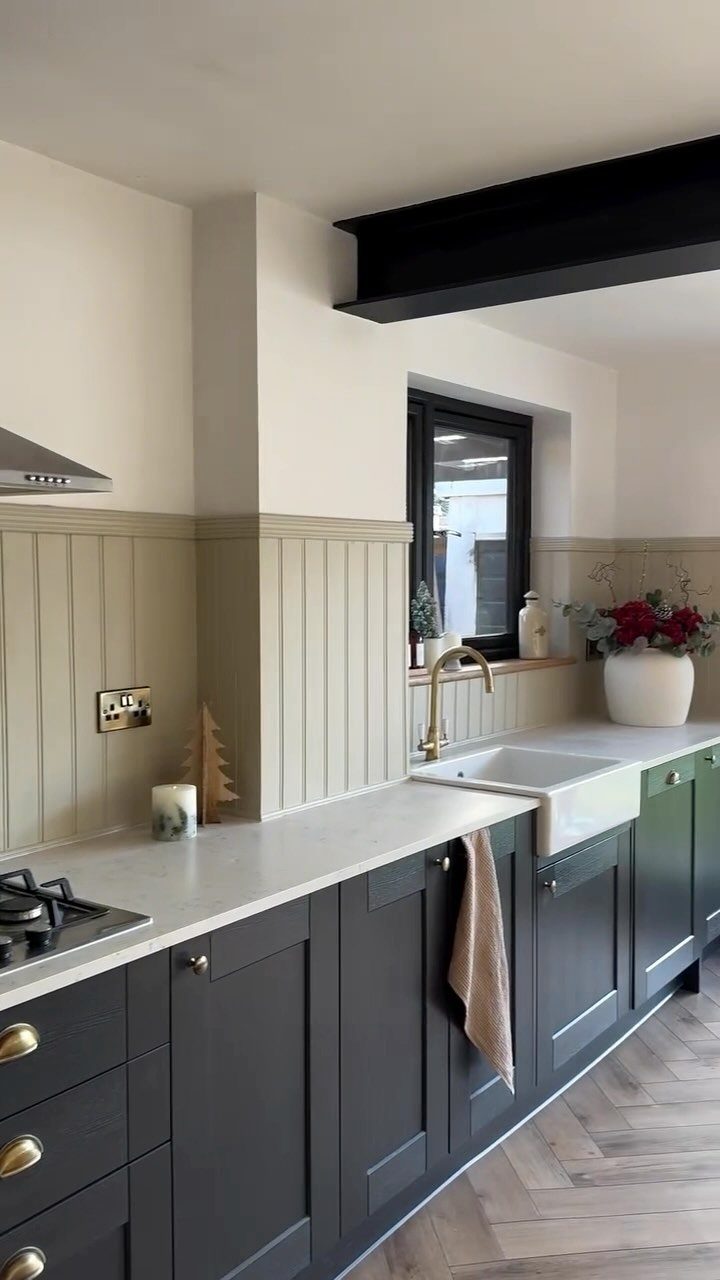
Gold stands out sharply against black or very dark grey cabinets, creating contrast that feels deliberate and a little formal. The pairing suits kitchens with enough natural light to keep the space from feeling closed in.
I’d choose brushed or satin gold over polished for dark cabinets. The softer finish keeps the look from reading too ornate, particularly with modern cabinets and clean lines.
Black shows dust and watermarks as visibly as white does, just in reverse. Matte or satin cabinet finishes hide smudges better than high gloss.
7. Two-tone Cabinets with Gold
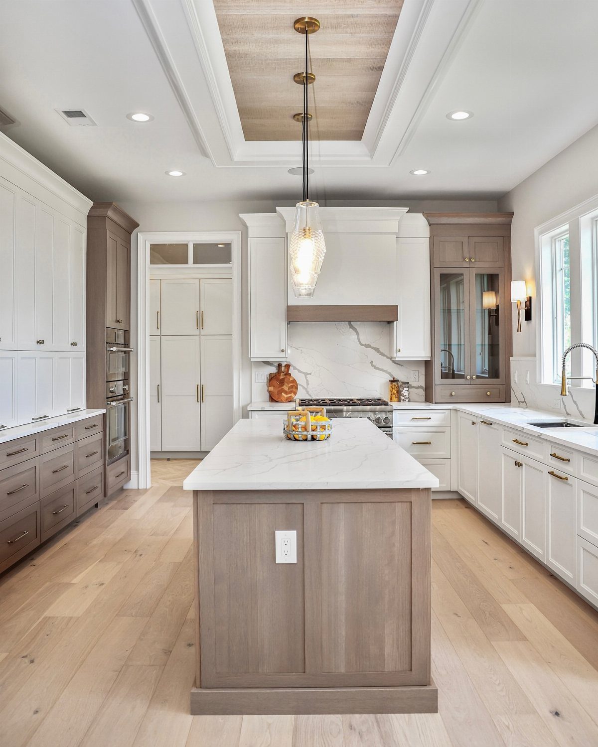
Splitting cabinets into 2 colors adds depth without needing a full remodel, and gold hardware ties both tones together instead of forcing a choice between warm or cool metals.
I’d put the darker color on lower cabinets where scuffs and spills land, and keep upper cabinets lighter to reflect ceiling light back down. Gold reads as intentional on both finishes when the tones share either warmth or coolness.
The line where colors meet needs to land somewhere that makes sense: at the countertop, at a natural break in the cabinetry, or along the base of an island. A random split halfway up a door looks like a mistake.
8. Polished Gold Cabinet Hardware
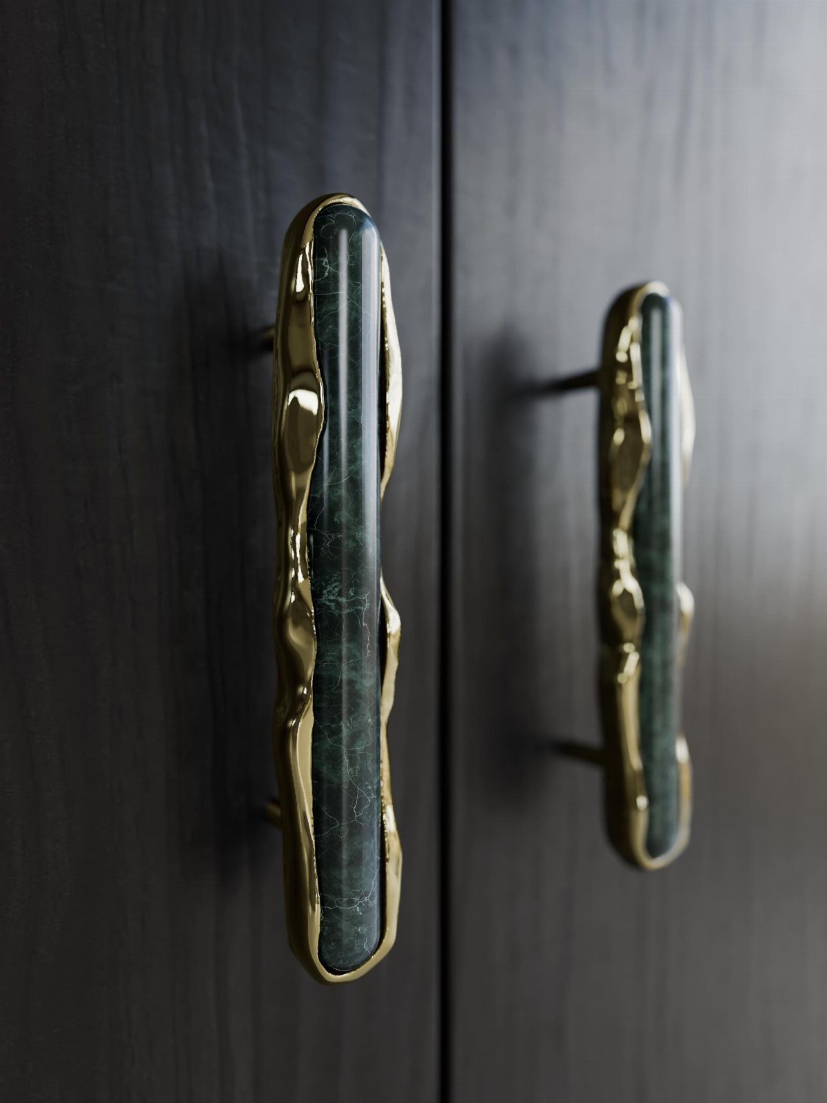
Polished gold catches light and reflects it back, which makes hardware feel more formal and draws attention to the cabinet doors.
The high shine shows fingerprints and water spots immediately, so I’d reserve it for cabinets away from the sink or stove. Polished gold shows every fingerprint, so I stick with it on cabinets I open less often.
Polished gold suits traditional kitchens with other reflective surfaces like marble or glass tile. In a matte kitchen it can look out of place.
9. Brushed Gold Cabinet Hardware
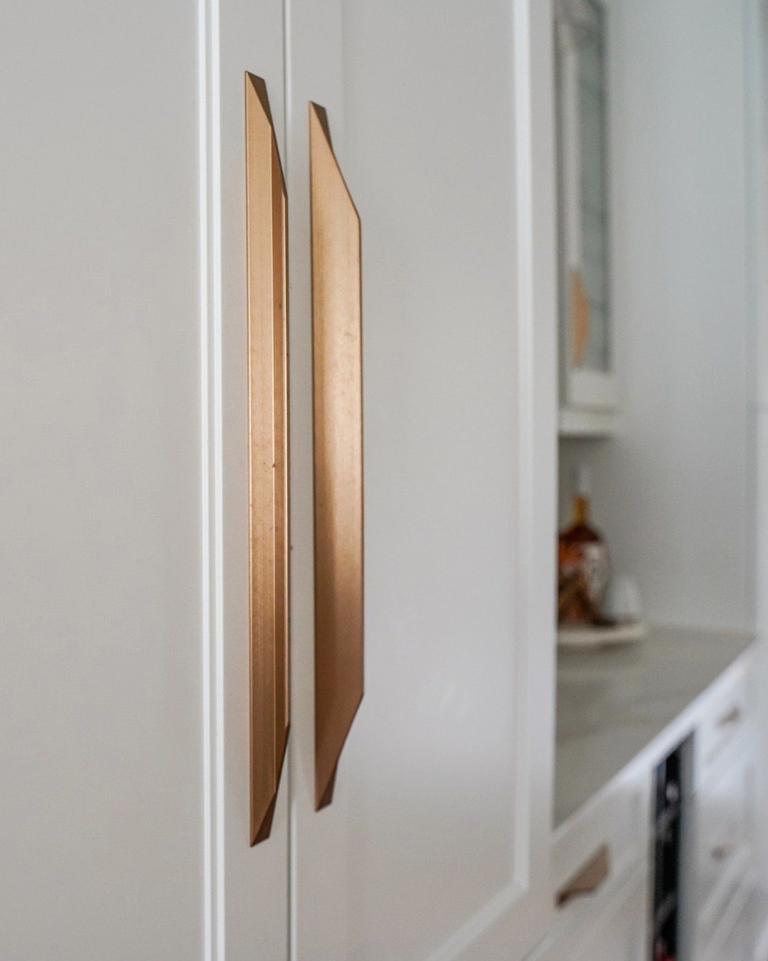
Brushed gold softens the shine and hides fingerprints better than polished finishes, which matters on cabinet doors near the sink or fridge that get opened constantly throughout the day.
The matte surface suits modern or transitional kitchens where you want warmth without the formality of high polish. I’d pair it with other low-sheen finishes like honed countertops or matte tile.
Brushed gold ages more gracefully than polished because small scratches blend into the texture instead of standing out as bright lines.
10. Grey Cabinets with Gold
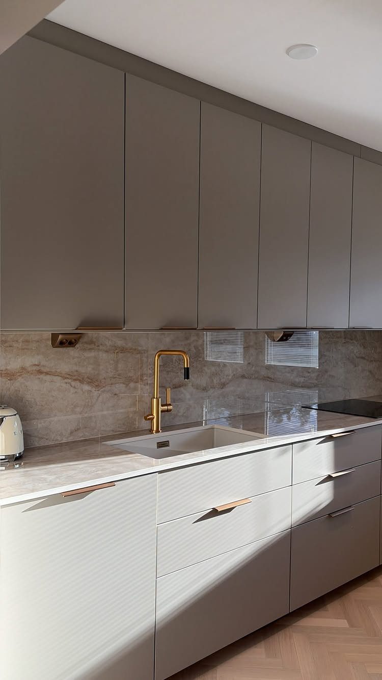
Grey sits between white and black, giving gold hardware a neutral backdrop that feels current without the stark contrast of darker cabinets or the potential starkness of pure white.
I’d match the grey’s undertone to the gold finish. Warm greys pair better with brushed or satin gold, while cooler greys handle polished finishes without the yellow looking off.
Grey cabinets hide kitchen grime better than white but still show dust, so plan on wiping down doors weekly near high-traffic areas.
11. Purple Cabinets with Gold
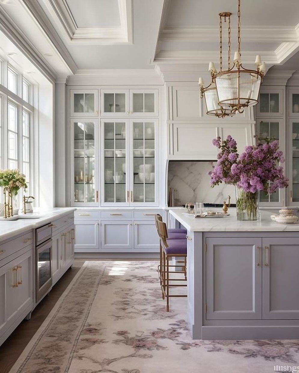
Purple cabinets make gold hardware feel decorative rather than purely functional, and light shades keep the space from reading too intense or dark.
Gold suits purple because both lean warm, but the pairing works best with white or light countertops and backsplash to balance the color. Too much purple without breaks reads overwhelming.
Purple is a bold choice that reflects personal taste more than resale value. If you’re updating a home you plan to sell, more neutral cabinet colors hold broader appeal.
12. Dark Brown Cabinets with Gold
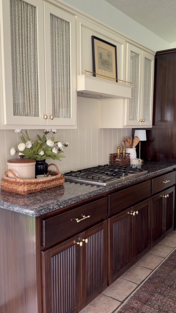
Upper cabinets in white balance the visual weight of dark brown lowers, and gold hardware on both levels keeps the metal consistent across the split.
Dark brown hides scuffs and daily wear better than lighter finishes, which makes it practical for base cabinets that take more abuse from feet, bags and spills.
The contrast works best when the 2 tones have similar warmth. A warm white with a rich brown reads cohesive; a cool white with a warm brown can look mismatched.
Cleaning and Finish Durability
A soft cloth, warm water, and a drop of dish soap take off fingerprints without scratching the surface. Anything with bleach, ammonia, or scrubbing grit will wear through the plating, so soap and water are safer every time.
High-quality finishes resist tarnishing and hold up to daily use. The finish matters more than the base metal when it comes to how long the hardware stays looking new.
Brushed and satin finishes hide fingerprints and minor scratches better than polished gold, which shows every smudge and develops visible lines over time.
If you’re choosing between finishes, consider how often you’ll touch the hardware and how much time you want to spend wiping it down.
I match the faucet and light fixtures to the cabinet hardware finish so the kitchen reads as one palette. Two different golds visible from one spot look like a mistake, not a choice.
Coordinating Metals and Lighting
Gold mixes with black, stainless, or chrome when one metal dominates and the others play a supporting role. I’d tie the gold through at least 3 visible elements: hardware, a faucet, and a light fixture or cabinet detail.
Under-cabinet lighting catches the hardware and bounces warmth onto the counter, which matters most when dark cabinets would otherwise swallow the detail. The strip sits close enough to the hardware that the metal catches and reflects it.
Pendant lights over an island or sink reinforce the gold when they include metallic finishes or accents. The repetition across the room makes the hardware feel like part of a larger plan rather than an isolated detail.
Frequently Asked Questions
What color cabinets look good with gold hardware?
White, grey, beige, sage green, navy blue, and wood tones from light oak to walnut all pair well with gold hardware.
The finish reflects warmth differently depending on the cabinet color: white and light grey keep gold feeling clean, while darker blues and greens make it more dramatic.
Is gold cabinet hardware in style?
Gold hardware stays current in both modern and traditional kitchens because it adds warmth without competing with other finishes. Brushed or satin gold reads more timeless than polished, which can look formal or dated depending on the space.
Is gold hardware still in style in 2026?
Gold hardware remains a solid choice because it suits multiple design styles and works with neutral and colorful cabinets alike. Brushed finishes hold up better visually over time than polished ones, which show wear and fingerprints faster.
Does gold hardware clash with stainless steel appliances?
Gold and stainless steel sit together when you keep the gold restrained and tie it to other metals in the space.